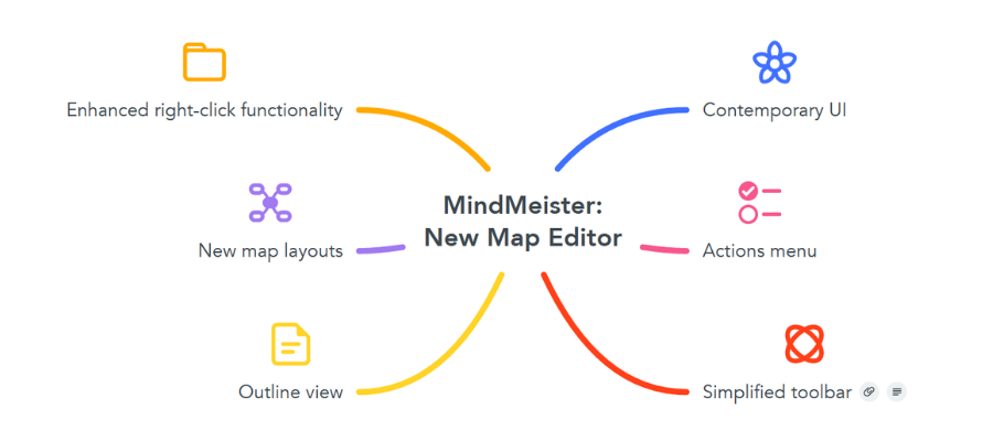
After 14 years, Meister Labs has decided to give the MindMeister map editor a major facelift. This update, which recently went live, features an elegantly simple, easy-to-use interface that puts commonly-used commands at your fingertips and groups them in ways that help you to streamline map creation and editing.
Here’s what’s new in MindMeister 2.0:
Overall user interface: When you open a new map in the updated map editor, you’re immediately struck by its brightness and its open feel. By default, the background map color is white. There are no more horizontal bands bracketing your mind map at the top and bottom of the workspace. These have been replaced by smaller, floating toolbars with monochromatic gray buttons. They stay out of the way until they’re needed, and aren’t distracting.
New styling toolbar: The previous version of MindMeister employed a “hamburger” button (3 horizontal lines) in the upper right corner of the workspace to provide access to map formatting tools, which were jumbled together in a confusing array of options. In order to figure out what a button did, you had to mouse over it to view a tooltip.
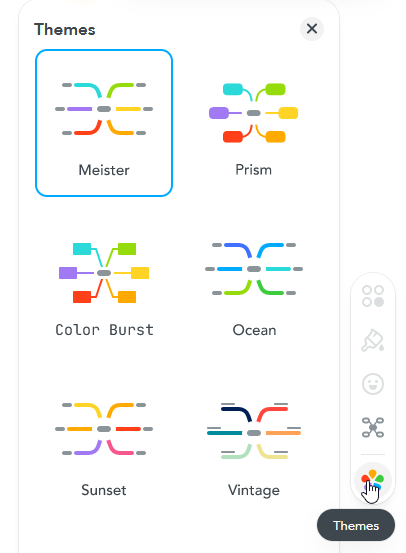
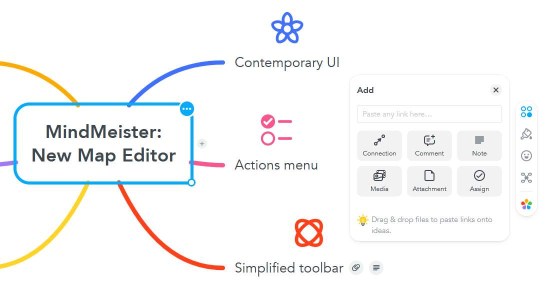
MindMeister 2.0 replaces that confusing arrangement with a vertical toolbar with five buttons that are persistently visible (but unobtrusively so) on the right edge of the workspace. They enable you to:
- Choose from a selection of colorful map themes
- Select one of three map layouts (radial, org chart or list),
- Add icons and emojis to to your map topics,
- Change the style of specific map topics, and
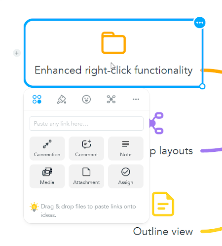
- Apply “actions” to your map topics. These can include connecting it to another topic, adding a comment, attachment, media, note or assign it as a task to someone on your team
The developers of MindMeister have done an excellent job of distilling the app’s toolbar down to the essentials you need to build an effective mind map. The effect is inviting and fun. No more large, vertical command center on the right side of the workspace. This tightly constructed set of buttons helps you get the job done, easily and efficiently.
 New map themes: One of the things that was hard to do with the existing MindMeister user interface was customizing the look and feel of your mind maps. It gave you plenty of control over topic shape, color and font, line color and map background color, but you had to adjust these properties manually. MindMeister 2.0 gives you 12 attractive new map themes that enable you to customize the look of your mind maps with a single click.
New map layouts: Until now, the only option was for you to create a traditional radial mind map, with topics arrayed in all directions. The new map editor enables you to also create right-facing maps, org charts and lists, where subtopics are stacked vertically below their parent topic.
What’s very cool is that you can mix and match these layout options. In other words, you can apply a new layout to any topic within your mind map. In other words, if you’ve created a large radial map, you can select one of its topics and change the layout of its subtopics to a list.
 Enhanced right-click functionality: The previous MindMeister user interface offered context-sensitive menus when you right-clicked on a topic, but they were relatively simple, text-only tools. The new UI offers a tabbed dialog box that provides quick access to actions, map styles, icons/symbols, map layout options and more. This elegantly designed dialog box is compact but lets you get a lot done without having to mouse over to the application’s toolbar. Clearly, a lot of thought went into making this well-organized and easy to understand.
Actions: As a descriptive label, “actions” speaks to me. It says that this command is going to help me get things done. And so it does. Everything works easily and intuitively.
For example, I selected one of my map topics and then clicked on “connector.” My topic displayed small plus sign (+) icons on all four sides. I dragged my mouse and was easily able to create a relationship line from it to another topic. I didn’t like it’s shape or where it connected to this pair of topics. I simply dragged and dropped them where I wanted them to go. Everything behaved intuitively.
I then selected another topic and added a note as well as a website link to it. The latter told me the URL I was typing was invalid – until I finished typing the “dot com” at the end. Then the annoying warning went away. This may be off-putting to some new users, who may think they’re doing something wrong or that this part of the application is broken.
Outline view: MindMeister 2.0 adds an outline view, which you can access via a floating toolbar in the lower left corner of the workspace. While you’re in outline view, you can use a set of keyboard commands to add new topics, change their level in the hierarchy of topics or move them up and down within the outline. If you’ve already created an outline in a word processor, you can easily copy and paste it into MindMeister’s outline view = nice!
Conclusion
MindMeister’s redesign of its map editor not only gives it a contemporary look and feel, it enables users to build great-looking maps faster. Its controls are logically arranged and are less intrusive on the workspace than the old map editor.
As Meister Labs has grown, it has made application usability a cornerstone of its mission. That commitment is reflected in its other tools, MeisterTask and the new MeisterNote. It’s awesome to see that the development team turned its attention to their flagship product, MindMeister, to elevate the design and functionality of the map editor – the place where ideas become tangible and turn into plans and actions.


Leave a Reply