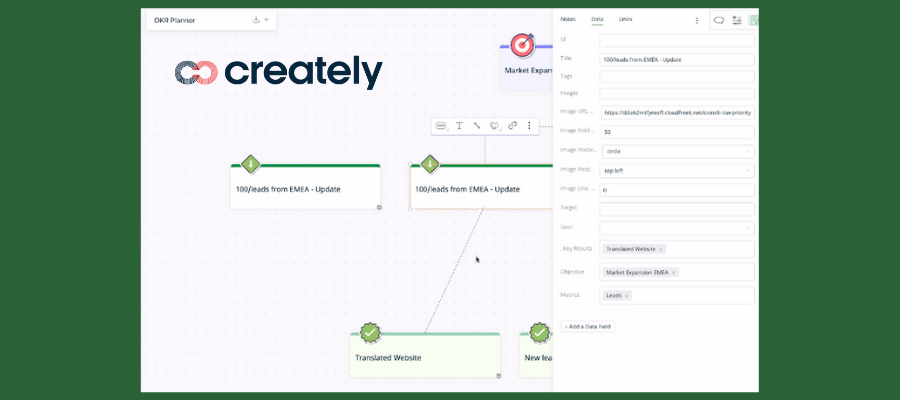
Creately, a web-based diagramming tool, recently unveiled a significant update that changes the game for this genre of visual productivity applications. It now incorporates a database into its workspaces, views and diagrams. This flexible capability takes it well beyond its traditional realm of brainstorming and planning to manage entire business workflows.
Here’s what’s new in Creately and what you need to know about it.
New database powers
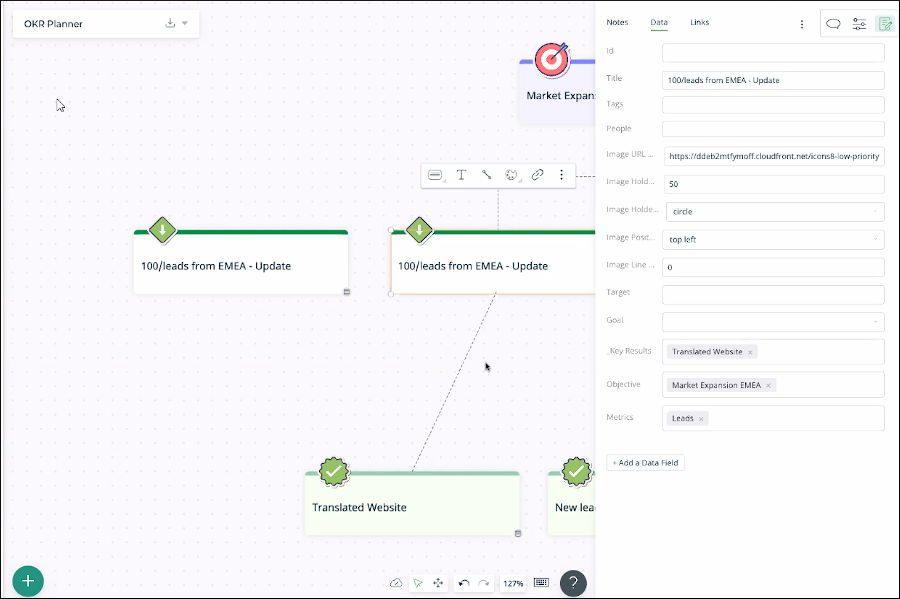
The new Creately adds the power of a database to its simple, free-form whiteboard interface. This enables you to add fields and properties to any topic in your diagrams, as well as notes and links. This data exists apart from the objects themselves, which means it can be re-used and filtered for use in multiple views and contexts.
You can add new fields at any time and assign common data types to them, such as dates, numerical data, currency and more. In addition, you can perform calculations on data, with at least as many types of formulas as you’ll find in Excel.
Creately enables you to create multiple views of information within a single workspace, drawing upon the same repository of data but displaying it in different ways. This gives you the freedom to create flexible, customized workflows based on the roles of your collaborators.
For example, let’s say you mapped out a hiring process, which you then wanted to use to store data about the job candidates. As a department head, you could create a data table that lists candidate names, current salaries and other relevant data about them. You could then create a new view that contains the hiring process flowchart, but with the candidate data filtered so that other people involved in the interview process can’t see the salary data.
Another powerful use of Creately’s new database capability is to store all data related to a project within a single Creately workspace. It can then be filtered and viewed in different ways as needed. In the process, it can save the entire project team a lot of time because all of the data can be stored in one central location, where everyone can use it in different contexts.
The diagrams themselves can not only display links to other shapes and objects, but also links to data sources. It’s a little hard to explain, but when you see it in action, it’s quite powerful. The developer points out that it’s hard to show relationships between tables of data in a spreadsheet tool like Excel or Google Sheets. But it’s a snap in Creately.
Detailed notes are a click away
Any shape or object in a Creately diagram can now contain detailed notes, which are displayed along with custom data fields in a vertical panel on the right side of the workspace. Notes can have complex formatting, including heading types, bulleted and numbered lists and much more. In effect, you can utilize Creately to build a visual wiki.
Shape-shifting magic
Objects in the new Creately can change shape and format, depending upon the context in which they’re being used. I’ve never seen this type of behavior in a visual thinking tool before. It’s quite innovative! Here are four brief examples:
Kanban idea classification: You and your team members can brainstorm ideas using digital sticky notes. When you’re done capturing them, you can use a Kanban board to classify them. As you drag and drop them into columns within the Kanban diagram, they automatically change shape into task cards that better fit this project management format.
2×2 matrices: Creately also provides smart templates that enable you to further prioritize your ideas on a 2×2 grid. When you drag and drop task cards onto the grid, they transform into round pins to conserve space. Each pin’s position on the grid corresponds to its data values. Clicking on it still gives you access to all of its properties, including notes, links and database fields. If you change its values, its pin moves to reflect them. Very cool!
Project management: Creately also speeds the creation of GANTT charts. Dragging and dropping an object that contains start and end dates into a GANTT chart automatically converts it into a timeline bar. Like the 2×2 matrix template, the GANTT chart supports two-way editing. If you drag and drop the start or end dates of a task in the GANTT chart, the underlying data is also updated.
Conditional formatting: I asked the developer if this powerful new iteration of Creately supports conditional formatting – the ability to create rules that automatically change an object’s color, shape or other attributes if the data it contains meets or falls outside of a certain range of values. This capability isn’t currently supported, but will be added in the near future.
I’ve seen conditional formatting in action in one mind mapping application and it’s a game-changer. It enables the creation of dashboards where you can tell, at a glance, if a task is overdue, a budget line item has been exceeded or other out-of-the-norm conditions exist you need to be aware of.
Workflow support
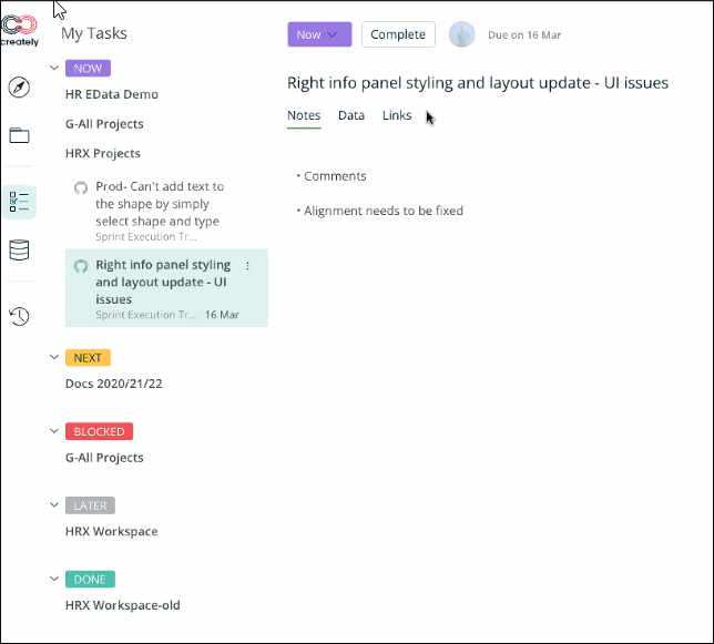
Creately’s newly-expanded capabilities enable you to create customized workflows and assign work items and tasks to team members based on roles. It also includes a personal task management view, which aggregates all of your tasks from across Creately into a single panel – nice!
GitHub integration: the first of many
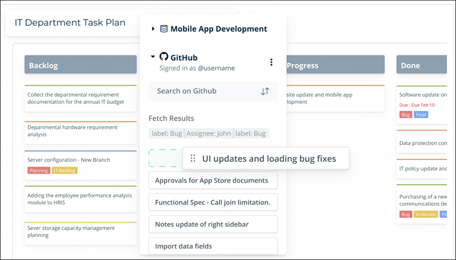
As part of its goal of serving as the single source of truth across entire business workflows – from ideation to execution – Creately is now offering two-way integration with the GitHub open-source software development platform. Creately’s goal is to connect the tools you use every day to it, connect to the data they contain, visualize it with two-way sync on Creately’s visual canvas, and even add more fields within Creately to extend that data.
Conclusion
The new version of Creately does so much that it’s hard to do it justice in a single product review. I applaud the developer’s ambitious efforts to connect and centralize docs from multiple apps, docs and people in a single, flexible visual workspace. It gives you new ways to think about how to organize and manage your work – to connect the dots between disparate pieces of information. That’s the key to insight and innovation.
I can’t wait to see what’s next from this rich visual thinking platform!

Leave a Reply