Graphics giant Canva recently added whiteboarding to its already extensive toolset. Is this a good thing? Maybe. Maybe not.
During the last decade, Canva has enjoyed meteoric growth by providing creators with a constantly expanding set of collaborative graphic design tools for creating web graphics, charts and graphs, infographics, videos, presentations and more. It’s now the go-to all-in-one visual tool for over 85 million users worldwide.
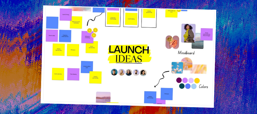
It recently added free whiteboarding capabilities to its portfolio, opening the door to new possibilities. For example, a team facilitator can use it to manage a workshop by first using Canva to produce a presentation that outlines the focus of the working session.
Then, with a single mouse click, he can switch to an infinite whiteboard canvas where the group can brainstorm ideas related to it and add them to the workspace using colorful sticky notes. If brainstorming isn’t your thing, Canva’s new whiteboard offers hundreds of templates that support many other types of business tasks.
Let’s take a closer look at this new offering to determine if it’s worth your attention.
How does the Canva whiteboard tool work?
To create a whiteboard in Canva, simply look for the new icon in the toolbar below the big blue “What will you design?” banner on the Canva home page. This takes you to an extensive page of whiteboard templates – everything from a design thinking ideation canvas and an Ishakawa (fishbone root cause analysis) to a project kickoff mind map and affinity diagram.
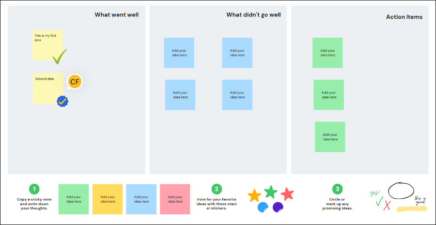
I selected a basic brainstorming template with regions for “what went well,” “what didn’t go well” and “action items.” Below the empty 3-panel diagram was a set of elements, such as sticky notes, stickers and a selection of elements you can use to mark up your diagram (a circle, a yellow highlight and more). This helps to show new users what’s possible. It also suggests a 3-step process for adding ideas to the canvas and then embellishing them.

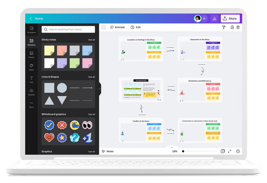
Simple instructions state that you can either duplicate these elements or use the ones contained in the familiar vertical panel on the left side of the workspace. When I clicked on the “elements” icon in the latter, categories appropriate to whiteboarding automatically appeared at the top of the list: sticky notes, lines and shapes and whiteboard graphics – nice!
Unfortunately, if I was new to Canva, I probably wouldn’t have discovered this collection of resources on my own. That’s a problem.
Adding an idea to your whiteboard is a simple matter of dragging and dropping it where you want on the canvas. Clicking within it enables you to enter text. It’s formatted at a font size of 12, which means the average sticky note can contain a lot of text – not necessarily a good thing. If you want to limit note text to just a few words that you must manually adjust the font size of every idea.
When a sticky note is selected, a context-sensitive menu appears below it that enables you to quickly add a comment to it, duplicate it or delete it. An ellipsis (3 dots) button gives you access to additional commands, including toggling something called “quick flow” on and off. Enabling it causes plus signs to appear above, below, right and left of the currently-selected sticky note so you can add new sticky notes to the canvas – fast – without having to mouse away from it.
If you’re facilitating a brainstorming session and the ideas are coming fast, this functionality will enable you to keep up. If you’re brainstorming alone, it will help you keep your creative “flow” going.
Graphics, such as checkmarks and emojis, can be added to the whiteboard from the left-hand menu panel. Once placed on the canvas, they act as free-standing elements. They don’t appear to “attach” themselves to sticky notes in any way. Strange…

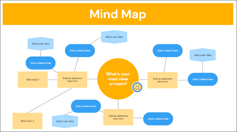
I also selected a mind map template and played around with it. Because it displays a connected hierarchy of ideas, quick flow is automatically turned on. Clicking on a plus sign on a map node creates a new, connected topic in the direction you choose. I noticed that it intelligently chose optimal locations for each new topic, eliminating the need for me to rearrange them manually.
Pros and cons of Canva’s whiteboard tool
As you would expect, Canva provides a large number of professionally-designed templates you can use to support everything from strategic planning and design thinking to root cause analysis and agile sprints. Plus, you have full access to its full library of over a million graphics, images and video clips, which you can incorporate into your collaboration sessions.
And therein lies its greatest potential weakness: For teams that may be new to online collaboration, the whole experience may feel a little too unfocused and overwhelming. With a cornucopia of elements just a few clicks away, it may be too tempting for team members to stray from the task at hand and play around instead of staying focused on the task at hand. There’s just too much here that can potentially distract team members. When it comes to effective collaboration environments, less is more!
The large, vertical panel that provides access to these tools also uses up valuable screen real estate. If collaborators are using smaller laptops that have become the norm in corporate environments today, they may find that their diminutive screens don’t provide much room to share their ideas. They may be forced to do a lot of zooming and scrolling to effectively see others’ contributions to the whiteboard and navigate the workspace. It can be collapsed, but that’s not its default state. This functionality is something a facilitator would need to explain before beginning a collaboration session.

Finally, this new toolset feels like an afterthought to me. Over two years since organizations were forced into remote working and collaboration, it feels very late to market. Most teams are already using other, much more mature (and relatively affordable) whiteboard-based collaboration tools like Miro and Mural to get work done in today’s hybrid work environment. In short, I’m not sure what unmet need Canva’s whiteboarding tool fills.
On the positive side, it’s very easy to use, it’s integrated with the developer’s presentation tool and it’s free. Organizations that may already be using Canva for graphics creation may want to try it out with their teams to see if collaborative brainstorming makes sense for them. They can do so without investing in per-seat fees.

Leave a Reply