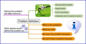
 One of the fastest ways in which you can improve your software-produced mind maps is to move beyond the default settings of your program.
“Out of the box,” many mind mapping software produces black-and-white, text-focused maps that just aren’t very interesting. A few create randomly-colored branches automatically, but most don’t. A lot of the mind maps I see online are, how can I put this delicately… BORING!
How can you add color and visual interest to your mind maps? Here are five suggestions:
- Change the topic text or shape color
- Change the color or shape of the lines used to connect topics and subtopics
- Add a background image to your map
- Add an image or modify the text, shape or color settings of the central topic
- Add images to individual map topics
Please keep in mind that I do not advocate doing this randomly. Color, shape and other elements should be used to convey or enhance the meaning of your map. I like the simple example above, especially the use of the soccer ball image to depict goals, and the way in which the questions are colored orange. This naturally draws your eye to the most important part of the map – the questions that you should consider when you’re engaged in problem solving.
What strategies to you use to add visual interest to your mind maps? Please share your techniques in the comments area of this post.

Leave a Reply