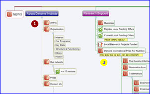
 Website mind maps are a great planning tool for site developers, because they can clearly show the hierarchical relationships between web pages, as well as other types of relationships that cut across the page hierarchy (using relationship lines).
This example from the XMind map gallery is particularly well done. It is well organized and communicates the structure of its subject website very clearly – even though part of the map is in French. There is much to like about how this mind map is designed, which we will analyze in my latest report in the Effective Mind Maps series.
In these reports, I deconstruct visual maps and analyze what’s good about them and what could be improved – all in the interest of helping you to understand the principles of effective mind map design.
To access this report, you must first login to the Mind Mapping Insider area. If you don’t have one, please click here to learn how to get one.

Leave a Reply