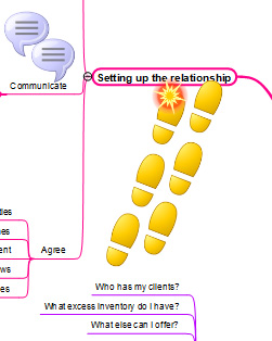
 The best mind maps do a number of things very well: They provide just enough information, well-organized in an easy-to-understand sequence. They use images, icons and symbols creatively and sparingly to add meaning and context to the map. They help the reader by using topic borders to draw your eye to the most important content in the map. And they use color to add visual interest. This mind map does these and several other things extremely well.
In my latest report in the Effective Mind Maps series, we’ll take a closer look at what’s notable about this mind map from the NovaMind Connect social mind map sharing gallery, which summarizes the author’s notes from three Jay Abraham workshops into a single visually engaging summary that goes above and beyond a typical mind map.
In these reports, I deconstruct mind maps and analyze what’s good about them and what could be improved – all in the interest of helping you to understand the principles of effective mind map design.
To access this report, you must first login to the Mind Mapping Insider area. If you don’t have one, please click here to learn how to get one.

Leave a Reply