SpiderScribe, which debuted last year as a beta web mind mapping application, has been officially released. For someone who has never done mind mapping before, its simple, well-designed drag-and-drop interface is very welcoming.
SpiderScribe enables you to easily build simple mind maps that incorporate text, images, maps and events, by simply dragging and dropping “stencils” into the workspace, arranging and connecting them – all in an easy-to-understand user interface. Even if you’ve never created a mind map before, you’ll find the process to be easy and intuitive. Unlike some programs, the developers of SpiderScribe provide a help page and demo video that are clear and easy to follow.
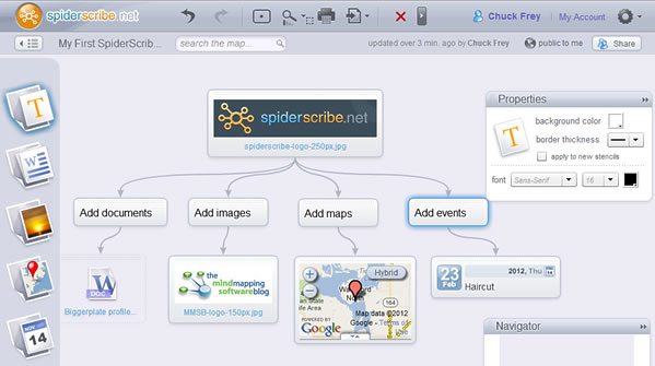
I created a simple map in SpiderScribe, which you can see above (click on the image to view a larger version). I’ve also embedded it in this blog post (below), so you can see how that works. The app behaved just as I would expect it to. Dragging and dropping a stencil into the workspace immediately opened a dialog box, where you could select the asset needed – such as an image or document to add.
A dialog box in the upper right corner of the workspace enabled me to adjust the properties of my stencils, changing the size and color of the font in a text stencil, for example, and even giving me the option of applying these settings to new stencils – a real-time saver!
A second dialog box acts as a high-level map viewer, so you can move quickly through larger, more complex mind maps. Both this panel and the properties one can be minimized to give you more screen real estate – nicely done!
Each stencil has a dotted border at the top, where you can drap and drop it to a different position with the workspace. Connecting items was a simple matter of dragging my mouse from the plus icon at the bottom of a stencil to a neighboring one. Controls in the upper left and right corners of each stencil enable you to quickly duplicate or delete it.
To keep your mind maps looking neat, you can snap topics – which SpiderScribe calls stencils – to a grid or aligned to other stencils. This worked very well. Rather than constantly displaying a grid in the background of the workspace, which would cause visual clutter, a dotted line only appears when the stencil you’re moving is aligned with its neighbors. The stencil popped into place with a satisfying jump, giving me visual feedback that the alignment had occured.
Opening and saving maps occurred quickly, with no lag time. Obviously, the code behind SpiderScribe is well-honed, and is running on some decent servers. Kudos to the developers for that.
Sharing maps is accomplished by clicking on a “share” button in the app’s toolbar. A dialog box enables you to send e-mail invitations to your colleagues to share your mind maps. You can control whether your map is public or private, and whether your collaborators have view-only or editing privileges.
This dialog box is also where you embed your maps. If you select “public on the internet” in the sharing settings, a link appears that enables you to embed it into your website. You can then copy and paste a set of “iframe” code to make this possible. Using this simple format ensures that your map will appear properly in most websites, blogs, Facebook pages and elsewhere. Controls in the dialog box enable you to specify the size of the map, the amount of your map you want to be visible and give it a description. This is a greater level of control than I would have expected from a version 1.0 app.
Here is what an embedded map looks like:
Conclusion
SpiderScribe is a well-designed first effort by its developer. One of the challenges of developing web-based mind map apps is making it simple enough for newbies to figure out, yet full-featured enough so that intermediate and experienced users will find value in it. The developers of SpiderScribe appears to have gotten this balance just right. I can’t wait to see what’s next with this terrific mind mapping app.


Leave a Reply