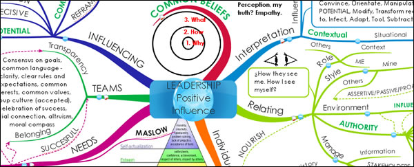
Ideally, mind maps need to guide the reader’s eye, helping us to understand what’s important and what the flow of information is around its circumference. Use of typography, font size, font color and images should be consistent and should help to add meaning to the map. There shouldn’t be any ambiguity – the presence of each major topic should be clearly explained or implied. Unfortunately, the subject of my new mind map analysis falls short by trying to cram too much information into too little space. In the process, it includes some elements that leave us wondering, “Why did the map author put this here?”
In this report, I will deconstruct what could be improved about this mind map that tries perhaps a little too hard to tell us about building influence as a leader.
Members-only resource
 This link to this report is only visible to members of the Mind Mapping Insider membership program. It contains a wealth of resources that can help you to be more productive, creative and have a greater impact in your life.
New reports and resources are being added to the Insider area every week, plus members get access to over two years of archives. If you’re serious about becoming a mind mapper, why not check out the Mind Mapping Insider program today?
There’s no obligation – if you don’t find this program to be worth many times more than your investment, you may cancel at any time. Why not give it a try today?

Leave a Reply