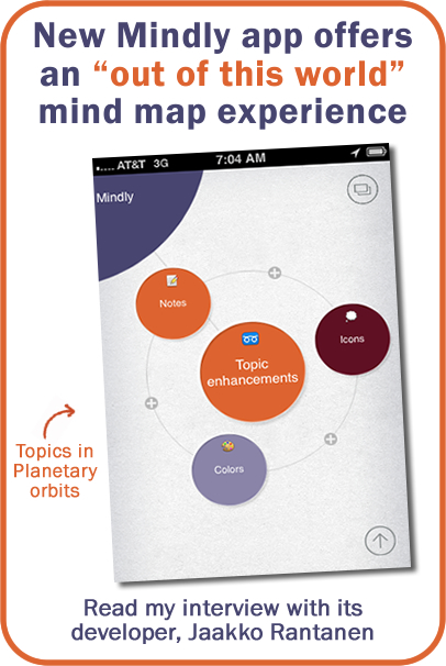
 App developer Jaakko Rantanen thinks conventional mind mapping apps on the iPhone force you to work as if you’re wearing blinders, revealing only a limited portion of your information at a time. So he decided to create a new design motif for his new Mindly app that is inspired by the solar system, and makes it easier for users to record and view the content of their visual maps.
This fascinating mind mapping app places topics in “orbits” around their parent; at the top-level view, the central topic and its first-level “children” appear in the center of the screen. Tapping on one of these first-level topics causes the parent to glide to the upper left corner of the screen, and the next level of information is displayed, this time with the first-level topic centered on screen and its child topics orbiting it.
It’s an elegant idea that deserved a closer look. So I e-mailed Jaakko to get a closer look at the thinking behind Mindly:
Frey: What was your mission in creating Mindly? What needs were you hoping to fill?
Rantanen: The best ideas often come in situations where you are not in front of the computer. Maybe on a bus, discussing with a friend or in a meeting. On those occasions one wants something that helps to develop that idea quickly, create a structure of the thing in your mind. So we thought that phone would be an ideal device as it is always with you. Just that the existing mind mapping tools seemed to suffer on a small screen.
Our mission was to offer a pleasant environment where you can play around with your ideas. A tool that does not get into your way. A tool that works well on a small screen.
Frey: How does the circles motif solve some of the challenges of mind mapping on the iPhone?
Rantanen: Because of the limited space on a smartphone screen we found the “map” concept difficult. It is like looking through binoculars and seeing only a small portion at a time. Feeling of being kind of “lost”. Mindly tackles the problem by concentrating on the thought structure rather than on physical “map” concept.
Mindly is organized like our universe. Think about planets circling around the sun, moons around the planets, electrons around the nucleus. By following this natural way of organizing things, Mindly gives users to the possibility to work directly with the thought structure itself. And it turned out that a smartphone screen is big enough for that purpose!
Frey: Who do you see as your core customer for Mindly?
Rantanen: We believe our core customers are the savvy mind mapping users. They have tried varied tools in the past. They are creative people and many are entrepreneurs themselves.
 Frey: What do users of Mindly typically use it for?
Rantanen: It seems to vary a lot. We’ve got a lot of feedback from people using it for project planning, note taking in meetings and even teachers creating overviews for students.
It has been really rewarding to hear that people are already using Mindly for their work – analyzing large complex ideas, planning a speech and even mirroring it to external screen for a group brainstorming. On the other hand, there are a lot of people using it in everyday tasks, from capturing ideas to creating shopping lists.
Frey: Why introduce another mind mapping app into a market that’s already crowded with them?
Rantanen: There was definitely a need for fresh angle to create mind maps on the go. While there are good apps for desktop and for iPad, nothing really convinced us on the iPhone.
Frey: What’s next for Mindly? What features and functionality do you hope to add to it?
Rantanen: We have received a lot of requests for a native iPad version, so that’s the next big thing. Improving printing, sharing and exporting options is already under development.
To download Mindly, please visit its web page on the Apple AppStore.

Leave a Reply