For small teams that need a virtual workspace in which they can brainstorm, plan and collaborate, Mural.ly is a powerful, flexible, web-based solution. More than just another “sticky note” environment within a web browser, Mural.ly offers a comprehensive toolset that encourages creativity and collaboration.
In this review, we’ll take a closer look at the business-oriented features of this cool web-based visual thinking tool, and we’ll explore some of the ways in which you can use it in your operations.
The Mural.ly user interface
Mural.ly offers a fairly Spartan workspace compared to many desktop- and web-based mind mapping, diagramming and visual thinking tools, which tend to cram the margins of the workspace full of buttons and options. Mural.ly only displays 14 buttons, divided between a vertical panel on the left side of the workspace, the header area above it and the lower right corner of the workspace. It’s a marvel of simplicity. But don’t let that fool you – it can do a lot of very cool things!
Adding content to the Mural.ly workspace
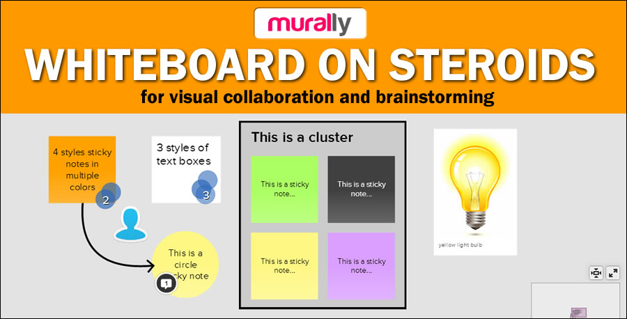
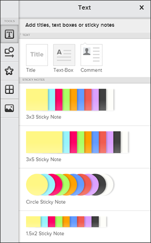 When I first looked at Mural.ly, you could add simple sticky notes or images to your “murals.” Now, the text button opens a large dialog box that enables you to add:
- A title box
- A text box
- A comment
- A 3×3 sticky note in 10 colors
- A 3×5 sticky note in 10 colors
- A circle sticky note in 10 colors
- A miniature 1.5×2 sticky note in 10 colors
When you drag and drop a note into the workspace, Mural.ly automatically highlights some dummy text inside of it and displays a text editing toolbar above it. All you have to do is start typing. No more clicks are necessary to enter your idea into the note. Text editing tools include the ability to:
- Change font size
- Change font (including a nice selection of business-like and playful fonts)
- Change text formatting (bold, underline, italic, strikethrough)
- Adjust text alignment
- Toggle the note border on and off
- Change the note color
- Change to a different note format
All of these options are presented in a simple, gray and white toolbar; combination buttons are used to provide access to numerous options, but stay hidden so they don’t overwhelm you. One or more people on the Mural.ly team are obviously well-trained in user interface design, because this simple, common-sense, efficient layout pervades the entire experience of using Mural.ly.
You can also double-click within a blank area of the workspace to add a new sticky note – ideal for fast-moving team brainstorming sessions where you need to be able to add many ideas quickly to your mural.
To give the feel of brainstorming ideas on physical sticky notes, Mural.ly also gives you the option to sketch your idea. That’s not very easy to do with a mouse, but if you have a pen and tablet input device, you should be able to create simple sketches quite easily. It also supports next-generation laptops and convertibles that have touch-sensitive screens.
Selecting an existing note within the Mural.ly workspace causes it to display a bounding box, which gives you access to four options, one on each corner of the box:
- Move the note
- Rotate it
- Resize it
- Access a menu of additional note manipulation options. You can add a comment, duplicate the note, lock its size and position (ideal for title shapes, which you don’t want to accidentally move while your building and tweaking your murals), bring to front, move to back, edit and delete the note.
If you select more than one note, an additional option appears in the menu – to group objects. This is important if you want to maintain the alignment of notes relative to each other.
As you move a note, alignment lines pop up on screen as your note passes within alignment of other notes. This enables you to create neat columns and rows of notes, if that’s important to you.
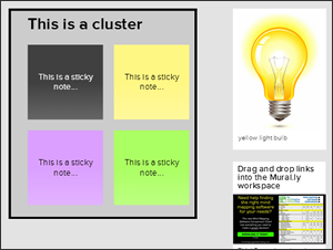
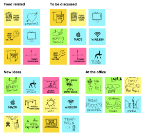 Dragging one note over the border of another one creates “clusters,” tightly grouped collections of notes. If you’re brainstorming, you can use clusters to group related ideas. One shortcoming: the border of a cluster is invisible – there’s no way to add a background color to it. I had to add a rectangle shape to my mural, move it to the layer behind my the notes within the cluster and then give it a semi-transparent color in order to achieve this effect.
Adding images to murals
The images panel in Mural.ly enables you to search an extensive collection of images or to upload your own. Images behave just like any other object in Mural.ly: They can be moved, resized and rotated. They can also have a title, a caption, a border and can be hyperlinked to a web page URL. I searched on the term “bulb,” because I was looking for a light bulb to add to my mural to depict ideas. Mural.ly displayed almost 100 images from which I could choose – nice!
You can also drag and drop images from your computer’s drives into your mural. I tried it with a PNG image and it worked flawlessly.
Well-designed collaboration capabilities
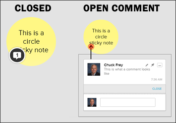 One of the key aspects of Mural.ly’s design is its support for small group collaboration. A core part of that is its commenting system. When you add a comment to a note, it appears with the head shot from your profile in a collapsible dialog box that appears to the lower left of it. Like a chat application, a blank box always appears below the last comment entered, to encourage additional conversation about an idea. Closing the comment box collapses it to a small conversation balloon that displays the number of comments that idea has received. This helps keep the Mural.ly workspace uncluttered, while providing useful feedback on how many comments each idea has generated.
Each time you login to Mural.ly, it displays a list of any changes that your collaborators have made since the last time you viewed it in a “mural activity” window – ideal for “catching up” and enabling you to continue the visual conversation in a meaningful way.
Live chat is also supported, which makes Mural.ly ideal for live brainstorming sessions with geographically-dispersed teams. As collaborators add ideas to the shared canvas, they can explain what they’re doing and answer any questions of their team mates in real time.
Connecting ideas
Mural.ly isn’t just a browser-based environment for creating loosely-related collections of ideas. You can connect them to create flowcharts, mindmaps and other types of diagrams.
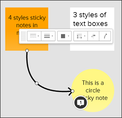 Adding shapes and connectors to your diagram is simple. Just drag one of the 4 connector types from the shapes menu to the workspace, and use the selectors at either end of it to place the beginning and end of the line over the notes you want to connect. Mural.ly doesn’t automatically “snap” connectors to the edge of each shape; this gives you the freedom to either connect at the edge of a note, or have a line extend into the shape. Another selector in the middle of the line enables you to easily adjust its curvature by dragging to either side of its current location, or dragging the selector along the line to change its “bending” location.
A faster way to connect elements in Mural.ly is to hover over the border of a note. A white circle appears. If you drag the cursor away from it, a line springs forth from it, which you can then connect to another note.
A context-sensitive pop-up menu provides you with additional options specific to that line type, including line type (solid, dotted, etc.), line thickness, color, arrow tip style, arrow direction and type of connector. It all behaves very intuitively.
The shapes menu also contains circle and rectangle shapes, which you can use to create colored borders around groups of ideas.
Dress up your ideas with stickers
Stickers are a fairly recent addition to Mural.ly. It contains collections of black-and-white and color icons that you can add to your diagrams to provide additional meaning and context, or to simply present your ideas in a more fun way. Stickers can be placed anywhere in the Mural.ly workspace – within a note or floating in free space. A similar 4-cornered selection box gives you access to the usual bevy of options to move the object, rotate it, resize it or access a drop-down menu for more options.
Layouts provide valuable templates
 For many business uses of a tool like Mural.ly, you don’t just want a blank workspace. You want a template or background that enables you to tackle common visually-oriented business tasks, like creating a business model canvas, a four-quadrant chart, an empathy map, monthly calendars – over 40 templates in all! This is clear evidence that the developers of Mural.ly aim to create a powerful business tool that will replace whiteboards with a much more flexible, digital canvas for capturing notes, ideas and other business planning information.
Other forms of input
In addition to Mural.ly’s rich toolset, its developers have wisely included full support for dragging and dropping assets into your murals – including images, files and hypertext links. Each of them are treated as separate objects in Mural.ly, which can be moved, resized, captioned and titled. In the case of the hypertext link, Mural.ly automatically populates the object title and caption with information from the web page.
I tried all three options, and found that it was easy and fun to add outside content to my mural. This vastly increases the number and type of business tasks for which you can use Mural.ly.
In addition, the developers of Mural.ly recently launched a new app for iPad called Mural.ly Sketch. It enables you to sketch notes quickly and easily, and also to photograph physical sticky notes for input into your murals – nice!
Filtering your ideas
If your mural contains a lot of elements, filtering is a practical way to display only the content that meets certain criteria. Mural.ly supports some powerful ways of filtering your murals:
- Keywords
- Created by
- Voted by
- Number of votes
- Sticky note color
The latter two are especially worthy of mention. If you’ve done dot voting on the ideas within your mural, your team has undoubtedly set a threshold – in other words, only the ideas that receive a certain number of votes or more will be considered for implementation. This filter enables you to quickly display only those ideas. Rather than setting an absolute number of votes, however, Mural.ly provides a slider tool, which enables you to be a bit more flexible in terms of which ideas make the cut and which don’t. It would still be nice to have a numeric filtering function.
The other filter I think is especially useful is the one that enables you to highlight sticky notes of a certain color. If you’re using color as a way to differentiate idea types, this could be especially useful.
When you filter your mural, the ideas that don’t meet your filter criteria don’t disappear from view; rather, they are grayed out. This makes it easy to see if a filter is applied to your workspace or not.
Voting – just like dot voting with real sticky notes
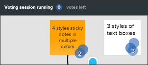 The voting feature of Mural.ly is designed to mimic the practice of dot voting on physical sticky note ideas. When you open Mural.ly’s voting tool, the application first prompts you to decide how many votes each of your collaborators should receive. Once you begin voting, Mural.ly displays an overlay that explains to each user how to add and subtract votes, and gives each person the option to vote privately. Once you have started to vote, a message at the top of the workspace gives you feedback on how many votes you have left.
As you vote by clicking on each idea or element you feel is worthy, Mural.ly displays how many votes they have received. At the end of your voting session, it displays an overlay that groups ideas based upon how many votes they received, displayed in horizontal rows – very helpful if you have a densely-packed canvas with numerous ideas!
I love the way the developers of Mural.ly have implemented voting. It’s very easy and intuitive, even for anyone who hasn’t previously used this application. Plus, it provides simple but useful instructions and feedback in all the important places.
Sharing your ideas
When you’re done developing, organizing and evaluating your ideas within Mural.ly you can share them in a number of ways:
- Presentation view toggles a full-screen view of your ideas, ideal for presenting your ideas to others within your organization
- Share your mural with others via a link or e-mail. Three tabs give you the option to share an editable version of it, a view-only version or embed it into a web page.
- Download your mural as an image (delivered in PNG format via an e-mail link)
- Download your mural as an HTML file
Conclusion
 Mural.ly is an ideal canvas for capturing, improving and manipulating your ideas. It becomes even more compelling when you brainstorm with other people in its shared environment. You can easily build upon each other’s ideas, share comments and do much more.
Its simplicity means that you and your team members can get started with it almost immediately. It is so intuitive that it has almost no learning curve. In today’s busy, disjointed business environment, that’s a big plus.
A solo account costs $96 a year (equivalent to $8 a month, but a monthly payment option isn’t available – clearly, Mural.ly is pushing users toward team use). A starter package, which includes 3 users, will run you $29 a month; garage, which includes 7 users, is $99 a month; studio, with 15 users, is $299 a month; and the business package, which includes priority support and up to 50 users, is $1,099 a month.
Considering all that Mural.ly can do and the ease with which teams can leverage it, I think it’s an excellent investment.

Leave a Reply