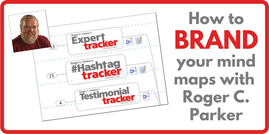
In recent years, blogger, book author and avid mind mapper Roger C. Parker has developed a strong, professional-looking brand for his mind maps. They are instantly recognizable anywhere, with their stunning typography and their consistent red and dark gray color scheme.
I’m so impressed by what Roger has accomplished in branding his mind maps that I recently interviewed to learn how he developed their distinctive look and feel, so we can learn from his approach and adapt it to our needs.
Chuck Frey: What made you decide to start using this style of central topics in your mind maps?
Roger C. Parker: I wanted to create a consistent image, or brand, for my mind maps, one that reflected the www.rogercparker.com website that I was developing at the time.
My goal was a fresh, clean look, one that was a clear departure from the colors that I have been using on my www.publishedandprofitable.com website for several years. It was time for a change. Especially since my Published & Profitable colors didn’t always work well when used on mind maps. The gold, for example, washes out when used at small sizes, and doesn’t work well as a background fill for topics containing reversed text.
Chuck: How did you decide on the gray and red color scheme?
Roger: I’ve always liked it, ever since I discovered it. The color scheme is a variation on the three colors that designer Roger Black recommended as the most powerful combination of colors: black, white, and red. (Roger Black is responsible for the design of magazines like Rolling Stone, etc.).
I’m always amazed by the huge difference between gray and black. Black text or connecting lines can appear harsh, or “in your face.” But, shades of gray are softer; they’re just as easy to read, but they have a restraint that I think projects a professional look.
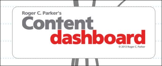
Another branding touch: notice the alignment of the “t” in “Content” in the first line with the “d” in the second line. In addition, the right hand stroke, or “leg” of the “n” in “content” aligns with the “h” in “dashboard” in the second line. Also, throughout the brand, the second line is indented and the first letter of the first word in the second line is set in lower case. This permits tighter line spacing, converting the center topics words to become a icon to be recognized, rather than words to be read.
By the way, as you can see from the Content Dashboard sample viewed by itself, there’s more to the center brand than just the colors. I used a white fill, to help differentiate the center topic from the map’s background (Mindjet’s Paper 2 option).
Chuck: What are the advantages of including your identity in the central topic, rather than create a brand block as a floating topic or make it part of the map background – basically somewhere in the “white space?”
Roger: When revisiting my Content Marketing Dashboard topics on Mindjet’s blog, I wanted to brand the central topics because, when mind maps are used online, you often don’t have control over how they are cropped, or how they’ll show up when viewed on mobile devices.
My goal was to immediately communicate both the map topic as well as the fact it was part of a “Roger series” of mind maps. When you see several mind maps together at once, such as when you search for my recent content dashboard maps on the Mindjet blog, you can see that each onevclearly indicates its purpose while reflecting a strong “family look.”
Chuck: Is this an image created separately and then pulled into the mind map?
Roger: Correct. The central topics are created in Adobe Photoshop, which allows fine-tuning letter spacing and line spacing, then saved as .jpg graphics.
Chuck: What’s the ideal size for graphics to be used with MindManager?
Roger: Chuck, I was afraid you’d ask. That’s one of the issues I constantly struggle with. Because some of the titles are significantly wider than others, I haven’t yet identified a “perfect size” for the graphics. Instead, I manually resize the graphics until they look proportional to the mind map.
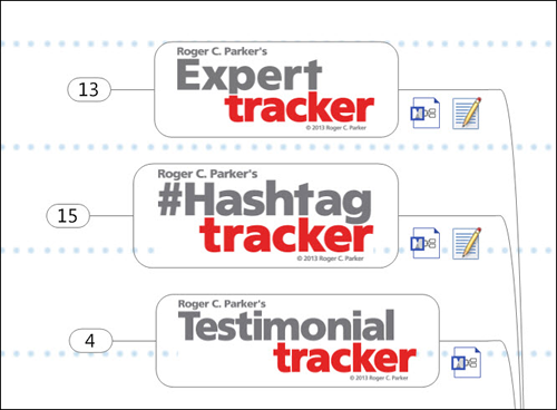
As you can see from Figure 2 (above), there is a great variation in the length of the words used in the titles of the various center topics. There is also a difference in the depth of the second line indent depending on the location of the letters that contain elements that can be aligned.
Mind mapping is an ongoing process of refinement and incremental improvement. As I move forward, improving existing mind maps, I plan to spend more time carefully editing the map titles, so there is less of a jump between shortest titles, i.e., “File Finder,” and longer titles like “Table of Contents Planner.” However, as Figure 2 shows, the end result is a consistent image with some visually-pleasing variations to set the topics apart.
Chuck: I noticed you also include your name in the central topic so the reader gets a sense of ownership, of who created this mind map. How important is that?
Roger: It’s a bit of an indulgence, a desire to “brand” my mind maps, but I feel it’s appropriate given the time I spend creating them and accompanying articles. Down the road, I might feel different.
Chuck: Do you also usually include a copyright?
Roger: Yes, recent content dashboard mind maps have included the copyright, although the purpose is to encourage everyone to download and use them.
Chuck: What else do you include in the central topic? I noticed some numbers in one of your maps, and a date updated on another one. For example, your Idea Tracker map has the numbers “14 05 20 Topic Tracker” at the bottom.
Roger: You bring up a great issue, Chuck. As you, and your readers know, by default, the center topic text becomes the filename the map is saved under—unless you specify a different filename.
A couple of times, before I started inserting explanatory text below the central graphic, some problems showed up. In some cases, the map graphic didn’t show up on mobile devices, so the purpose of the mind map was not obvious. In other cases, the map was either not saved, or was saved without a title.
To eliminate possible problems, I insert the map title and map creation date—or the date I have last updated the map–in small (8 point) text under the graphic. This has worked very well.
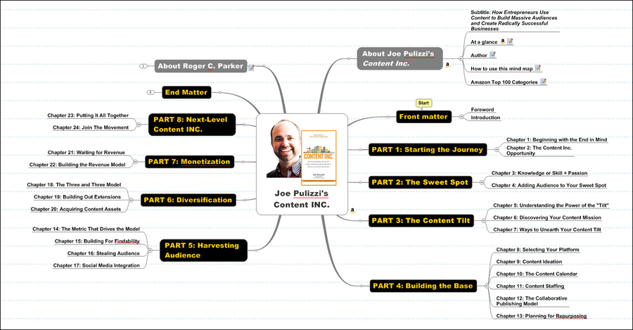
Chuck: I also see you’ve been doing mind maps of some relevant visual marketing books lately. In those maps, you let the book cover be the central topic, and then you include an “about Roger C. Parker” topic – always in gray.
Roger: You’re referring to my new series of mind maps showing the contents of important books I share on Biggerplate.com. I’m in the process of creating several categories of “Top Books,” i.e., Top Content Marketing Books, Top Productivity Books and Top Presentation Books.
In the case of these maps, the central topics contain just the book cover, so the cover will stand out surrounded by white space.
As you mentioned, my latest mind maps use both gray and black fills for the background of the first level of topics:
- Two topics with gray fills appear at the top of the map, one to the left and one to the right of the central topic. The gray topic to the right contains the book title and complete subtitle, and has quick reference links to the author’s background and other publication information. The gray to the left provides background information about me.
- Topics with reversed text against a black fill are used for the major sections, or parts, of a book. The reason for the black fill is to draw the viewer’s attention to the often-overlooked importance of breaking complex “how to” and “personal growth” topics into manageable chunks of information. A book with 10 chapters seems like a lot of work to read; a book with 3 parts, each containing just 2, 3, or 4 chapters, somehow appears easier to read.
As you’ve probably noticed, Chuck, there’s been a subtle change over the years in the center topic. I now create a center topic composite graphic combining the author’s photograph along with the title of the book. Originally, I only showed the book’s cover. It takes a little time to combine and resize the two graphics, but I feel the result greatly personalizes the mind maps.
In addition, for subtle visual interest, and when appropriate, I pick-up the primary color used in the book cover and use it for either the connecting lines map’s connecting lines, or the reversed text used for the various sections, or parts, of each book.
Chuck: Why are you posting these mind maps on Biggerplate.com?
Roger: There are several reasons:
- Helping authors. By showing the relationship between chapters of a book and the parts or sections that contain them, I want to encourage nonfiction authors to “containerize” their contents into a few key sections. The majority of bestselling nonfiction (or “service”) books use this technique, but it doesn’t receive the attention it should.
- Helping readers. Equally, I want to help readers get in the habit of adding notes and ideas to mind maps of the books they’re reading, while they’re reading them, instead of underlining or using a highlighter to emphasize key ideas. The act of summarizing ideas in a mind map is far better way to remember ideas than simply underlining. (Adding notes to mind maps also works better with ebooks and is a better choice for library books!)
- Also, I encourage my authors to not only analyze the contents of competing books in their field, but also use Amazon.com to locate competing books that they may not be aware of. This includes tracking titles often purchased with the title, similar books, and books that are purchased after visiting this page.
- The “About” topic also enables tracking details, such as the sales rank and the Amazon categories where the books are cataloged for print and Kindle e-book distribution. Also, by tracking who published each book, and the year the book appeared, it’s possible to identify potential publishers interested in books similar to the one you want to write. Finally, paying attention to the book’s price, number of pages, and physical size can help you identify a format that will help you differentiate your book from the competition.
- There is also a wealth of information to be gained from analyzing the number and contents of the Reader Reviews associated with each title. Reader Reviews may identify missing information that readers wish had been included in the books, as well as topics already covered in existing books.
Finally, sharing is good karma; it benefits everyone. Just like the time you give a couple of quarters to someone looking for change to put in a parking meter, at some time in the future, you’ll be in a position when someone “passes it forward” and give you a couple of quarters. There’s also the knowledge that I gain while preparing the mind maps and analyzing books in the context of their competition. Plus, as a mind mapping evangelist for over ten years, it gives me genuine pleasure to inspire others, just as I’m inspired by the stories of how other users leverage its powers for efficiency and greater productivity.
Chuck: Do you have any other tips for branding mind maps – especially with one’s personal brand?
Roger: I encourage everyone to explore mind mapping from the point of view of experimenting and constant improvement. Look for ways to use the tools of graphic design to improve the communicating power of your maps and, simultaneously, set your mind maps apart from the competition.
There’s a world of design power built into today’s mind mapping software, when you consider border options, fonts, colors, imported graphics, lines, topic fills, outlines, and shapes, and background images.
In the long run, the most important thing you can do is to come up with a recognizable “look” that you can consistently use to brand your mind maps and set your maps apart. Sometimes, this will require working with a professional designer to create a “look” that you can replicate on your own.
The key, of course, is to create branded templates for the various categories of mind maps you create for yourself and your clients. The time you spend creating the templates will be repaid in the future, by eliminating the need to make time-consuming design decisions in the future, making it easy to consistently project the right image.
Chuck: Anything else you’d like to add, Roger?
Roger: Only this, Chuck: I’ve been meaning to compliment you on the “new look” of your mind maps during the past 6 to 8 months. To me, it seems your latest maps are simpler, brighter, and fresher than ever before. At a glance, they project a feeling of optimism and professionalism. I should be interviewing you about the steps you have taken to bring your Mind Mapping Software Blog to a new level of clarity and freshness!


Leave a Reply