PowerPoint, Microsoft’s ubiquitous presentation software, had an absolute lock on the world of computer-based slide decks for many years. But one developer, Visme, is out to reinvent the process of creating, sharing and managing your thoughts visually.
I recently received a briefing from Visme founder Payman Taei, and I’m quite impressed with his new approach to this common business application. Here’s what you need to know about the Brave New World of presentations, according to Visme.
How Visme is bringing presentations into the 21st century
Slide templates designed for real-world information: Templates in PowerPoint are incredibly basic – and, in most cases, not very useful. Visme provides 21 templates that address common types of business information that executives typically include in their decks, such as:
- Timeline
- Agenda
- Charts and graphs
- Diagrams
- Testimonials
- Product comparisons
- Steps/process
- Testimonials
This intelligent approach to templates helps you get over “blank slide syndrome” and get on with preparing an effective slide deck that clearly communicates key information – visually.
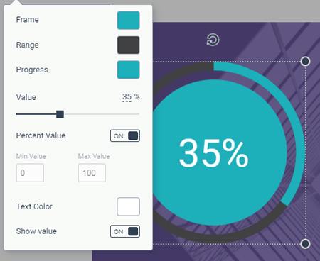
 Interactive data widgets: During the last several years, the Visme development team has been adding interactive widgets to its toolkit. This enables you to include charts, graphs and other visuals in your slides that are based on underlying data.
Team use workflow: One of the biggest problems with PowerPoint is that anyone can create anything. Brand logos, names and other defining elements that are associated with organizations routinely get trampled by well-meaning but not very talented slide creators. What’s needed is a workflow that enables one person to create the organization’s key visual assets, and then governance to ensure they get used properly and consistently.
I’m happy to report that Visme has nailed both of these needs.If you have a designer in house, that person can create the highest quality content and set brand guidelines. He or she can also shut off the custom content creation options within Visme.
Users see only the content that’s shared with them; in other words, finished files.
You can insert slides in a presentation that are not editable by users – that can be really important for certain companies! In other words, you can create a presentation that enables salespeople to customize some slides but not others.
When you update one instance of a slide, all other instances are updated, so you don’t have to worry about versioning problems. Very cool!
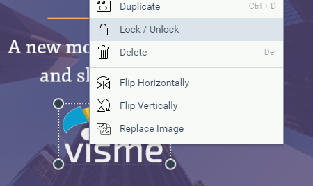
 You can even lock certain objects within slides, such as the logo, so they’re visible but not editable.
You can also create a deck of slides and make it available for users to drop individual slides from it into other presentations. That’s ideal for salespeople, because you can maintain control over the core messages you’re trying to communicate and your brand image, while still giving them some freedom to create their own additional brand-compliant slides.
Animation: Visme offers some rudimentary animation controls that provide limited options for making objects slide in, fade in and pop up in your slides.
Publishing your Visme deck: Before I learned what it can really do, I assumed Visme was a platform for creating slides that would be exported to PowerPoint for presentation. It’s not! You create and present them directly FROM Visme.
Visme gives you several options to share your presentations:
- Share privately,
- Publish to the web, or
- Drop into a web page or blog post using an embed code.
You can also download your presentations offline as a PDF document, a series of PNG images or an interactive HTML 5 format (which doesn’t require a web connection in order to play the slides). The download can be used as a worst-case scenario if an Internet connection is not available where you are presenting.
Proof of concept: my first Visme presentation
When it comes to writing about a tool like Visme, the medium is the message, isn’t it? I couldn’t just tell you about all of its great features for creating presentations without actually making one myself. Here is what I put together documenting its most notable presentation features
(tap the image to advance the slides or hover over the bottom of the image to display the slide controls):
Made with Visme Presentation Maker
The slides were easy to create and tweak. I particularly appreciate the attention that the developers have given to the user interface of Visme. Most of the resources I wanted to use were easy to find and behaved logically. The one exception was that I started creating this presentation using a legacy template, which means I didn’t have access to the collection of templates I described in this review. However, Visme technical support quickly provided me with a workaround. I appreciated their fast response and clear instructions!
Conclusion
Unless you are wedded to using PowerPoint in your organization, you really ought to yourself to give the presentation capabilities of visit me a look. No one has the luxury of having an unlimited amount of time to create a PowerPoint deck. Why waste your time creating slides from scratch when you can utilize the practical templates and reusable resources that visit me has designed an arranged to make the process so much more efficient?

Leave a Reply