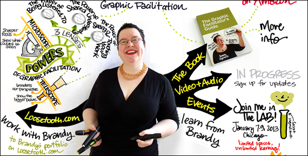
If you want to create visuals that communicate clearly, then you must use elements such as lines, shapes and colors consistently, warns Brandy Agerbeck in her excellent book, The Graphic Facilitator’s Guide: How to Use Your Listening, Thinking and Drawing Skills to Make Meaning. While she is talking about an important principle of graphic facilitation – recording the important points of a meeting on large sheets of paper with colored markers – the same principle applies to mind maps.
Based on many years of experience facilitating hundreds of groups, Agerbeck strongly believes that people who view your visual diagrams or drawings are distracted by inconsistencies. “Be consistent in your choices. People pick up on inconsistencies and wonder why the exception was made.”
In the case of graphical facilitation, examples of inconsistency could be making some words larger than others – which naturally implies they are more important – or if you write some words in red instead of black, that also implies that the red words – the exceptions – command more attention than the rest of your drawing.
The equivalent in our world is a mind map where all but one of the first-level topics is black, and the other one is green. Naturally, our eyes are drawn to what is different. It’s how we as human beings process information – we filter or ignore a lot of background “noise” and focus upon the exceptions.
If your intention was to convey that the green topic is the most important one in the mind map, the one you really want your readers to focus upon, then that’s great. The problem comes in when you’re just randomly coloring first-level topics, only to make your map more interesting. You may be inadvertently conveying something that you didn’t intend to do.
I find it interesting that Agerbeck doesn’t just consider visual inconsistency to be annoying – something that people in a meeting can deal with. She comes right out and says that it’s downright distracting, and implies that if people are focused upon what’s different about your visuals, then they probably aren’t fully engaged in the meeting or what you’re trying to communicate to them. In other words, it actually hinders communication.
There’s another reason why consistency and clarity is critically important when you’re creating mind maps. Unlike graphical facilitation, where you’re recording a group’s output and making meaning in real time, in many cases you’re creating a mind map in isolation and then sharing it with others with whom you may not be face to face. That means they don’t have the context that you did at the time you created the map.
In other words, YOU know what you meant when you structured your mind map and its contents the way you did, but they may not understand what you’re trying to communicate. That means it’s very important that you review your mind maps before you share them from the point of view of their intended audience. Ask yourself: “What if I was them? Would I ‘get’ this?” If the answer is “no,” then you have more work to do!
Keep these important communication issues in mind the next time you’re creating a mind map to capture the ideas of a group at work, or any time you’re sharing the output of your visual thinking with others.

Leave a Reply