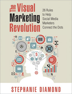
 Incorporating visual communication techniques in your marketing and social media efforts can significantly increase their effectiveness. So says Stephanie Diamond in her excellent book, The Visual Marketing Revolution: 26 Rules to Help Social Media Marketers Connect the Dots. In it, she shares four valuable tips for crafting high-impact visual communications.
Use a visual structure for effective storytelling
“Along with our unending thirst for visuals, our brains are hard-wired to pay attention to and enjoy stories. If you can turn raw business information into visual story form, you are helping your message be heard… Stories engage both sides of our brain, mixing information with emotion.”
What kinds of stories can you tell in your business communication? Diamond shares 4 examples:Stories customers tell (the traditional problem/solution/result customer case history)
- Stories about the company (which bring to life its vision and values, not self-serving hype)
- Stories about the industry and the people and current topics in it
- Stories from inspirational leaders and mentors
For best results, Diamond explains, business story telling needs to follow a traditional hero’s journey or story arc that paints a vivid picture of a customer’s situation, before and after. When it’s done effectively, readers get “swept up” into the story and identify with the challenges the protagonist faces, and the satisfaction of the resolution at the end of the story.
“The key to a good story is to take the protagonist through a ‘trial by fire’ and have her come out the other side a changed individual. The journey of that trip is the story. The problem with ineffective business stories is that companies create stories where nothing transpires and no one is different at the end.”
In this context, visuals are mainly an internal communication tool, used to capture the flow of the story in a structured way. Diamond outlines 5 steps that are common to each narrative:
- The protagonist’s current reality,
- The conflict the protagonist faced,
- Their struggle he or she must wrestle with,
- The resolution of it, and
- The new reality or successful outcome he or she now experiences
The underlying message of this part of The Visual Marketing Revolution is to use a story structure to give your story the best chance at succeeding with an audience.
Tie your ideas in with things your customer is already familiar with
“As you struggle to make your thinking visual, you should be aware that your audience is seeking to find patterns and make associations with things it already knows. If you think about showing visuals from that perspective, you can help your audience make connections more quickly.”
This is where visual metaphors can come in very handy. Metaphors, by definition, explain something new in terms of something we already understand. When the automobile was first introduced at the beginning of the 20th century, it was referred to as the “horseless carriage.” When you have trouble getting coworkers or children to move in the same direction, we talk about
“herding cats” – which places an image in our minds of the futility of that action. Or when you have many problems cropping up at work, you may describe that as “fire fighting.”
Here are two examples of visual metaphors used in business communications:
First, let’s say you’re selling an executive coaching course. You could use an image of an iceberg, with 80% of its mass submerged, to communicate how your prospective customers are currently only realizing a fraction of their potential. The part of the iceberg above the surface symbolizes what they are now visibly manifesting to the world, while the submerged part represents the person’s future potential, if they adopt the strategies you will teach them.
Example number two: One LinkedIn strategist shares updates on LinkedIn and Google+ using an image of the social media channel’s logo with orange and yellow flames coming out of the left side. The visual impression is that this expert’s strategies will help you to “supercharge” your performance with LinkedIn. It’s eye-catching and meaningful, because it makes you think of a fast sports car with similar flames on its sides.
Simplify your visual diagrams
“Don’t expect someone to look at a complicated visual and understand it immediately. Too much visual information at once causes a person to look away. They need time to process it, literally. That means the best marketing visual is one which has limited information and can be understood with a quick glance. Think about eliminating unnecessary elements whenever possible.”
This touches on a principle that I’ve talked about for some time to my Mind Mapping Insider members: When you’re the author of a mind map, you can’t assume that everyone else who looks at it will understand what you meant by the topics and their arrangement. That’s because you have the context in your mind for every element of it. But other people viewing it do not. They may interpret what you created in different ways than you intended. Or, worst of all, your mind map may just confuse the hell out of them – in which case they will simply give up and will probably dismiss any future efforts to share information with them visually.
When in doubt, simplify and clarify. This forces you to switch from your perspective to that of the people whom you’re trying to communicate with or influence. How would they view your mind map’s or visual diagram’s contents, based upon their knowledge and ways of looking at the topic at hand? What may be unclear? Can it be clarified? What is confusing? What is extraneous and can be eliminated? These and other similar questions will help you to increase the odds that your audience will understand the meaning of your visual communications.
Rethink the idea of a visual map
If you’ve been mind mapping for any length of time, then you probably view visual maps as tools to arrange a hierarchy of information. But according to Diamond, they are also useful in the ways that physical maps are – helping people get from one place to another that is unfamiliar to us. Only in the  context of communication and persuasion, you can use visual communication to help move people from one IDEA to another.
Think in terms of a simple process flow or a visual that emphasizes the customer’s “before” and “after” states. Help them visualize where they are now, and where you want them to move to. By creatively using images and words together, you will be more successful in getting your audiences to take the actions you desire.
A treasure trove of visual marketing advice
If you haven’t picked up The Visual Marketing Revolution yet, I strongly recommend that you do so. It’s the best visual thinking book of 2013, in my opinion. This is one of those volumes you’re going to want to keep close at hand, because you will refer to it again and again as you build visual elements into your marketing campaigns and customer interactions.

Leave a Reply