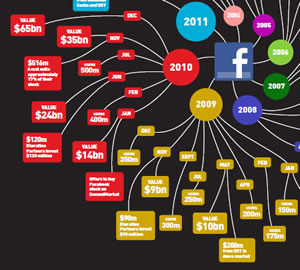
 From time to time I come across mind maps that expand my understanding of how they can be used. A case in point is this Facebook history mind map produced by Mindjet. It traces the history of this wildly popular social networking site from its beginnings in 2004 until its present state. It utilizes a combination of color and shapes to group items visually. This format is very effective and makes it easy to view this information in a clockwise pattern (click on the image to view a larger version).
Part of what makes this mind map format work is the progression of colors which seem to follow naturally one to the other; the strong contrast of adjacent branches makes it easy to see which topics belong to which year.
All isn’t perfect about this visual representation, however. First, it’s hard to know where to look at first because this mind map is so busy visually. It takes a moment to figure out what you’re looking at and what it means.
In addition, because the valuations of Facebook for each year are located on separate sub-branches, it’s hard to compare the valuations from one year to the next. If you want to show growth, the usual way you do that visually is via a line or bar chart – which enables you to get a sense of the direction and rate of growth. You can’t discern that from looking at this mind map.
But I do like the idea of a chronologically-oriented mind map. Accordingly, I spent some time brainstorming how you could put this concept to use. Here are two examples:
A yearly planner with major topics for the 12 months of the year:
A weekly planner with seven major topics one for each day of the week:
What do you think? How could you utilize a chronologically-focused mind map in your work and life?


Leave a Reply