#1 in the Effective Mind Maps blog post series
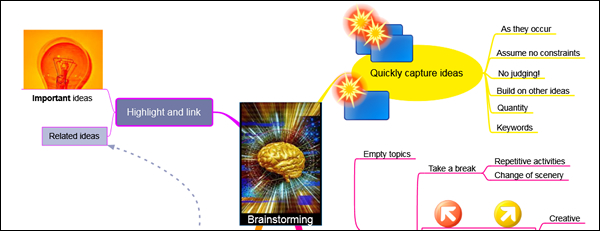
Images add visual interest to your mind maps. They can be utilized as the central topic of your map, or attached to other topics, and add a wealth of meaning and context to your maps.
According to mind mapping expert Tony Buzan, adding images to mind maps has numerous benefits:
They help to focus the brain, which prefers colorful objects to black-and-white ones.
They leverage your brain’s powerful associative capabilities. Images tap into our imagination at a much deeper level than words alone can.
Words and images together multiply your intellectual power. It’s the combination of the two that make mind maps such a rich visual medium for creative expression.
Images are an excellent memory aid. Simply put, they tend to be more memorable to your brain than words do – as the old saying goes, “a picture is worth a thousand words.” Buzan has this to say on the benefits of incorporating images into your mind maps:
“They make use of a massive range of cortical skills: color, form, line, dimension, texture, visual rhythm and especially imagination – a word taken from the Latin imaginari, literally meaning to picture mentally. Images are therefore more evocative than words, more precise and potent in triggering a wide range of associations and thereby enhancing creative thinking and memory.”
Sources of images
Where can you find images to use in your maps? My favorite source is iStockPhoto.com – a collection of over 3.2 million low-cost, high-quality, royalty-free images and illustrations. I use their pay-as-you go credit system; points can be purchased in bundles from 10 to 1,500. I pay approximately US1.60 per credit, which works out to about US$10 each for some truly outstanding images – an excellent investment, in my opinion. What makes it really useful is that it contains numerous images that can be used to visually describe not just things, but concepts – such as creativity and success – and a wide variety of illustrations and line art that fit nicely into software-produced mind maps.
Flickr is a huge collection of images that may be of some use to your mind maps. But be sure to limit your search to images that have been approved for commercial use under Creative Commons.
Google Images is a free and nearly inexhaustible source of images, but be careful using them. Some of them may have copyrights or royalty fees associated with them.
How to use images in your mind maps
Some programs enable you to turn an image into your mind map’s central topic – which can be quite striking visually. Be sure to select an image that’s not too visually “busy” or the text you layer over it could be hard to read.
Use an image editing program to manipulate your image prior to importing it into your mind map. Some ideas include treating it with Instagram-like effects (posterization, torn edges, sepia color cast, etc.), rotating it slightly (15-20 degrees) to add visual interest, masking it to give it an oval shape or a rectangle with rounded corners or adding a drop shadow to it. In this video, my good friend Matthew Tanguay explains how to add some simple visual effects to an image using PowerPoint’s image editing tools – a quick and easy solution using a program you probably already have on your computer!
When adding images to topics in your mind maps, learn what your program is capable of. Some programs, such as NovaMind, enable you to place images above, below, to the right or left of the topic text, and to size the image. I urge you to play around with the images you import until you’re satisfied with the way they look. As a supporting visual element, an image should not dominate the topic to which it refers.
Using color in your mind maps
Like images, color adds meaning and context to your mind maps. Most mind mapping programs enable you to change the colors of topic backgrounds, topic text, branch lines and map background. These settings allow you to personalize your map, and make it more colorful and appealing to yourself and others. A few programs come with color “themes,” which can be used to apply a complementary group of colors to specific elements of your maps. This can be real time-saver compared to adding color to each element of your map individually!
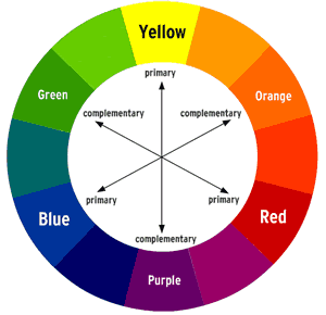
 If you’re going to pick your own colors for the elements of your mind map, I recommend that you learn about color theory – specifically, how to use a color wheel to pick complementary and contrasting colors. This article on the Color Matters website is an excellent layman’s tutorial on this subject.
Keep in mind that colors can be used to “code” the content of your mind maps. Colors have meaning. For example, action items can be colored green, while concerns or problems could be colored red. The meanings of these colors are deeply embedded in the minds of most Western cultures (just think of a traffic light, where red means stop, yellow means caution and green means go).
Also keep in mind that you may want to adopt your organization’s corporate colors when creating mind maps, or incorporate a logo as a floating image to help brand your mind maps.
A caution about using color and images in mind maps
You should definitely incorporate color and images into all of your maps, to make them more visually engaging. But be careful not to overdo it. It’s easy to get carried away with these elements, which may waste your time without adding any more value to your maps. Ideally, your use of color and images ought to reinforce the meaning of your map; if an image or color doesn’t add to the message that your map is trying to convey, then you may want to consider eliminating it.

Leave a Reply