Want to show a sense of purpose or direction in your mind maps? Then consider creating a “compass map” diagram like this one, inspired by a new nutritional information program launched by global food giant Nestlé.
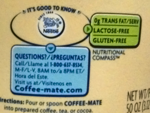
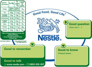
 Inspiration for visual diagrams sometimes comes from the most random places. In the case of this compass map, the kitchenette at my full-time job has a large plastic container of coffee creamer sitting on the counter. Near the bottom of it, in the area where the nutritional information would normally be displayed, was this intriguing “Nutritional Compass.” So I googled this term, and quickly discovered that it’s a new informational tool that Nestlé has developed to give consumers more detailed information about the foods they’re buying – in an engaging visual format.
 As Nestlé explains on its Nutritional Compass web page, “The compass has always been treated as an essential navigation tool. It helps you know where you stand, decide where you want to go and find your way ahead.” By connecting the traditional table of nutritional information with more specific details on the food’s nutritional benefits and a tip on how to make healthier choices, Nestlé says the Nutritional Compass makes it easier for consumers to make more informed choices about the foods that families eat.
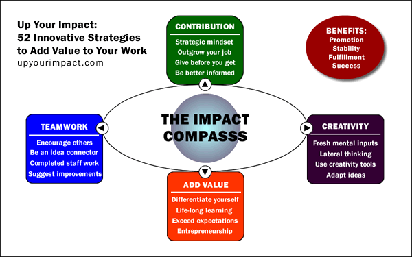
I was so intrigued by this visual concept that I created my own using a series of simple shapes (circles, an oval and rounded rectangles) using Adobe Fireworks, a program that is designed to produce professional-looking web graphics, to promote my new book, Up Your Impact: 52 Innovative Strategies to Add Value to Your Work (above). I call it the Impact Compass. You can recreate it in almost any vector drawing program or app.
Using the directional metaphor of the compass, he’s how I think It makes sense to use it to visually summarize the main themes of my book:
- The bottom of the compass, south by direction, is where I have placed the concept of adding value to your work – differentiating yourself from your peers. This principle forms the foundation for the rest of the book. If you are just like all of your peers, why would senior management have any reason to pay attention to you?
- The left and right sides of the compass (east and west) are where I have placed two complementary concepts, which support and reinforce each other: creativity and collaboration. Cereativity helps us to add value to our work by contributing ideas that will help to grow the business. At the same time, we need our team mates to support, improve and implement our best ideas. We can’t do it alone. We need their buy-in and active support for them.
- The top off the compass (true north) is where I have placed the concept of contribution, which is that the other three principles enable us to accomplish. If we’re contributing to our employer or the people it is our privilege to serve at a higher level, then it follows that we will be more successful. Higher compensation should follow suit, along with opportunities for cooler projects, more recognition and respect, and potentially new job opportunities.
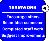
 Note how I have expanded each of the four topics to include a major heading and several words that help the reader to understand what the book covers within each of these topics (see example at right).
How do you think you could use the compass metaphor in your work?
I recently launched a Kindle version of Up Your Impact. Click here to learn more about it on the Amazon.com website.


Leave a Reply