Droptask is a new web-based visual task management application that aims to help individuals and small teams to manage tasks and projects more effectively. However, in its current early beta stage, it’s missing several essential features.
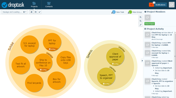
Droptask looks very impressive: You can easily create groups for your projects, events or teams – any logical gathering of tasks can be contained within a group. Groups appear as large circles within the application’s user interface. When you add tasks to a group, they appear as smaller circles within the larger group to which they are assigned. Tasks can have different properties, such as due dates, file attachments and the person to whom the task is assigned. Droptask also offers some small team collaboration capabilities. Team members can create and assign tasks to each other and can track the progress of other people’s tasks within their team.
All of this is rendered an interface that is so beautiful that websites like Lifehacker and CBS News have raved about it. But I think it’s a case of “pretty object syndrome.” In other words, these sites have been so enamored by Droptask’s good looks that they’ve overlooked the fact that its task management functionality isn’t quite as good as it needs to be. Keep in mind, however, that this is a beta application; its functionality could improve dramatically as its developers respond to the input of users.
I’ve always like to use mind maps for task management, because there is so much that you can do in terms of embellishing topics and tasks to visually differentiate them from each other. For example, you can change the color of topics, add icons or symbols and change the size and styling of topic text. Unfortunately, this is not the case with Droptask. All tasks that you enter into a group are the same size and the same color. You cannot adjust their size or appearance. That’s unfortunate, because the whole idea of displaying information visually is to utilize variables like size, color and styles to add meaning and context to it
Well-designed task management applications give you a high level of control over prioritizing tasks. Unfortunately, Droptask doesn’t. The only two choices are “important” and “urgent.” These appear as little slices sticking out from the side of a circular task. Ideally, this task management tool should provide some sort of A/B/C or 1/2/3 prioritization. It would also be nice if the most urgent tasks could be flagged in a more obvious way – say, with a bright color that makes them stand out on screen. Hopefully, this is something the developers will address before Droptask is officially released as a version 1.0 product. I can deal with the fact that all of the tasks at the same size. But I definitely need more granularity to the prioritization of tasks.
 Another thing that is a little bit unusual is that you can set due dates on tasks, but Droptask doesn’t seem to notify you of impending deadlines outside of the application. Perhaps that’s because you can sign up for this service with either a Google or Facebook account – which means that Droptask may not be capturing e-mail addresses for all of its users. There is a notifications button above the workspace that displays deadlines and other messages from Droptask. But it would be much more convenient if the application also sent out e-mail notifications, since most people won’t be “living” in Droptask 8 hours a day.
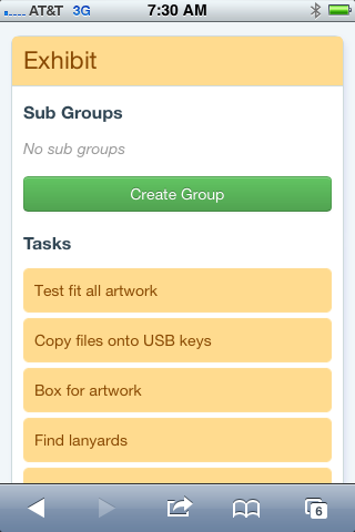
Droptask’s developers plan to release mobile apps that will integrate with the web application. Meanwhile, you can use your smartphone’s web browser to manage your tasks. Droptask auto-detects when you’re accessing its site with a mobile device, and displays a simplified version of the application (see the screenshot at right). This enables you to keep your to-do list and projects up to date, wherever you are – a big plus. I tried it with the Safari browser on my iPhone and it worked very well.
Conclusion
Like any beta software application, it’s hard to know exactly what functionality Droptext will have when it is officially launched. But what I’m seeing so far appears to be a little rough around the edges.


Leave a Reply