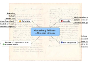
 Many mind mapping programs enable you to add a background image or pattern to your mind maps, to enhance their visual appeal and branding. But this functionality is among the hardest to use effectively, because a background can easily conflict with elements of the mind map itself – on the screen or in printed form.
By default, most mind mapping programs utilize a white background for the maps they produce. While this provides an excellent contrast for the map itself, it can get rather boring to look at visually. To add visual impact to your maps, you may want to consider adding a background image or pattern (click on the image above to view a PDF of the Gettysburg Address – as a mind map!). There are several reasons why you may want to do this:
- To help your mind map get your audience’s attention, especially if you’re making a presentation from your mind mapping program.
- To enforce consistent branding of the mind maps produced by your company. If you’re a consulting firm, for example, you may want to create a simple map background and incorporates a screened back logo. If you create a custom map template that incorporates this background, then each of the maps that your team produces will include it – ensuring that each one clearly communicates your firm’s brand to your clients and prospects.
Here are some tips on how to incorporate backgrounds into your mind maps:
Where can you find background images? Many mind mapping software programs ship with a selection of images that are specially designed for this purpose. In addition, you can utilize any image from your computer’s hard drive, or purchase inexpensive stock images from a website like iStockPhoto.com. Check your program’s help file for instructions on recommended sizes of images for map backgrounds, tiling (using your image as a background pattern) and other options.
Use a color gradient effect: If you want to keep it simple, consider adding a gradient of a solid color as your map background. This effect can add a whole new level of depth to an otherwise flat mind map.
Relevance to your map’s topic is always a good thing: Try to make the map’s background relevant to the content of the map. For example, if you created a mind map that summarized the content of a book you read, you could include a screened back photo of the cover in the map.
Branding your mind maps: If you want to add a corporate logo to your map background, I recommend positioning it in one of the four corners of the map, where it is least likely to interfere with any of your map’s content. You may need to experiment with image size and placement (in other words, placing your logo in one corner of a large white or colored rectangle) to get this to work right.
Tile effects: If you want to “tile” your logo in a repeating pattern as the background of your maps, I strongly recommend that you start with a black-and-white image of your corporate logo, and then use your favorite image editing program to screen it back 70 to 80%. This should convert it to a very light gray, something like a watermark. This is exactly the effect that you are going for. This will help to ensure that your logo is clearly visible, yet it shouldn’t interfere with the content of your mind map.
Test, test, test: Finally, if you plan to share such a map with others, I strongly recommend that you print it out both in black-and-white and color, so you can verify if there is enough contrast between the map background and the content of the map itself. You may discover that your background image or pattern conflicts with elements of your mind map when it is printed out in black-and-white, or that a solid background color may obscure the color of your map’s connector lines, topics or other elements.
If you have a creative technique that you have used to add background images to your mind maps, please share it in the comments area below. I’d love to hear from you!
If you found this post to be useful, why not subscribe to the RSS feed for The Mind Mapping Software Blog?

Leave a Reply