If you’re looking for a quick and easy way to spice up your PowerPoint presentations, why not give the popular cloud-based web graphics application Canva a try? Canva not only contains numerous ready-made design templates, but also a flexible, easy-to-use set of tools if you want to “roll your own.” Here are some tips on how to use it to create supporting images for your PowerPoint slides:
Select a large canvas size to start with. This will give you more flexibility in resizing your image once you import it into PowerPoint, without any loss in quality. I recommend 2500 to 3000 pixels per side. Canva does offer a presentation project type, but it’s only 1024 x 768 pixels in size and is intended for slide backgrounds.
 Have a clear idea what you’re trying to communicate before you start designing in Canva. Are you trying to show a process flow? Depict relationships between elements? Depict a hierarchy of information? Remember, Canva is just a tool. If you don’t have a clear idea what you want to accomplish, it can’t help you.
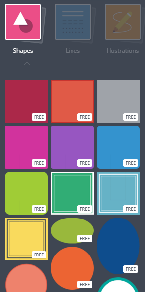
Begin with the shapes menu of Canva. It contains numerous simple and complex shapes that can be used to meet a variety of needs. You can also upload your own images or those that you found in icon or image directories online.
Text size: If your images will contain text, make sure it’s of sufficient size so that it will be readable once it’s imported into PowerPoint.
Use Canva’s alignment tools to make sure that your image elements are properly aligned horizontally and vertically. The way to do this is to pay careful attention as you are dragging one image near another. As it crosses alignment points, dotted horizontal and vertical lines appear. When you see them, your images are properly aligned.
Exporting your graphic design: When you export your image, use the high-quality PNG setting. PNGs hold up better than JPGs when resized.
Cropping may be required: When you import be PNG image into your PowerPoint slide, use the context sensitive format menu to crop the image to size, because it will probably have extra white space on the top and bottom. Otherwise, the white space of your imported graphic may obscure other elements on your slide.
Don’t overlook images. Don’t forget: you can use Canva’s image search option to find shapes, photo and illustrations that may meet your needs. Depending upon what you are trying to depict in your slide, you may be able to fashion an image that superimposes wording over the top of a photograph or illustration.
 Color matching: For best results, match the colors in your image with the colors of your brand. Canva lets you create custom colors based on RGB codes. To determine what the color codes are for your brand, either consult your organization’s branding guide or use a free eyedropper tool such as Instant Eyedropper for Windows or Digital Color Meter (a tool that is bundled into Mac OS X) to determine what the proper code is and then enter it into the custom color selector in Canva.
As a general rule, keep your designs simple. Remember, they will be projected onto a screen to an audience that may be paying limited attention to the visuals within it. Your graphic must be exceptionally clear, so it can be understood in a matter of seconds.
Use contrasting colors. Colors that are close in tone may blend together as the projector tries to interpret and display them properly.
 An ideal place to learn more about using Canva effectively: Finally, I recommend that you invest some time exploring the tutorials and resources in Canva’s Design School blog. You’ll learn so much about the workings of this powerful, flexible graphics tool that you’ll be glad you did!


Leave a Reply