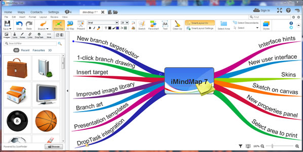
ThinkBuzan launched a new version of its flagship mind mapping program, iMindMap 7, earlier this week, with a new user interface, unique branch art designs, new editing and layout features, task integration with DropTask and a host of other improvements.
These expanded capabilities give users of iMindMap 7 more freedom than ever to express their ideas in the form of an organic-looking mind map. But in its drive to create a more flexible and intuitive workspace, developer ThinkBuzan may have diminished its usability somewhat, in my opinion.
The new user interface
The biggest change in iMindMap 7 is the user interface. The ribbon toolbar has been relocated above the drop-down menus. It now contains five tabs: Home, maps, contacts, settings and notifications. Next to them are tabs for your open mind maps. After I explored each of these tabs, I clicked on “home” to return to the main section of the ribbon toolbar. At least that’s what I assumed would happen, based on other programs I often use – such as the entire Microsoft Office Suite and other mind mapping software.
Instead, I was taken to the iMindMap start page to create a new mind map – not what I expected. I then realized I had to click on the tab of the open mind map next to the ribbon tabs in order to return to where I was before. Not exactly intuitive, in my opinion.
In previous versions of iMindMap, developer ThinkBuzan took a minimalist approach to the program’s main toolbar. It now contains numerous colorful buttons, making it look much more like other mind mapping programs. It contains many of the most frequently-used buttons for creating and editing your mind maps, and is well organized and easy to use.
The left side of the workspace now contains a tabbed set of panels that give you access to images, icons, notes, links, DropTask tasks, audio, snippets and project data. The tabbed toolbar also contains buttons that enable you to undock this panel or switch it to the right side of the screen.
Creating a mind map in iMindMap 7
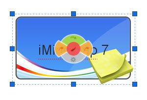 When you first open iMindMap 7, this mind mapping program asks you to select an image that will be the background for your central topic. So far, this is very similar to previous versions. Next, you need to give the central topic a name. But when you select the central topic, iMindMap’s branch target circle appears over the top of it. This makes it hard to read the wording of it.
In previous versions of iMindMap, this branch target has made it easy to quickly add different types of content to your mind maps. It’s an excellent usability enhancement. But I’m not sure that extending it to the central topic was a good decision.
You can add branches to your central topic in several ways. As always, you can position your mouse in the center of the target and drag the cursor outward, which “grows” a branch that follows the path of the cursor. You can also single click on the red circle in the center of the target. This makes it possible to add topics quickly, with a single click.
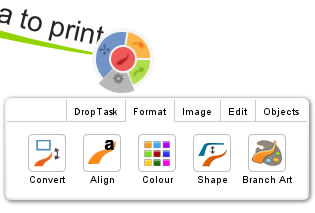 Editing the properties of a branch has been made easier in iMindMap 7. The branch target now contains a gray segment that, when you click it, causes a dialog box like the one at right to pop up over the currently-selected topic. This enables you to:
- Toggle it between a regular and a box branch
- Toggle the branch text between right, left and center alignment
- Change its color via a pop-up color palette
- Change its shape (this didn’t work in the beta version I used)
- Change the appearance of the branch itself via branch art (for example, you can make it look like a pencil, a road, an arm and lightning)
The pop-up window contains four other tabs, in addition to branch formatting: DropTask, image, edit and objects. DropTask enables you to integrate the tasks you’ve created in this web-based visual task management tool with your mind maps. The image tab gives you fast access to iMindMap’s drawing tools and image library, as well as a “file” button to import images from your computer. Edit gives you access to cut, copy and paste tools, while “objects” lets you quickly add notes, hypertext links and audio files to a map branch.
Why is this valuable? Any time you can enable users to get work done within the mind map, without having to repeatedly move the cursor back to the program’s toolbar, is a plus. Continuing to work within the map is almost always faster, especially for repeated tasks.
To move a topic, you must click and drag on the blue segment of the branch target. When you do so, the blue segment turns into a blue circle and you can position it as needed. Not exactly intuitive at first, but once you’ve got the hang of it, this method of moving topics works well. The way the segment transforms into a circle is excellent user feedback that you’re doing it right!
Insert target
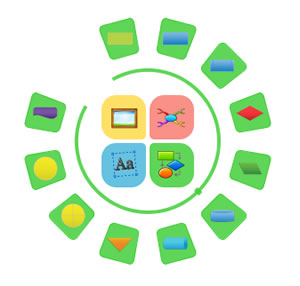 In the same way the branch target helps you add content to your mind map with having to use iMindMap 7’s toolbar, the new insert target does so for floating assets. When you double click in a blank area of the workspace, a set of four icons appears, which enable you to quickly add images, floating text, flowcharts and new maps. Clicking on one of these buttons displays another tier of buttons, arrayed in an arc next to it, like the screen shot at right.
To select one of these elements to add to your mind map, you can simply click it or drag and drop it. When you first start using the program, a help window pops up that demonstrates via a simple animation how to use the insert target. This is very helpful, but I think this new user interface element could also benefit from tool tips, which would appear on screen as you hover over a button.
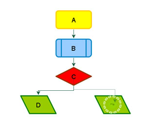 I added a simple flow chart to my mind map, and found the charting tools to be very easy to use. When a shape is selected, two little tabs stick out at the bottom of it that enable you to change its color and shape. While connecting one shape to another, iMindMap 7 provides you with ample visual feedback. When you hover over a shape, a green button appears in the middle of it with a dotted circle rotating around it. This lets you know the program is ready to add a connector line. You simply drag it to the shape to which you want to connect. As soon as your mouse hovers over the edge of the second shape, a similar rotating ring appears to let you know you’re in the right spot to drop the line (see screen shot at right, which depicts me joining shapes C and the green parallelogram E).
Sketching
The last several versions of iMindMap have given you the ability to add sketches to your mind map canvas, but they did so in a separate window. In this new version of ThinkBuzan’s mind mapping software, you are able to create them directly in the workspace. It provides a nice set of tools for creating common shapes, such a circles, rectangles and polygons, plus brushes, a paint can and more. The controls are simple and intuitive to use, and you can easily resize or drag the sketching region around the workspace, even while you’re creating a sketch- nice!
Presentation templates
Developer ThinkBuzan debuted a presentation builder in iMindMap 6. In version 7, it has added templates to help users create presentations even faster. Adding logos and backgrounds is now easier, too.
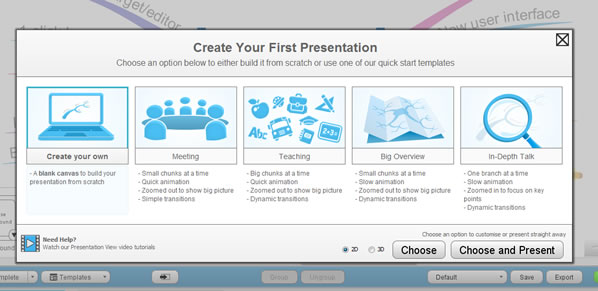
When you click on the “present” button in the program’s toolbar, a window pops up that asks you what kind of presentation you plan to create – a meeting, teaching, big overview or in-depth talk (like the screen shot above). Helpful instructions explain what you’ll get if you select each option. You can also build your own presentation. Keep in mind that in the parlance of iMindMap 7, a presentation “template” doesn’t mean a set of colors and styles – it has to do with how the program displays each topic, the type of transitions used between slides and the speed at which it does so.
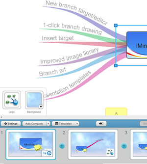 I selected “meeting,” and iMindMap 7 automatically created a set of slides where one branch appeared at a time in a slide-by-slide view, with quick transitions between them. I then used the new logo and background controls to add these elements to my slides (see screenshot at right). Logos appear in the lower right corner of each slide; you can’t move them around, and it’s up to you to select an image with a transparent background so you don’t get a white box around it when you add a background (which happened in the screen shot – see the logo in slide 2?).
I then switched to “in-depth talk” and re-ran my presentation. The program now displayed all of my map’s branches in every slide, but simply zoomed and repositioned the map to center on each topic in succession. But because each slide displayed all of the topics and the branches were right next to each other, the effect was like watching my mind map bounce around on screen. To my way of thinking, this would probably be somewhat disconcerting to people viewing a presentation given in this style.
Despite this minor nitpick, I like the way the presentation builder is designed. It’s easy to use and behaves intuitively.
Integration with DropTask
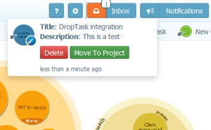 As you create mind maps in iMindMap 7, you can easily transfer tasks to DropTask, a visual, web-based tool for project and task tracking (click here to read my review of it).
To use this feature, you can either click on the gray segment of the branch target and the DropTask tab in the menu that pops up. The program also displays DropTask information for the current task in the tabbed panel at the side of the workspace. There, you can add a note to the task and send it to DropTask. When it arrives there, it appears in the application’s inbox (as shown in the screenshot at right). This gives you the option of assigning it to a specific project.
This is an interesting integration, but with a relatively small population of DropTask users in the world, I question its usefulness to the majority of iMindMap 7 users.
Conclusion
Visit the ThinkBuzan website to see what else is new about iMindMap 7, including selecting an area of your map to print, improved export to PowerPoint and Word, and printing of slides.
Overall, I’m impressed with the continuing advances ThinkBuzan has made with iMindMap 7. It gets more and more capable with each new version. But it’s getting to the point that it does so much, that usability is starting to suffer slightly.
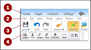 A case in point: The toolbars and menus. As you can see in the screen shot at right, within a small area you can see four menus stacked up. This is bound to be confusing for new users. I’ve been using iMindMap for years, and I’m not even sure what all of these commands do. It’s easy to get lost, especially when the “home” button doesn’t take you back to your map and the main toolbar, but to the iMindMap 7 start page.
And then there’s the branch and insert targets. Don’t get me wrong – they’re wonderful tools that help users get more work done faster. But as they get more complex, with more segments and buttons, new users may quickly become confused. Without tool tips or other “hints,” they must learn by trial and error what each one does – or RTFM (read the f**king manual). Once you understand what each one does, it’s a very productive way to build and enhance a map. But it just creates a learning curve that’s a little higher for new users.
You can learn more about iMindMap 7 on the ThinkBuzan website. A single licensed copy of iMindMap 7 Ultimate is US$245; a 7-day free trial is also available here.

Leave a Reply