ThinkBuzan has placed brainstorming front and center in iMindMap 8, the latest version of its popular mind mapping software program. It features an excellent new free-form ideation mode, improved Windows ribbon toolbar and branch target tool, as well as a redesigned presentation view that contains some great new capabilities.
In this review of iMindMap 8 Ultimate, we’ll take a closer look at the most relevant business-focused functionality of this new version, and I’ll give you my opinion on the program’s pros and cons.
A significant improvement in usability
When I reviewed iMindMap 7 a little over a year ago, I praised its many new features, but expressed some reservations about its overly-complex toolbars and contextual tools, which I thought could overwhelm first-time users. For version 8, ThinkBuzan has succeeded in fixing these issues and helping users get oriented and get down to the task of creating mind maps.
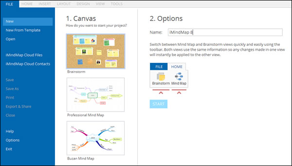
One case in point: When you first open iMindMap 8 Ultimate, you’re given three choices: Create a new session in brainstorming view, create a “professional” mind map or a Buzan mind map (see the screen shot below). What’s interesting to me is the distinction between the latter two map types. The thumbnail image of the professional mind map shows skinny, angular connector lines and rounded rectangle topic shapes, while the Buzan mind map has colorful tapered branches with words upon them – what we’ve come to expect from iMindMap. Apparently, it’s developers have recognized that business people tend to be very pragmatic, and want map designs that look more professional and less “creative.”
Brief on-screen instructions are clear and easy to understand, and should help new users understand the basic concepts of creating mind maps and brainstorming with iMindMap 8. Nicely done!
To give me a better sense of what changed from version 7 to 8, I opened up a map I created last year in iMindMap 7, and compared the two. The differences are striking! iMindMap 7 looks cluttered, with tabs and buttons everywhere – in the toolbar above the workspace (which has two sets of text menus above it) and in the properties panel on the left side of the workspace, which displays 6 tabs, with several more hidden from view.
By comparison, iMindMap 8’s user interface is simpler, more businesslike and efficiently designed. Its menus and options are all still available, but they are better presented in ways that don’t overwhelm the user. Kudos to ThinkBuzan on an excellent user interface!
Brainstorming view rocks
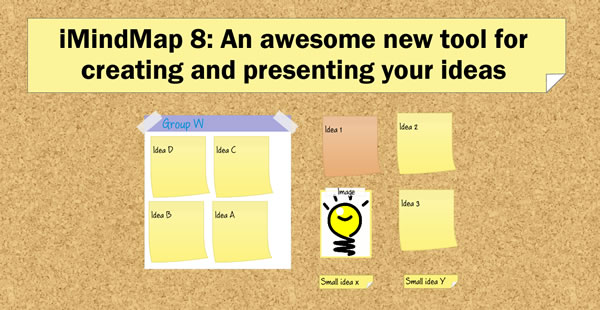
 iMindMap 8’s new brainstorming view (only available in the program’s Ultimate version) resembles a cork board; ideas and images can be placed on it and are styled to resemble Post-It notes. It’s a perfect representation of a brainstorming wall in your cubicle, office or in a meeting room.
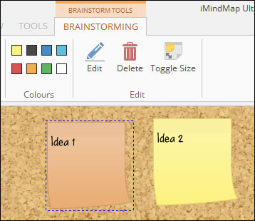
Using the program’s contextual brainstorming toolbar, you can easily add ideas, small ideas (think of half-sized sticky notes) and images to its canvas, and move them around at will. A playful-looking font gives you the impression of hand-written notes, adding to the authenticity of this creative thinking environment. Images appear as if they have been affixed to a sticky note at the top edge with a piece of transparent tape – a nice touch, in my opinion.
One key to capturing ideas in a program like this is the ability to do so quickly. That means keyboard-only input. I experimented a bit and determined that the INSERT key doesn’t work, but the spacebar creates a new idea in your brainstorming workspace. You can also create a new, regular-sized idea by double-clicking in a blank area of the workspace.
Adding a group to your brainstorm causes iMindMap 8 to add a white box to the corkboard surface. Like images, groups appear as if they were taped to the surface. Adding items to a group is as simple as dragging and dropping them into it. The box automatically resizes as you add more ideas to it.
This is an ideal setup, because it enables you to engage in free-form brainstorming, without regard to the structure of your ideas. You can then switch from ideation to evaluation, grouping your ideas in ways that make sense to you. In doing so, you’re creating a hierarchy that will drive how they are arranged when you switch to mind map view.
Another way to visually classify your ideas is by color; iMindMap 8 enables you to select from 8 colors for ideas. The virtual Post-It notes can also be toggled between full and half-size, if you need to squeeze more ideas into the space of your screen. In addition, you can drag with your mouse on a blank area of the workspace to access additional screen real estate, giving you almost unlimited room to capture your inspirations.
I played around with brainstorming mode while evaluating iMindMap 8, and was delighted with its functionality. I’m an avid student of brainstorming tools, technologies and techniques, and I’m not easily impressed. ThinkBuzan definitely got brainstorming mode right in iMindMap 8!
Simplified branch target aids new users
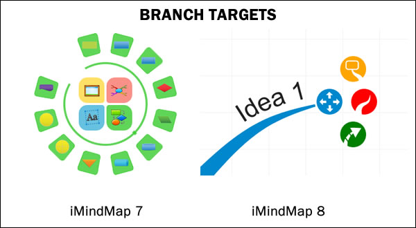
In iMindMap parlance, the branch target is a set of buttons that pop up as you hover over the end of a map branch. They enable you to complete common tasks without needing to move your cursor back to the ribbon toolbar each time. In version 7, the branch target was like a Swiss Army Knife, with a myriad of commands clustered into a two-tiered set of icons. In iMindMap 8, it has been considerably simplified to do four things:
- Adjust the branch’s shape
- Add a new subtopic
- Add a new box topic
- Add a relationship line
ThinkBuzan has wisely limited its functionality to one essential über-task: Adding content to your mind map. This should make iMindMap 8 much more intuitive to use, especially for first-time and occasional users.
Another simplification: In previous versions, when you selected a branch, control points were visible, which enabled you to reshape the branch. These are now turned off by default, but can be toggled on via a command in the layout menu. I think this is a wise decision; the average user will probably never used this feature. Advanced users, who want precise control over branch shapes, will appreciate that it’s still there and can be turned on as needed.
Presentation view gets a facelift
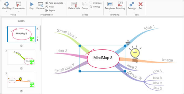
The presentation view of iMindMap has been significantly improved in version 8, and contains some very cool touches. You can auto-create a presentation with a single mouse click, or “roll your own.” You can then make adjustments in the slide viewer panel on the left side of the program’s workspace by dragging and dropping them into the order that makes the most sense to you. You can even rotate the view, to add more visual interest (don’t overdo it, though!).
You can also group slides in presentation view. How does this work? Let’s say you have a pair of topics at the lowest level of one of your map’s branches that the auto-create function has interpreted as two separate slides. Simply multi-select the two slides and group them. The result is a single slide with both topics displayed. Two slides have become one using a simple, intuitive process. If you change your mind, iMindMap 8’s presentation toolbar contains an ungroup button, which returns the topic to its previous state.
As you view a slide in the sorter, a blue box appears over the mind map that corresponds to the amount of it that will be shown in that slide. If you want to adjust that to zoom in, zoom out or reposition that slide’s view, you can do so by manipulating the blue box. Nice! The updated presentation view in version 8 now enables you to add notes to each slide. During a presentation, these notes appear to you but not to your audience.
When you give a presentation using iMindMap 8, your presenter view displays the current slide with a timer below it; to the right are smaller views of the next slide and any notes you have added to the current one. Your audience only sees the current slide.
You can also open a vertical sorter panel during a presentation, which enables you to immediately move to any slide in your presentation – ideal if a member of your audience wants you to go back to a specific slide for additional discussion about it. Best of all, this all happens “behind the scenes” – only on your screen. I love the intuitive way this works!
Best of all, iMindMap 8 “flys” you from one topic to another during presentations, rather than just displaying a series of map “snapshots” as some competing programs do. This latter approach is inferior, in my opinion, because it causes your audience to lose sense of where the currently-displayed topic resides within the overall structure of your mind map.
One of the keys when presenting information to an audience is to include your company or brand logo on each slide. iMindMap 8 makes this easy. All you do is click on the “branding” icon in the presentation toolbar, and the program lets you select an image from your hard drive. You then have the option of placing it in any one of the four corners of your slides. It may take some experimentation to get the logo to display at the size you want it – you can’t scale it up or down within iMindMap. Perhaps ThinkBuzan will add this capability in a future version.
Presentation view also includes an intelligent group of settings that give you more finite control over how it handles animations, transitions and how the program traverses from one slide to another. Kiosk mode enables you to set up your presentation to auto-run and loop continuously, unattended. This is ideal for trade show booths, lobby displays and other applications where you want your presentation to run continuously.
Contextual menus reduce visual clutter
In iMindMap 8, ThinkBuzan has adopted a user interface technique that Microsoft Office has used for years to help manage complexity: Contextual menus. These are additional tabs that only appear in the ribbon toolbar when you’re performing certain functions – such as branch tools, brainstorming and presentation mode. This helps to decrease toolbar clutter and once again, makes iMindMap 8 easier to use.
New icon library and properties panel
iMindMap 8 features a new icon library and properties panel, nestled in a set of buttons that expand into tabbed panels on the right side of the workspace. Seven buttons/tabs provide fast access to topic notes, the image library, icon library, attachments, flowcharts, snippets (segments of mind maps that can be added to your map at any time) and task data. The design of these tools is clean, uncluttered and intuitive.
Conclusion
It’s common for mind mapping programs to fall victim to “featuritis.” Under pressure from customers and salespeople to “just add this one more feature,” software often becomes bloated and harder to use as more features and functionality are added.
That’s why iMindMap 8 is a breath of fresh air. Its clean, intuitive design makes it a pleasure to work with. As I’ve said in previous reviews on this blog, there’s a real art to keeping what’s visible in a user interface simple enough so new users don’t get overwhelmed, while also keeping advanced functionality close at hand to meet the needs of power users. ThinkBuzan got this balance right in version 8.
I’m an especially big fan of the new brainstorming mode, which helps you get into a creative mode with its corkboard background and colorful sticky notes to capture your ideas. I’m glad to see it supports keyboard-only input, so when the ideas are coming hot and heavy, you can keep up, whether you’re facilitating a group brainstorming session or ideating solo.
The presentation mode also includes some thoughtful touches that elevate it above many competing programs. I especially love the group/ungroup slide and branding capabilities. In addition, the “flip screen” command is very useful – since most times you’re going to be preparing presentations at your desk or at a laptop, without the benefit of a second screen. Being able to toggle back and forth between your view and what your audience will see is a real plus. Compare that to what you would otherwise need to do – run your presentation, exit from it, tweak and repeat. This is much faster!
iMindMap 8 Ultimate is immediately available for Windows for US$235; ThinkBuzan plans to launch the Mac version around the end of January, 2015.

Leave a Reply