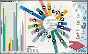
 Information graphics – or infographics for short – are “graphic visual representations of information, data or knowledge. These graphics present complex information quickly and clearly, such as in signs, maps, journalism, technical writing, and education,” according to the definition of the term on Wikipedia.com.
They take complex topics and make them easy to understand. They show us the trends and implications that underlie data. And they help us to understand our world better. Some people, like Dave Gray, founder of XPLANE, one of the thought leaders in this area, believe that infographics represent a new visual language.
As infographics have grown in popularity, so have websites and blogs that attempt to catalog the best examples of these colorful, charts, diagrams and illustrations. Here are several of my favorites:
There are many more. Just Google “infographics blog” and you’ll see what I mean!
Infographics and mind mapping
So what does this have to do with mind mappping? How can you become a better mind mapper by viewing compelling examples of infographics? Here are 5 ways:
- Pattern recognition: The best infographics are all about extracting the patterns that underlie data and information. So it is with mind maps. Examples of the most compelling infographics help us to think in terms of the bigger picture, of the patterns that reside within the information we’re recording in our mind maps.
- Poly-mapping: Infographics remind you that mind mapping is but one of many ways of representing and communicating information visually. Infographics go well beyond bar charts, Venn diagrams and business process flows. They encompass literally hundreds of ways of visual thinking.
- Rich examples: Infographics provide you with some great examples of the ways in which creative designers have handled color, shape and spatial relationships.
- Inspiration: They should inspire you to work at communicating your ideas in more compelling and impactful ways.
- Should I mind map it? Infographics should help you to remember that mind maps are not a panacea – in other words, you should not mind map everything. Certain types of information lend themselves better to other types of visual diagrams. For example, a business process is usually better described by a flow chart than a radial mind map.
So why not check out some of these blogs and learn from the visual expressions of the best infographic designers?

Leave a Reply