One of the things that a lot of people struggle with, according to the research I’ve conducted, is understanding when a mind map is effective. It’s hard for them to tell the difference between a good map, a mediocre one and a bad one.
Like many illustration programs, mind mapping software gives you a blank slate, which you can use to create a masterpiece – or a mess.
Creating a mind map for your own use is easy enough. You know what you intended when you added each topic to it. Within your brain, you have the full meaning and context of it.
The problem arises when you share your mind map with other people, who don’t have the advantage of your context. They may look at your visual diagram and ask, “WTF?”
So what DOES a poorly-constructed mid map look like?
- It’s hard to tell what the primary purpose of the mind map is
- There isn’t a clear progression from one first-level topic to the next
- There’s too much text in many of the topics, causing visual overload
- The use of color, shapes, lines and other elements is arbitrary
The solution to bad mind maps
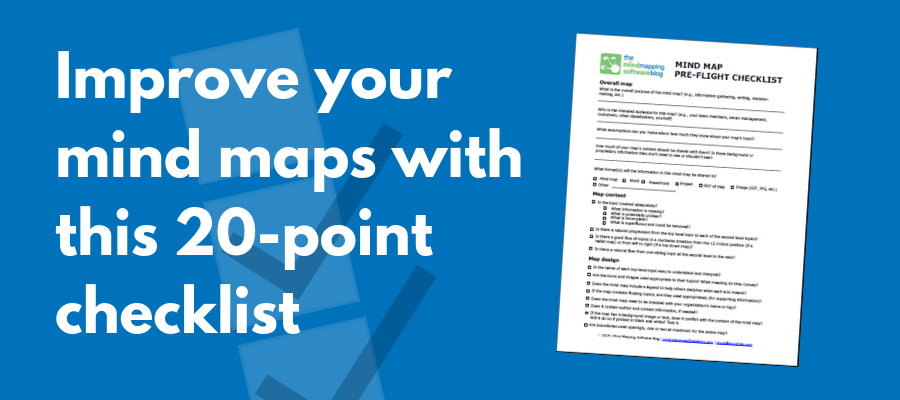
Wouldn’t it be great to have a checklist that you can use to improve the quality of your mind maps? A set of best practices that would help you to create visual maps with greater impact and clarity? Now you can!
This single-page “pre-flight checklist” distills everything I’ve been teaching on this blog into a single-page form. In much the same way as an airline pilot uses a set of checklists to prepare for a flight, this form can help you to prepare a successful mind map.


Leave a Reply