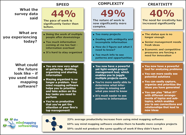
Mind mapping software is often dismissed by linear thinkers as being somewhat frivolous and not worthy of their attention. But by ignoring it, they’re missing out on one of the most powerful productivity tools of the modern age. This infographic explains why (please click on the image to view the full-sized image).
The creation of this chart has a twisted but interesting history:
A few days ago, I had the privilege of listening to an excellent TED talk by visual thinking expert Nancy Duarte, in which she talked about how to craft persuasive, engaging stories that will have an impact when you present them to the people and groups you need to influence. Her breakthrough in understanding what makes an effective story is when she realized that the world’s best speeches followed a common pattern: They oscillated between describing the present conditions to which the audience can relate – the problem state, if you will – and a compelling future state in which the problem has been solved – a utopia where everything is ideal. In the process, these speakers literally compel their audiences to want to achieve that ideal future. An example of what this looks like appears below:
This visual model is marvelously simple!
The examples Duarte shared were Steve Jobs’ launch of the Apple iPhone in 2007 and Martin Luther King’s famous “I have a dream” speech. In the case of the iPhone launch, the inimitable showman compared the state of affairs of cell phones at the time with a utopian picture of what these devices could be – a telephone, music player and much more. In the case of Dr. King, he compared the challenges that African Americans were facing at the time of his speech and a future vision of equality for all men, regardless of creed or color. Who would have guessed that these two famous speeches had so much in common?
Connection with mind mapping software
I was blown away by Duarte’s keen, simple insight, and got to thinking about how I could apply it to this blog and the field of visual mapping. What if I painted a picture of the present challenges that executives face without a visual thinking tool like mind mapping software, and then compared it to what an ideal future with it could look like? I further realized that I had a wealth of excellent data from last year’s survey that I had communicated with you back then, but perhaps I needed to do a better job of “unpacking” it to help you understand what it means, and why you should care. That would lend credibility to these ideal future benefits.
So I combined these two sets of elements – the present/future comparison and the survey data – into a single infographic that I think does an excellent job of telling the story of why executives who aren’t utilizing mind mapping software should be.
If you want to share this infographic with others (and I encourage you to do so), you can download it as a PDF file here.
Mind mapping software is often dismissed by linear thinkers as being somewhat frivolous and not worthy of their attention. But by ignoring it, they’re missing out on one of the most powerful productivity tools of the modern age. This infographic explains why (please click on the image to view the full-sized image).


Leave a Reply