Scrintal is a remarkable personal knowledge management tool that combines the power of mind mapping with networked note-taking. It’s ideal for researchers, writers and anyone who needs to manage projects or knowledge visually.
It offers some innovative unique functionality that really impressed me – and that’s not easy!
Here’s what’s notable about Scrintal and how are you can use it to create your own visual knowledge base.
The basics of Scrintal
To create a new note, simply double click in a blank area of the application’s workspace (which it calls the “desktop”) or use the plus icon in the toolbar on the left side of the workspace. You can then drag and drop your new note wherever you want on the desktop. Then start typing, or drag and drop images, videos or links into your note.
To create a new note from within the current note, you simply use the plus key, type the name of your new note and hit enter. Quick and easy!
Scrintal supports the block editing feature that’s all the rage today in note-taking tools. That means you can use a round icon in the right margin in your note to move a paragraph of text to another position within the note or even into another card.
A plus icon enables you to add media to your note, including an image, PDF, video link and more. You can also copy and paste tweets. Into your Scrintal workspace – which I think itls quite useful, because Twitter is often an excellent source of concise bits of serendipity for me.
Images, videos and PDFs have one unique behavior that I’ve never seen before in a visual thinking tool: While you’re viewing a note containing one of these rich media elements, you can “extract” it – that is, view it side by side along with your note. While extracted, you can zoom in and zoom out on them. You can do the same thing with web links; Scrintal can open them in a preview window within the application, making it easy to copy and paste relevant information or take notes from a video or PDF while viewing it. Whoever thought of this is a genius!
If you prefer a distraction-free writing environment, Scrintal gives you the option of expanding a note’s contents to fill the screen. If you see a link in the currently expanded note that you want to follow, you can preview it and then tell Scrintal to swap the note cards. Nice!
At the bottom of each card, Scrintal displays 3 sets of links: cards to which the current card links, back links (links from other cards TO your current card) and related cards – those that are not directly linked to the current card but are somehow related to it.
Tagging: An essential tool for connecting your ideas
The developers of Scrintal don’t believe in folders. Instead, it uses tags to organize information. To add one to a card, simply type the hashtag (#) key and type the name of your hashtag. A pop-up list displays the names of the tags you’ve already created. If you want to use an existing tag, simply select it.
If you have a lot of notes in your database, you’ll be glad glad to know that you can group select cards and apply a tag to all of them at the same time using a right-click command. Very convenient!
What if you’re working within a note and you see a concept you’d like to expand or brainstorm about in a separate note? Simply highlight it, click on the plus icon and a new linked note is created on the desktop. As someone whose mind goes a thousand different directions at once, this is welcome functionality!
Clear your desk
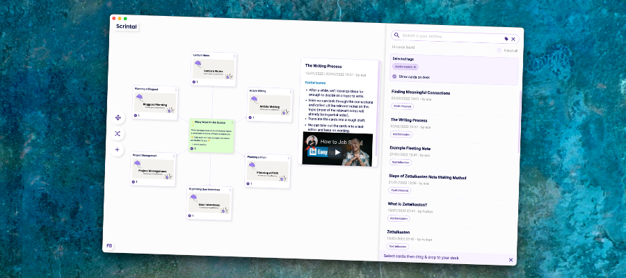
If your Scrintal desk becomes too cluttered, you can simply group select the notes you’re no longer using and hit the delete or backspace key. They disappear from the desktop – but they’re NOT really gone. They’re stored in Scrintal’s database and can be viewed within the archive, a vertical panel on the right side of the desktop.
Notes stored in the archive appear in an abbreviated view, displaying only their titles, author and other basic information. Hovering over an archived note causes its full contents to pop up in a preview window – a great way to check it out without re-opening it on the desktop.
Powerful search
The archive is also where are you search for all of the cards you’ve created. You can also use it to search for cards by their tags.
The developer recommends creating a unique tag for each project. That way, you can search for it in the archive and quickly load all of the cards associated with it.
Boards equal stored views
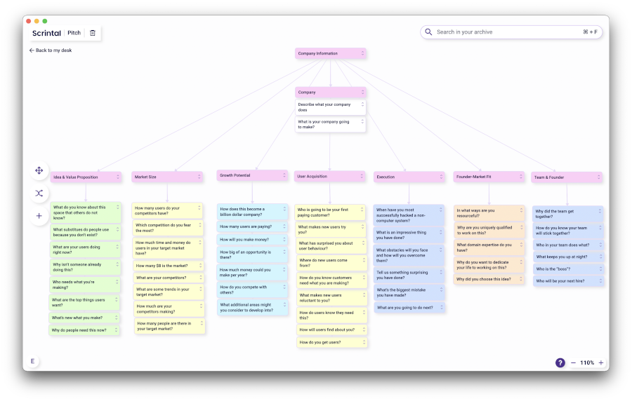
Scrintal enables you to create multiple boards, which are sort of like stored views of your cards. There is no limit to the number of boards you can create, and they can be shared with others. One card can appear on multiple boards, which is why Scrintal keeps everything in one central archive.
Flexible knowledge management
As your knowledge base grows in Scrintal, it will become increasingly common that a note you have open on the desktop is linked to others that are not currently displayed. Scrintal includes a “show links” button in each note that enables you to view all of your linked ideas in the archive panel. You can then decide which ones, if any, you want to add to the desktop.
To keep your desktop from getting too crowded, Scrintal gives you the option to “fold” notes – so only the note titles are visible.
Try it yourself
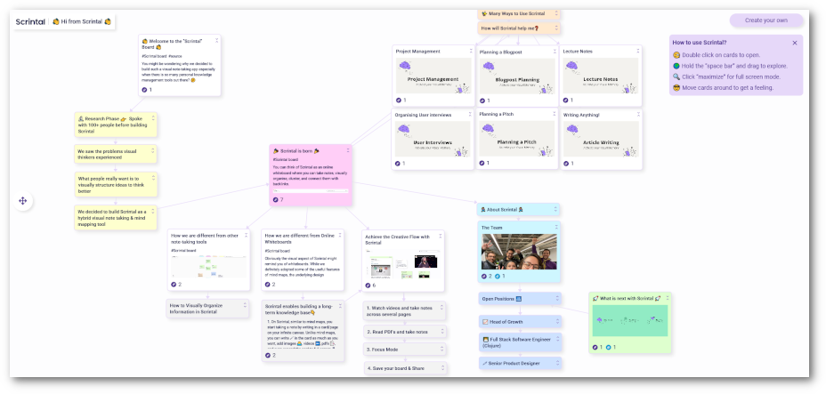
To get a better sense of how Scrintal functions, the developer has published a public board that you can play around with. At the same time, the content it contains will educate you on what makes Scrintal unique, popular use cases and more. Click here to view it or click on the image below.
Conclusion
Scrintal does an impressive job of straddling the line between a mind mapping and note-taking tool. At the same time, it introduces some intriguing innovations, such as using the desktop as a flexible workspace for ideation, research, outlining, writing and other tasks – but then giving you the ability to wipe it clean or save it as a view (in a board). This is quite a bit more flexible than either mind mapping software or the current genre of note-taking applications.
Scrintal lets you work with your knowledge, ideas and information in a very fluid style that is refreshing. But surprisingly, it does so without burdening you with a lot of obscure or confusing concepts or methodologies. It all feels very intuitive and natural.
If you compare that to a complex note-taking and database environment like Notion or bare-bones link-centric tools like Roam and Obsidian, Scrintal’s elegant, flexible interface is even more remarkable.
In short, Scrintal is a fascinating tool that looks like it has a bright future ahead of it!
Scrintal is currently in beta testing mode. Visit the application’s home page to get your name added to the wait list to try it out. I think you’ll be impressed by all it makes possible!


Leave a Reply