When you’re creating visual diagrams and infographics, it makes a lot of sense to cultivate a “signature” style that is recognizable anywhere. That’s exactly what Gerry Moran has done with his informative “blueprint” infographics.
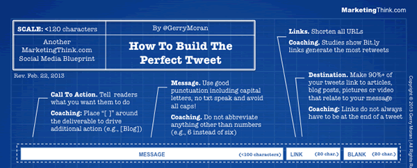
Gerry’s terrific infographics do a marvelous job of explaining best practices that anyone can use to make better use of social media channels. Recent examples include How To Build The Perfect Google Plus Profile, How To Create The Perfect LinkedIn Profile and How To Write The Perfect Tweet (see image above – click for larger, full version).
Each of these infographics resemble construction blueprints, complete with white-on-blue color scheme, title block in the corner, a light-colored grid pattern in the background and serif typeface. Call-out lines are populated with brief, descriptive text that explains what each element is and, more importantly, the best practices for using it.
Branding of each infographic is understated and consistent, with the MarketingThink.com name appearing in small text in two corners of the blueprints, and in the title block along with Gerry’s name. Why is this important? Infographics like these are likely to be widely shared in places like Pinterest, Tumblr and Facebook, and it’s important that other people who see them know who produced them and can easily find Gerry’s work online. Thanks to the fact that he’s branded his visual work as “MarketingThink.com” rather than just “MarketingThink,” Gerry makes that easy to do.
The genius behind the blueprint
What about the distinctive blueprint style? No, it’s not original but I like the way Gerry has adapted it to serve his needs. Unlike most infographics, which look like a cacophony of shapes and colors, Gerry’s infographics use only two colors – blue and white – which makes them stand out. I also love the connotation of the blueprint itself. In the context of construction or manufacturing, what does an old-fashioned blueprint do? It tells workers how to build something. In this context, it implies that by viewing these social media blueprints, we will learn something about how to “build” effective social media content.
At a more basic level, these terrific infographics simply beg to be shared online and printed off and hung in one’s cubicle or office as a reminder of how to “do it right.” No one is producing infographics that look like this!
Gerry’s infographics are further enhanced by well-written, informative blog posts in which they appear. These write-ups don’t just repeat what’s in the infographics, but convey additional knowledge and advice. Taken together, these words and distinctive stories do an excellent job of conveying Gerry’s social media expertise and his savvy approach to creating distinctive, eminently useful and sharable content.
Other examples of a distinctive visual style
Gerry Moran isn’t the only example of a distinctive visual style helping content its creators get noticed online. Others who have made this approach work well for them include:
- Hugh MacLeod, with his unique and frequently thought-provoking hand-drawn Gaping Void drawings,
- Mike Rohde, author of The Sketchnote Handbook and prolific producer of these hybrid notes/drawings,
- Austin Kleon, who creates “newspaper blackout” poetry in which he starts out with a newspaper article and blacks out all but a handful of words with a black marker to form a clever saying or brief poem,
- Adam Sicinski’s colorful, intricate hand-drawn mind maps with their chunky branches and playful illustrations, and
- Wojciech Korsak’s wildly imaginative illustrated mind maps and dashboards, which I featured in a Mind Mapping Insider report last year.
Each of these people have a consistent style that is unique theirs and immediately commands attention. If you’re trying to build a reputation online, now is the time to start cultivating a style that is uniquely yours – whether your medium of choice is infographics, photography, art or another form of expression, crafting your own signature style will differentiate your work from that of your peers and will help you to get noticed online.


Leave a Reply