Recently, I was the guest speaker for a mind mapping webinar conducted by Boeing Corporation. I decided to use MindManager 9’s new slide-based presentation mode to support my talk – you know, the medium is the message. This worked okay, but not as well as I would have liked. This is not due to a shortcoming of MindManager, but rather a problem I discovered with the whole idea of enabling users to create slides based upon selective content of their mind maps.
Here’s how I discovered this shortcoming:
Prior to my presentation, the webinar organizer at Boeing placed a PDF of my mind map on the group’s intranet site. During my presentation, a number of participants asked questions about the slides I was presenting – specifically, why they didn’t seem to correspond to the PDF of my mind map. In reality, they were seeing pieces of the same mind map, but didn’t realize it. Without some larger context, the webinar participants saw no correspondence between the overall mind map and the individual branches I was showing.
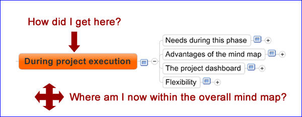
In the traditional mind map presentation view, the program opens one branch of the map at a time, and zooms and pans the mind map to display each one in turn. it’s easy to see the progression from one branch to another, or the “drill-down” from a higher level to a deeper level, because the presentation mode literally “flies” you through your mind map. This movement from one topic to the next gives you a strong sense of context. That’s what’s missing from the slide-based approach.
On the positive side, a slide-based presentation mode does give users of mind mapping software a much greater level of control over what gets displayed from their mind map and what remains hidden. After all, not everything contained in a mind map is meant for public consumption. Some is for internal use only, while other topics are simply background information or notes to yourself.
What’s the solution?
Based upon my experience with Boeing, I recommend a hybrid approach to mind mapping presentation modes. In other words, let the user designate which topics and subtopics should be presented, and in which order. But instead of treating them as disconnected mind map “chunks,” join them together with some sort of animated transitions, so members of our audience can see the progression from one idea to another and how they got to the segment of the map they are now viewing.


Leave a Reply