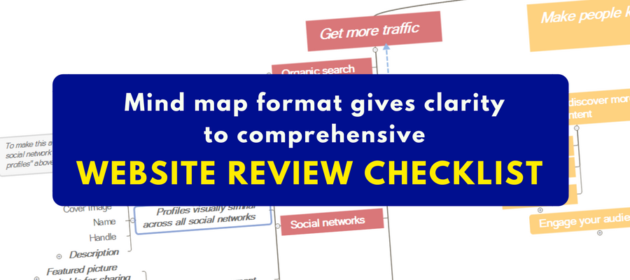
If you wanted to create a website review checklist, a mind map probably wouldn’t be the first format that comes to mind. But for Gill Andrews, a web consultant for small businesses and solopreneurs, it represents an elegant tool to help bloggers and website owners to tackle this huge project in an orderly way.
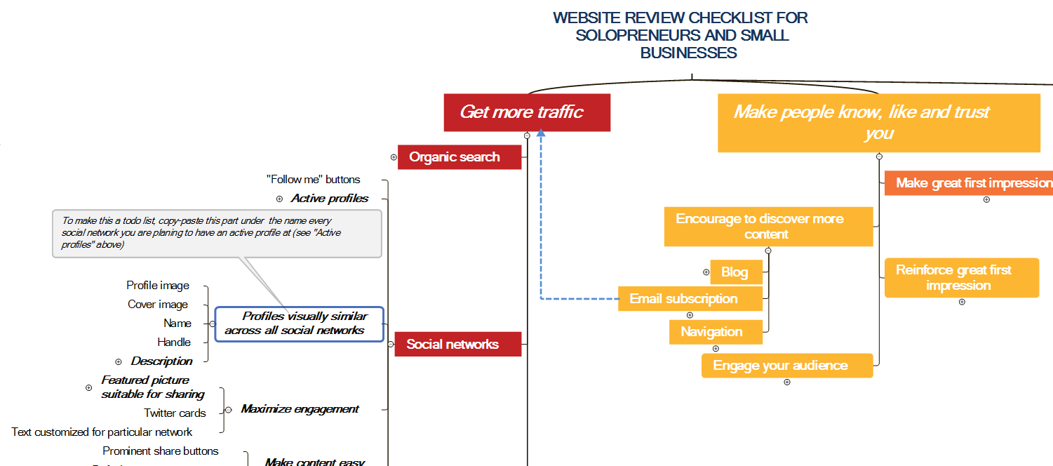
This well-designed mind map guides you through a strategically designed process, from getting new visitors to your website to converting them into paying customers. It provides website owners with a simple framework they can use to grow traffic and convert it into sales.
I recently had an opportunity to interview Andrews to learn about this practical application of mind mapping software:
Chuck Frey: What made you decide to make your Ultimate Website Checklist available as a mind map?
Gill Andrews: It wasn’t a conscious decision, but rather one based on a habit. I use mind maps a lot when working for my own website or for my clients to map out a content strategy, outline a blog post or review a website.
In my website reviews, I not only point out the problems but explain why this is a problem and how to fix it. At some point, I started noticing that many of my clients have similar problems with their websites, so I had to explain the same things over and over again. It became clear to me that I need to collect all advice in one place, and make it clear and applicable so that the website owners can review many things on their websites themselves.
Because mind maps proved to be very helpful to me in the past, I decided to make a website review checklist as a mind map.
Frey: What advantages does it provide versus a linear list?
 Andrews: Linear lists are great for a collection of 10-15 independent points – a todo list for today, a shopping list, a “what to pack for my vacation” list. But as soon as you have a complicated subject with many points that also have dependencies and subcategories, a linear list fails you.
Suddenly, it becomes more difficult to extract the necessary information:
- You need to scroll back and forth to find out a particular task.
- The hierarchy and dependencies are not clearly visible.
- With a linear list of 200+ points (the number of the points in my mind map), identifying problems with your website becomes a scavenger hunt.
- Deciding where to add a new task is complicated.
You don’t have these problems with a mind map. In a mind map, you can easily navigate between the points, because most of them are instantly visible on your screen. You can hide certain parts of the list you don’t want to look at for now.
You have a clear hierarchy that compartmentalize your tasks. You can add dependencies and notes. Adding new tasks and tracking progress is a breeze, and so on.
When it comes to running a website, I would choose a mind map over a linear list any time.
Frey: You point out in one of your YouTube videos that one of the problems with list-based assessments is that they usually don’t reflect a bigger strategy. Is the ability to tie assessment tips back to larger categories an advantage?
Andrews: You can think of your website as a road that is supposed to take your website visitors on a journey from strangers to paying customers.
Imagine you have to build such road, and you start collecting stones to do that. Would you take every stone that comes your way? What if a stone is too big and would make your road bumpy? Where would you put it to extend your road in the right direction?
It’s a very long road, so do you know where all the holes are that might cause people to trip? Do you know what holes you should fix first?
If you build your website by simply implementing every tip that being praised by experts, you will end up with a bumpy road with many holes that leads nowhere.
You need to ask yourself: Does this stone fit my road? Does this tip fit the nature of my business, the needs of my audience, my business goals?
You can only answer these questions when you have a clear plan of how you are supposed to build that road and where it is leading.
That’s why my website review checklist uses a 4-step strategy of how to make people buy your product – to ensure that the road that takes your website visitors on a journey to become paying customers is smooth and leads in the right direction.
Frey: I see you’ve color-coded the top-level topics of the mind map. How does that fit into the assessment framework you’ve created?
Andrews: I believe that when you know the reason behind doing something you will do it better and with greater motivation.
Compare these two ways to look at one task:
“I need to work on the load speed of my website” vs “I need to work on the load speed of my website to improve SEO and user experience, which will result in more traffic and better impression my visitors will get from my website.”
Which sentence will make you more motivated to start improving your website’s load speed?
Thus, it was important to me to communicate where every point and task belongs within the overall strategy. The colors in the map provide this information instantly and without taking any additional space.
Frey: How important is the clarity that the mind map format provides?
Andrews: Clarity is always important, especially when it comes to such complicated matter as running a business website. Here, clarity is indispensable.
Frey: Is the ability to expand and collapse map branches an advantage? If so, why?
Andrews: When you fully expand the mind map and look at it for the first time, you might feel overwhelmed. Imagine if it stayed this way for the whole time you are working with it! It will still give you an uneasy feeling of having too much to do and make you constantly double-check things.
When you hide certain tasks, which then get out of sight, they get out of your mind. This way you can better concentrate on things that you are currently working on without being visually distracted by things that you’d like disregard at this point.
Frey: What do people learn from the relationship lines in your mind map checklist?
Andrews: These relationship lines indicate dependencies between the checkpoints or tasks that belong to different categories.
For example, certain aspects of user experience are an important ranking factor. Or setting up an email newsletter will increase your traffic as well. This is something a website owner needs to know to be able to prioritize tasks, for example. Also, it contributes to improving the overall understanding about what makes a successful website.
Frey: You don’t seem to like the idea of placing checkmark icons next to tasks to show they’re completed. Why not? What do you recommend doing to designate “done” topics instead?
Andrews: The main idea of working with this mind map checklist is to get a clear perspective where you are with your website: What you’ve already done and what you still have to do.
After an initial website review, you should be able to see a clear picture just by looking at the mind map. So whatever is not important, whatever is already done and doesn’t need your attention anymore needs to be less visually prominent. Yet, if you set an icon to indicate a done task it becomes an attention magnet.
That’s why I recommend making the font color of a done task light grey and crossing the task off, like this: This is a done task. This way your brain will ignore it while scanning your website review checklist for important things.
I don’t recommend deleting completed tasks, though, because then you can’t tell whether you’ve done it, accidently deleted it, or decided not to do it at all. And this will add unnecessary tension.
The only points that you can safely delete are the ones you are sure do not apply to your website. For example, I don’t have a Facebook profile and I’m not planning to have one. So I deleted that point from the mind map for my own website.
Frey: In one of your YouTube videos, you point out that website owners can continue to use the mind map as a tool going forward – creating task lists and appending new tips to it, for example. How important it that this represents a “living document?”
Andrews: It’s not important in the sense of a website review. If you are doing it for someone else, you can simply use that mind map as a one-time website review checklist.
But if you are using it for your own website, it would be a shame not to make use of this functionality of a mind map to add new tasks, and do it in a strategic way to make sure you stay on the right track.
Plus, it takes this anxiety you have every time when you read about a new tip for your business website trying to decide whether it’s something you need to implement on your website as well.
Now you can simply double-check whether you are already doing it and/or whether it fits your website at all, and stop worrying about it.
Frey: You also recommend making any mind map additions visually prominent. What’s your preferred way to do that?
Andrews: This might have been a misunderstanding. I don’t recommend making any mind map additions visually prominent. On the contrary, I recommend making them look the same as the already existing points. Because a task that you have to do is still a task that you have to do, regardless of when you added it to your checklist.
I think you are referring to the red flag icons I placed in one of my videos next to some tasks. It was to mark a task I know I need to do in the near future. This way I’m making tasks that I care about completing soon stand out more in comparison to other tasks with no icons, which I might be still undecided about or haven’t even looked at.
This is a personal preference, though. You can indicate this difference in any other way or not indicate it at all, if you see no benefit in it.
Frey: The mind map certainly seems to differentiate your offering from the dozens or hundreds of other website review checklists available online. Have you found that to be the case?
Andrews: It’s surely the case, as I haven’t seen any other website checklists in a form of a mind map. I can also understand why. To create a linear website review checklist is easier, especially if it doesn’t aim to be an ultimate website checklist that contains all the components of a successful website.
To create this mind map, it took me 2 months to collect the information on the side plus two weeks of dedicated effort to finalize and test it. It’s understandable that not everyone is ready to invest this amount of time and effort into a website checklist.
But it was certainly worth the trouble for me. It helps website owners to finally get a clear picture on where they are with their websites and how they can improve things on their own, without hiring a consultant.
Plus, I use this mind map for client website reviews and for keeping track on the progress of my own website.
Frey: What do you hear from website owners who have downloaded the mind map and used it to assess their sites?
Andrews: I get two kinds of feedback on it.
The website owners who have been running their business websites for some time already, find it very helpful. They are able to instantly recognize its value, because they spent quite some time struggling to identify the problems with their websites and to find the solutions for them. They leave the comments on my blog, share my website review checklist on social media, and even recommend it to their peers and co-workers.
But I also heard from people who are either not that involved in running their business websites or who are new to this. They found this mind map overwhelming, which is understandable.
That’s why I created a different version of this checklist – a PDF website checklist that contains the same points as the mind map but looks more familiar and offers a smoother introduction in the world of running a successful business website.
But even that PDF website checklist, although being linear, is different from the usual checklists, as it preserves the color coding and has mini-infographics that summarize particular sections.
Frey: What did you use to create the cool animated timeline in your video? Also the static version of it in the right rail of your site.
Andrews: For the animated timeline in my video, as well as for the video itself, I used ActivePresenter, a free software to make videos for demonstration purposes. Among other things, it can record your desktop, combine different video clips in one and create PowerPoint-like animations.
For that infographic on my blog, I used Illustrator and Photoshop. Using these tools requires a steeper learning curve than using Canva or PicMonkey, but they also offer the flexibility no online image editor can offer and are fast in handling images of any size.


Leave a Reply