#6 in the Effective Mind Maps blog post series
If you are sharing a mind map with other people, and want to draw their attention to a specific section of it, a boundary is a good way to do that. But boundaries are often misused. Here are tips on how to utilize them effectively.
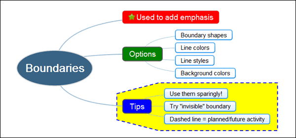
A boundary visually joins a topic and its subtopics together, usually with an enclosed line and a different background color. It is used to provide emphasis to a section of your mind map, to make it visually stand apart from the rest of its content. They are especially valuable when used in larger, more complex mind maps, where many topics and levels of information are fighting for attention.
Most mind mapping programs give you a variety of options in terms of boundary line styles (solid lines, guidelines, as well as scalloped cloudlike shapes) and colors. Don’t be afraid to experiment with your program’s boundary options to learn what works best for you.
A pet peeve with boundaries
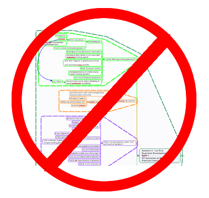
 One of the ways in which I see boundaries overused has become a pet peeve of mine. I hate it when I see maps in which every first-level topic and its children are surrounded by boundaries. Remember, its purpose is to emphasize important content in your maps. But if everything is emphasized, then nothing stands out, negating the value of it as a visual aid.
In the example at right, not only does every first-level topic have a boundary, but also every second-level topic! In other words, this mind map contains nested boundaries. Yikes!
Here’s one creative way in which you can use map boundaries is in combination with relationship lines:
- Create a boundary around a group of topics
- Add a relationship line that points from another topic to the boundary.
- Change the background color and line color of the border to clear, or match its color to the background color of your map.
- The result is a relationship arrow that points to the vicinity of a group of topics, without touching it.
Another creative use of boundaries is to use your program’s border line style in a way to add meaning and context. Let’s say you have created a map where one branch depicts a group of tasks or project elements that are optional or may be accomplished in the future. If you change the topic line and border line style to a dashed line, you visually reinforce the idea that this section of the map is focused on items that are for future consideration.
One final tip: if you want the people with whom you’re sharing your map to clearly understand why you have emphasized one or more parts of it with boundaries, then you may want to consider adding a callout or floating topic with an explanatory note. As with many other mind map elements, you can’t assume that the people with whom you’re sharing your mind maps will understand what you’re trying to say. Make it obvious for them!
(originally published Jan. 21, 2009. Updated to be included in the Effective Blog Posts series Jan. 8, 2013)


Leave a Reply