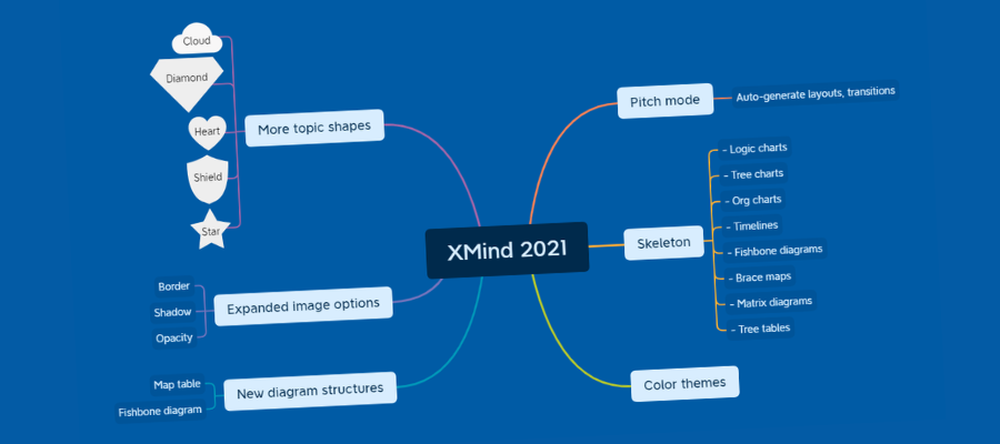
XMind continues to grow its toolset in surprising new directions. XMind 2021 is no exception, with a brand-new pitch mode, tree tables, unique new object shapes and much more.
In addition to these cool new features, XMind does the basics exceedingly well. This makes it an excellent choice for first-time users of mind mapping software it those who don’t want to be overwhelmed by busy, overwhelming user interfaces with dozens of options.
Let’s take a closer look.
A simple user interface
When you first open XMind 2021, the first thing you notice is its minimalistic interface. No busy ribbon toolbar to distract you with a wealth of options. Just six buttons for adding topics, plus several others for Zen mode, the new pitch mode and one on the right side of the workspace entitled “panel.” Clicking it causes a vertical panel to slide open to reveal all of the formatting options for the element of your map that’s currently selected.

Zen mode further simplifies the interface, removing all toolbars from view and enabling you to fully focus on the content of your mind map. You can use keyboard shortcuts and right-click commands to add content to your map and modify it. It’s a welcome option for those of us who are easily distracted.
You can customize the program’s keyboard shortcuts from an unobtrusive set of icons in the upper right corner of your screen (a nice touch!), change map style and type as well as add stickers ad markers to your map topics from here. A timer is also available for brainstorming sessions.
This simple setup should be especially appealing to first-time users of mind mapping software, who may become disoriented by complex ribbon toolbars and a myriad of options for modifying the content of their mind maps.
Pitch mode
Pitch Mode generates automatically generates presentations with animated transitions from your mind map. It takes a decidedly different approach than anything I’ve seen before in mind mapping software. It’s elegant in its simplicity. To test it, I created a small map with six first-level topics. Two of them contained second-level topics.
I accessed pitch mode from the program’s toolbar. The screen immediately turned black, with my central topic displayed in white. Clicking the spacebar of my keyboard caused it to slide to the left. A right-facing bracket appeared, with the first of my six first-level topics displayed next to it.
It’s a unique layout, but it conveys a lot of information in a very simple format. First, it’s obvious what the relationship is between my main map topic and the first-level topic to the right of the bracket. There’s also enough white space to reveal five more sibling topics. If you want to display the rest of the first-level topics in a ghosted view, simply move the mouse while in pitch mode and they’ll appear – nice!
Clicking again makes my first first-level topic move to the center of the screen. It contains a single sub-topic, which remains hidden for now. Tap the space bar and it appears on screen just below it, separated by a horizontal line. A little different than the first drill-down, but still easy and intuitive to understand.
Another click returns me to the view of my central map topic. My first-level topic slides back into its original position at the top of the bracket, and the second first-level topic quickly fades into view below it.
I like the fact that pitch mode always gives the audience a sense of where they are within the structure of the mind map. I think this is really important. It’s something that’s been lost as most mind mapping programs have moved to a mode that uses “snapshots” of map branches to create static slide presentations. As you view these screenshots, you tend to lose all sense of how the branch you’re viewing fits into the overall structure of the mind map.
Pitch mode elegantly solves this problem.
Pitch mode is a really great start, but it left me wanting more. Why were all of my map topics rendered in black-and-white? While it did a great job of drawing the attention of the viewer to the main message on the screen, it looked a bit boring. I asked the developer and was told that color and other enhancements may be added to pitch mode in future releases. For now, it remains focused squarely on presenting your map’s content in a clear, concise, intuitive format.
Skeletons
Today’s XMind does far more than traditional radial mind maps. It can now produce:
- Logic charts
- Brace maps
- Org charts
- Tree charts
- Timelines
- Fishbone diagrams
- Tree tables
- Matrix diagrams
The developers of XMind apparently believed they needed an “umbrella” term to describe all of the different types of visual structures it can produce. They came up with the term “skeletons.” When you first open the program, it displays a set of templates for the different “skeleton” types you can create. You can also change the format of your map at any time from the map settings tab of the formatting panel.
New color themes
XMind 2021 features a new set of color themes, which you can quickly and easily apply to your mind maps to give them a more attractive appearance. With most mind mapping software programs, I tend to avoid pre-made map themes, because they’re usually not that good. I prefer to “roll my own.” But I was impressed by XMind 2021’s map themes, which are actually attractive and appear to be well-thought out from a visual design standpoint.
New diagram structures
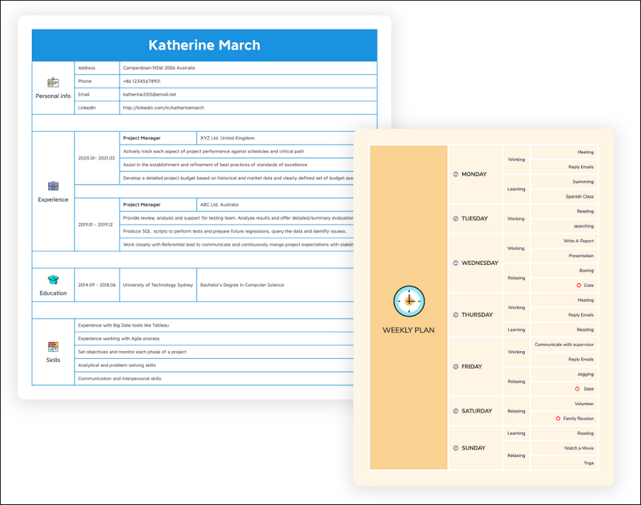
One of the most unique additions to XMind 2021 is a new diagram type called the tree table. This format, based on a spreadsheet, presents topics as nested blocks. Each column represents a deeper level of your information’s structure. It’s easy and intuitive to understand.. It’s not very easy to explain, but is much easier to show you:

This may be useful in cases where you want to show others the path of your thinking and research, but you don’t want to overwhelm them with a radial mind map. It also represents another low-distraction view for building out your ideas.
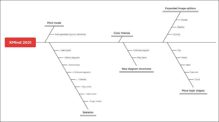
XMind 2021 also offers a fishbone diagram type. It’s useful for root cause analysis, a form of visual problem solving that’s popular with engineers. The main topic represents the problem or symptom. Each branch represents one cause of the problem, while the sub-branches help users visualize the “whys” behind them.

XMind offered a fishbone diagram type many years ago, but it’s now back with two templates and an improved layout.
Expanded image options
XMind 2021 makes it possible to personalize your mind maps like never before by enabling you to apply border, shadow, and even opacity. No more one-size-fits-all images!
Expanded topic shape options
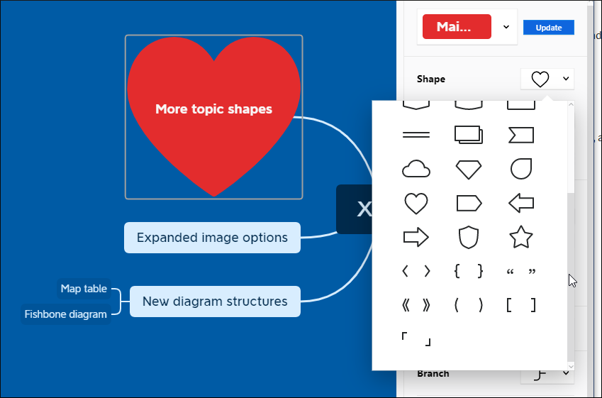
XMind 2021 includes a significantly expanded library of 31 topic shapes. New options include cloud, diamond, heart, several styles of arrows, star, quote marks, parentheses and several styles of brackets. Make your mind maps more imaginative than ever!
Other noteworthy improvements
What else is new in XMind 2021? How about these noteworthy improvements:
- Multi-branch color: Check a box and voilà – rainbow-colored branch lines. Nice!
- Free-positioning topics: In past versions of XMind, you needed to use the mouse and a keyboard command to freely position topics in your mind maps. It’s now a checkbox in the topic format settings – much more intuitive. It’s especially useful for placing floating topics exactly where you want them.
- Quick styles: This new topic format option enables you to quickly modify a topic to designate it as very important, important or cross it out. The last option should be especially useful to writers, who may want to visually designate that they’ve finished working on a specific section of a book or other large writing project. It would be nice if quick styles could be customized, but that’s not an option yet.
- Unfold all sub-branches: This comes in handy during presentations. It’s accessible via a keyboard shortcut and automatically opens an entire branch- including all of its sibling topics at multiple levels – in one command.
- Support for complex mathematical and chemical formulas: Using the MathJax open source library, you can input LaTeX math commands, convert them into formulas and insert them into your mind maps.
Conclusion
XMind 2021 has accomplished something remarkable: It succeeds in simultaneously providing its users with a simpler, intuitive user interface but at the same time offers more options for designing mind maps that are uniquely your own. Its simple, common-sense design makes it easy to create attractive, functional mind maps. XMind 2021 is ideal for anyone who is just starting out with mind mapping.
If you want a higher-end program with advanced functionality, the developer still offers XMind 8 to meet those needs.
Pricing for XMind 2021 is US$39.99 for 6 months or $59.99 for one year. This enables you to install it on up to 5 devices, including Windows and MacOS desktops, plus iOS and Android mobile platforms. Quite generous, considering that most productivity software from major developers limits you to 1 or 2 simultaneous installs per license.
To learn more about XMind 2021, visit the product page here.


Leave a Reply