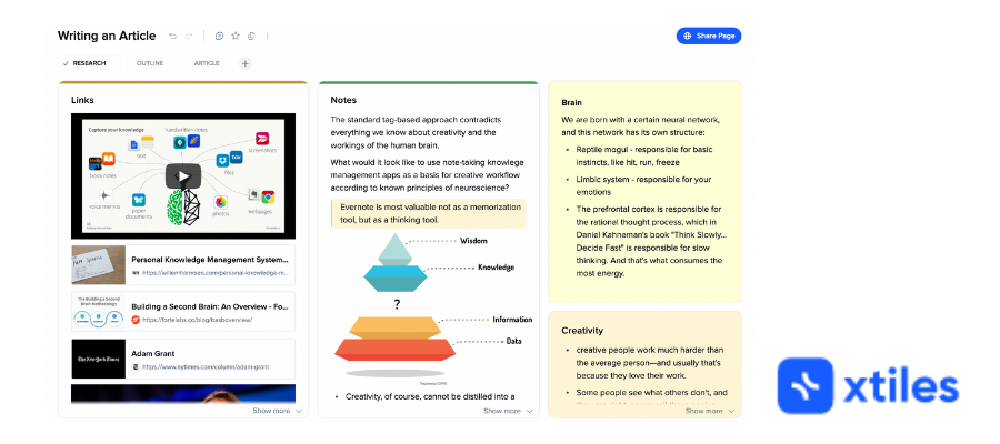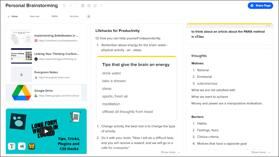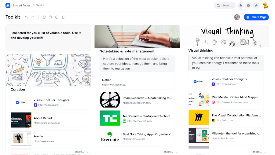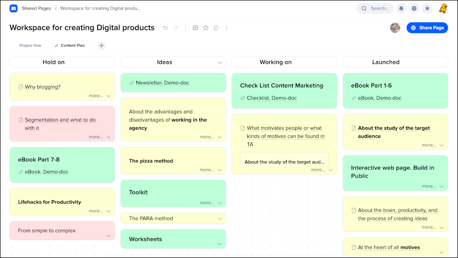
xTiles is a new visual note-taking tool that aims to be a flexible workspace for organizing notes, links, images, videos and other content visually.
Its simple, intuitive user interface doesn’t burden you with a lot of mental overhead, figuring out where to place an idea within your personal knowledge base or project board. Instead, it gets out of the way and empowers you to develop your ideas in the ways that make the most sense to you.
I recently had an opportunity to interview xTiles founder Maksym Kuchur from Ukraine to learn more about the thinking behind this intriguing visual note-taking tool.
Chuck Frey: First, what is xTiles? You’ve described it as the love child of Miro and Notion. Please explain.
Maksym Kuchur: The world of productivity tools has been moving to hybrid applications. People want to combine best features from different types of services so I tried to combine the best of what I loved into a single, elegant tool.
xTiles has combined many good features from note-taking, whiteboards, text editors and even spreadsheets. But the most important is the block type of editor, which was inspired by Notio,n and the very special canvas with vertical orientation. Those form the foundation of xTiles.

Frey: What inspired you to create xTiles?
Kuchur: I liked to use a lot of productivity tools, but I couldn’t get comfortable with one tool. I had to use several, depending on the use case. I wanted to have an assistant to my brain’s work, which I could use to visualize my thoughts in a digital view. I also wanted the flexibility to improve my ideas and work with information in different ways, depending on the situation.
Frey: What’s unique about xTiles compared to other visual note-taking tools?
Kuchur: The real power of xTiles is a unique way to create pages visually that could be a note, presentation, board, etc. That makes it sound like a complex tool. But the xTiles UI is actually very easy and intuitive to use. A tile is a component you can use to build any type of page. We give you a universal building block to build the house you want, so to speak.
Simplicity and flexibility are two words that we hear often from xTile users. You can start your work with xTiles in a minute, but the product still gives you a lot of flexibility and doesn’t restrict your creativity.
Frey: Who is your ideal user for xTiles? What types of people can benefit the most from it?
Kuchur: Our ideal user is a creative person. People who like to brainstorm, to write, to research will found xTiles as a valuable assistant in their creative process. People who like curate and play around with any data can use xTiles as workspace to gather and organize their information.

Frey: How does xTiles provide a simpler and more intuitive user experience?
Kuchur: There are no unnecessary things in the xTiles user interface. We don’t force people to think what they should click. We offer to make your first tile so you can start writing immediately.
New users don’t need to watch a ton of videos or go through extensive training to get started working with xTiles and get their first results. When you make your first tile, then you start to learn how to move them, structure your workspace, and create tabs and sub-pages. It is a very smooth and intuitive onboarding process.
Frey: Specifically, how does xTiles help its users to be more creative? How does it encourage “A-ha!” moments?
Kuchur: I am strongly convinced people can be the most creative when nothing distracts them from their creative process. When you can express your thoughts quickly and see a result of your work in an attractive shape, then you feel happy and can continue to develop your ideas.
Frey: After users capture their ideas, how does xTiles help them to develop them and take action on them?
Kuchur: In my opinion, developing ideas is a way to collect all necessary information in one place, distill it to get rid of excess pieces, and then draw the big picture of your ideas with the ability to add details, if needed.
xTiles give you two main things – a rich and simple visualization on a vertical canvas and ultimate freedom with tiles and tabs. You can play with items on your page like a puzzle to get that combination that will get you the necessary result. It’s great for serendipity.
Frey: How can tabs help users see information and ideas from different perspectives?
Kuchur: Tabs can help in two ways. First, you can divide your content into tabs for easy and efficient navigation. Second, you can duplicate your page to make several versions of it. Tabs are distinguished from pages in classic documents. We chose the metaphor of tabs because people think of them as more independent and flexible than pages.
Frey: I understand that users can send tiles from one tab to another. How is that useful?
Kuchur: It’s a way to keep your ideas in a meaningful context all the time. xTiles gives you a one-page canvas to show the big picture of your idea. But sometimes you need a way to organize them. Tabs let you create multiple workspaces that are adjacent to each other. The ability to move tiles between tabs helps with that.
Frey: Does xTiles support tagging of information? In other words, can users classify their notes and the other information they’ve captured in xTiles?
Kuchur: xTiles doesn’t have tags. But we are preparing a much more flexible approach called collections. You can collect any items in collections and then use them to navigate and search your xTiles knowledge base. In the future, collections will have a table view as well as a card view.

Frey: In a Medium article, you talk about the Deep Dive and sub-pages features of xTiles. What do they do, and what problems do they help users to solve?
Kuchur: Structural flexibility is one of the advantages of xTiles. We have sub-pages as one of the possibilities to nest elements within each other. Now users can put pages into each other and make one-directional links. It’s very similar to Notion sub-pages. But next our steps are nesting tiles in another tile as blocks, or tabs in tiles as blocks. It will give users the possibility to play around with the nesting of all types of items on the page.
Frey: I read a case study by DeckLinks and they talked about sharing boards with their customers. How does that work? Are they in read-only view, or can customers add new notes and content to them?
Kuchur: It can be both. We provide base collaboration features like online cooperative editing, comments, and notifications. We have interesting additions in our roadmap and will release them soon. It will include reactions, assignments and other capabilities.
But the unique xTiles approach to structuring pages with tiles gives the possibility to collaborate in a way that is better than other tools. It’s hard to explain in words. You need to try it out and experience it firsthand.
Frey: I understand that you’re working on an xTiles mobile app. Will that only be for clipping interesting content and sending it to your xTiles account? Or will users be able to view and edit their boards on their smartphones, too?
Kuchur: Yes, we are planning to release the mobile app at the end of June. Users will be able to clip content and share it into the app, but also view and edit their pages. In the mobile app, you’ll be able to expand your pages to display and work with the tiles they contain.
The main features of the mobile app will be capturing ideas, making quick notes, searching, notifications, comments and editing existing pages. Creating new pages won’t be a priority in the first iteration of the xTiles mobile app.
Frey: What’s next for xTiles?
Kuchur: Our biggest priority in development is adding the ability to link and nest items on the page. Collections, which will take the place of the tags, folders or tables (databases) that other note-taking apps use, will be our next step. Eventually, we plan to offer the ultimate workspace to collect and capture any information and organize it in the most useful way. We will offer a note-taking assistant that will be a second brain to our users.
You can learn more about xTiles and sign up for a free account on the xTiles website.

Leave a Reply