
Ever since Covid upended workplaces and forced teams to collaborate virtually, canvas-based collaboration tools like Miro and Mural have found an enduring place in modern workplaces.
But other than group brainstorming and process optimization, what can you actually use these tools for? Their developers have not done a very good job of outlining all the ways in which these versatile tools can create value.
Both companies and their lesser-known competitors have done an exemplary job of blogging about the challenges of modern workplace and the ways in which visual collaboration can streamline work processes and help teams achieve clarity.
But I’ve never seen a list of applications drawn together into one place to provide a complete, concise picture of what’s possible with visual collaboration tools.
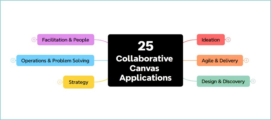
So I decided to create one myself. The mind map below lists 25 popular applications of these tools, while the narrative that follows provides a summary of how they create value in each one.
(click on the image below to view a larger version)

Ideation
Free-form brainstorming
A team gathers on an infinite canvas and everyone writes ideas simultaneously, rather than waiting their turn. Parallel contribution raises the raw idea count, nothing is lost when the meeting ends and remote and in-office participants have identical access to the canvas. Most valuable of all is private mode, which hides the names of contributors. This makes it possible for team members to share controversial ideas without fear of retribution. It also minimizes the effect of anchoring, where the first idea spoken aloud tends to narrow everyone else’s thinking.
Affinity mapping
The natural second act to brainstorming, affinity mapping enables you and to sort through a chaotic pile of notes, naturally grouping them based on emerging themes. I thus method, every idea carries equal visual weight. Discussion shifts from debating any single idea toward how the ideas fit together, which democratizes the room.
Mind mapping
A single concept sits at the hub of the canvas and branches radiate outward into themes and sub-themes. What the collaborative canvas adds that a solo application cannot is multiple people building the same map at once, with the map sitting beside the team’s other work rather than trapped in a separate file.
Dot voting and prioritization matrices
Each participant receives a fixed number of tokens to distribute across the ideas on the canvas. A two-by-two matrix is useful companion for plotting importance against difficulty. Running it digitally because built-in voting can be made anonymous. Anonymity removes the HiPPO effect (a workplace phenomenon where the Highest-Paid Person’s Opinion carries disproportionate weight, often overriding objective data and team feedback).
Agile and delivery
Kanban boards
Work is organized into columns representing workflow stages, with cards moving left to right as they progress. It provides an at-a-glance, high-level overview of the flow of all active projects. One of its biggest benefits is that creators can set work-in-progress limits for each step of the workflow. This enables you to see logjams as they occur, pinpoint where delays are happening and take corrective action quickly.
Retrospectives
At the end of a sprint, the team reflects on what worked, what didn’t and what to change, using formats like Start/Stop/Continue, Mad/Sad/Glad or the Sailboat, each of which surfaces different information from the same team. Timers stop any one section consuming the meeting, while private mode and anonymous voting create enough psychological safety for honest input.
User story mapping
Popularized by Jeff Patton in 2005, this arranges user activities horizontally and breaks them down vertically into tasks and stories, producing a two-dimensional view a flat backlog cannot provide. The map walks through every customer touchpoint, so the team sees the whole experience rather than an ordered to-do list. Release slicing becomes a visual decision: draw a horizontal line and you have defined what ships first.
PI planning
The flagship SAFe event, where every team on an Agile Release Train plans and commits together over two days, every eight to twelve weeks. This was traditionally done in person with vast quantities of sticky notes and literal red yarn strung between them to represent cross-team dependencies. Digitally, nothing needs transcribing because the board is already the artifact, dependencies become clickable connections, and breakout boards feed a shared program board.
Design and discovery
Design sprints
Created by Jake Knapp at Google in 2010 and refined at Google Ventures with John Zeratsky and Braden Kowitz, this takes a critical business question to a tested prototype in a week. Its real innovation is replacing group brainstorming with silent individual sketching followed by structured critique, which is why a sprint reliably outperforms the same team’s ordinary brainstorm.
Empathy mapping and personas
The canvas divides into segments capturing what a user says, thinks, does and feels, building a holistic view of a person rather than a demographic profile. Best practice is to establish the persona beforehand, run a timer, and use private mode during brainstorming. Why? Because empathy mapping is unusually vulnerable to groupthink. Once one person characterizes the user a particular way, the rest of the map conforms.
Customer journey mapping
A journey map traces the path a person follows across every interaction with a company, capturing actions, touchpoints, thoughts, feelings and pain points at each stage. The step that separates a useful map from a poster is attaching evidence, such as quotes, recordings, screenshots, funnel data, directly to the relevant stage, which is where the digital canvas decisively beats paper.
Service blueprinting
A blueprint sits underneath a journey map and shows the operational machinery: employee actions, backstage processes and systems supporting each customer-facing moment. What’s the difference between a customer journey map and a service blueprint? The former helps you understand the customer’s experience. Use the latter to understand what is operationally creating or undermining it. In practice the journey defines the horizontal structure and the operational layers stack beneath it.
Research synthesis and repositories
Synthesis turns transcripts, usability notes and survey data into themes; the repository is the durable version, a searchable board acting as a database of findings across studies. It solves a specific organizational problem: insights buried in individual researchers’ documents and stakeholders pinging researchers for data they cannot find themselves. The board becomes a surface product managers and leadership can consult directly, with visual organization that makes findings legible to people not fluent in research conventions.
Lo-fi wireframing
Wireframing on a canvas occupies a useful niche: more capable than pen and paper, far less committal than Figma. Stripping away color, typography and branding forces conversation onto information architecture and user flow. These are things that are inexpensive to change now and expensive to change later. Because the wireframes live beside the journey maps and personas on the same board, design decisions stay tethered to the research that motivated them.
Strategy
Business model and lean canvases
Osterwalder and Pigneur’s canvas decomposes a business into nine building blocks — value propositions, customer segments, revenue streams, partnerships and the rest — on a single page. Each block fills with stickies, links and sketches, so the model carries its supporting evidence rather than asserting conclusions. The value proposition at the visual center acts as a check on every other block. Because it completes quickly and revises cheaply, teams can hold two or three competing models side by side and compare them, which is impossible to do with a conventional document.
SWOT and strategic analysis
SWOT suits the canvas because the exercise is fundamentally about collecting many perspectives into four buckets: strengths and weaknesses internal, opportunities and threats external. What makes the digital version more than a formatting choice is the surrounding library — PEST, the Balanced Scorecard, gap analysis, the Strategy Diamond, the BCG matrix, RICE — so a session moves fluidly between frameworks on one board. Outputs can be transferred directly into a prioritization matrix or roadmap on the adjacent frame.
Product road mapping
A roadmap communicates goals, initiatives and timelines to teams and stakeholders, with variants including agile, technology, combined product-and-marketing, and a “cone” roadmap that narrows visually as the timeline extends. The advantage over a slide is that the roadmap sits adjacent to its own evidence: the matrix that ranked the initiatives, the research that justified them, the story map that decomposes them. Real-time collaboration and task assignment make it a working surface during planning rather than a read-only broadcast produced afterward.
OKR planning
The hard part of OKR setting is not recording the objectives but converging a large group on a small number of them. One model begins with shared context, individual brainstorming on stickies, small groups narrowing to three to five, then whole-group presentation and prioritization. That structure — individual generation, small-group filtering, large-group convergence — is difficult in a document or conventional meeting and trivial on a canvas with breakouts and voting.
Operations and problem-solving
Process mapping and flowcharts
Process mapping documents how work actually flows: steps, decision points, handoffs and owners, using standard flowchart shapes, BPMN, swimlanes, value stream maps or SIPOC. The most common failure mode of process mapping is to map the process as it is supposed to work rather than how it actually works. The fix is putting frontline workers who know the real handoffs and workarounds in the room. A shared digital canvas makes this small-group consensus building easy to do.
Root cause analysis
The fishbone diagram, named for quality expert Kaoru Ishikawa, places the problem at the fish’s head and organizes causes along bones by category, while the 5 Whys asks “why did this happen” in succession until the underlying cause surfaces. Use the fishbone to map the causal territory, then apply 5 Whys to the most promising bones. Because the analysis flows directly into a corrective action plan on the same board with owners and deadlines attached, the investigation proceeds easily from diagnosis to solutions.
Pre-mortems and risk assessment
Before a project starts, the team imagines it has already failed and works backward to explain why, then converges on preventive actions with owners attached. This works better on a canvas than in conversation because the independent-writing step is essential and hard to enforce verbally: once someone says out loud that the timeline is the risk, everyone else’s thinking collapses toward the timeline. The hypothetical framing also gives people social permission to voice doubts without sounding negative.
Stakeholder mapping and RACI
Stakeholders are plotted on a matrix of influence against interest, which then dictates how much communication each one gets, with RACI as the operational companion assigning who is Responsible, Accountable, Consulted and Informed. Concurrent editing lets all affected parties negotiate their own roles in real time. That matters, because a RACI chart imposed by one person tends not to survive contact with the project.
Facilitation and people
Workshop and meeting facilitation
Beyond individual methods, the canvas is the container for the whole session: agenda, participant profiles, activities, resources, roles and documentation plan, built before anyone arrives. Lean Coffee is the best-documented format for meetings that cannot have a fixed agenda. Created by Jim Benson and Jeremy Lightsmith in 2009, it uses three kanban columns, dot voting to order participant-proposed topics, and five-minute timeboxes. It produces a participant-prioritized agenda in about five minutes that no amount of facilitator preparation could match.
Icebreakers, team building and onboarding
The premise is that in distributed environments, the connective tissue that forms incidentally in an office has to be created deliberately. Themed onboarding journeys extend this, giving a remote new hire a spatial, explorable orientation instead of a folder of documents.
Teaching and classroom collaboration
Educators set activities up on the board and use it as a presentation, moving between static frames and interactive exercises while building on student contributions live, supporting individual, small-group and whole-class work simultaneously. Faculty report that the main benefit is hybrid equity: students who miss class through illness or conflict participate fully in design activities from Zoom, which would previously have been impossible.
Leave a Reply