During the last several years, Venngage has become my go-to tool for creating infographics. Why? Because its large collection of excellent templates are the perfect starting point for expressing my ideas.
A case in point is a recent infographic I created to promote my new CATALYST newsletter. It highlights the latest trends, tools and strategies to help you master change. It’s the best place to learn how to elevate your thinking, amplify your success and make a bigger impact. It also features interviews with smart people on the front lines of change, who share their insights in a concise 5-question format.
I wanted to create a simple infographic that would explain the focus of the CATALYST in a clear and compelling way. At the same time, I wanted to remind people of the qualities they need to cultivate to be successful in today’s turbulent business environment – a personal innovation roadmap, if you will.
 I started with the template at right.
I liked that it focused on five key elements and provided a modest amount of space to explain each one. Although it was designed as a timeline, I thought I could use its layout to express the relationships between the five concepts I wanted to convey, but without making readers feel like they represented a strict sequence or process.
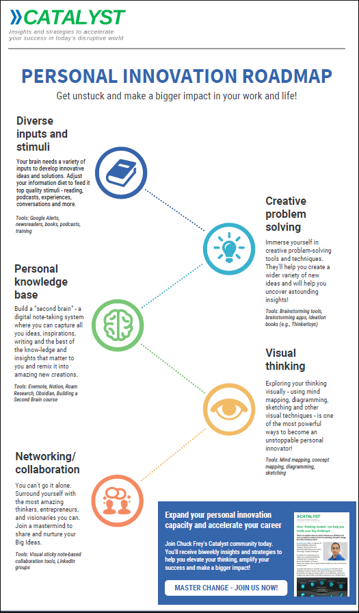
Here’s how I adapted this template to create my Personal Innovation Roadmap. which is depicted below. As you can see, it describes five key areas you need to focus on if you want to thrive in today’s world. Each key area of focus is then followed by a brief explanation of it, plus some recommended tools to help you accelerate your efforts in each area.
Step 1: Clean up your workspace
The first step in my creation process was to clean up my workspace by removing unneeded elements. I immediately deleted the black header and footer and all of the elements within them, plus the horizontal dotted lines adjacent to them and the stars that were scattered throughout the layout. Venngage enables you to group-select elements and delete them quickly, which streamlined this part of the process.
I also deleted all but one of the sets of descriptions next to each icon. Why did I keep one? To use as a model to create my own.
Step 2: add your information
One of the first things I typically do is change the title at the top of the infographic so that it reflects what I’m creating.
Next, I changed the icons to fit my needs. To do so, I first needed to ungroup the objects that mad it up: two stacked circles and the icon itself. Once they were ungrouped, I could select the icon and use Venngage’s convenient “replace” button in the toolbar. It caused the icon dialog box to open in the application’s assets panel.
![]() Once I found the icons I wanted, the next step was to size them and center them within the circle. This was easy, using Venngage’s pop-up alignment guides. Next, I color matched each icon to the circle that surrounded it. The fastest way to do this was to click on the color picker tool in the application’s toolbar, hover over the circle and click again. Venngage immediately painted the icon in the same color.
Once I found the icons I wanted, the next step was to size them and center them within the circle. This was easy, using Venngage’s pop-up alignment guides. Next, I color matched each icon to the circle that surrounded it. The fastest way to do this was to click on the color picker tool in the application’s toolbar, hover over the circle and click again. Venngage immediately painted the icon in the same color.
As a next step, I changed the wording of the existing elements, substituting my information for the existing text.
Several times during the process of adapting this template to my needs, I needed to create additional elements. One of the shortcomings of Venngage is that it doesn’t show you the dimensions of shapes as you create them. So it’s hard to match a new shape exactly to an existing one.
The best workaround I discovered was to select an existing element and duplicate it. It create another shape of the exact same size.
3. Tweak the arrangement of text and images as needed
To ensure that your infographic looks neat and professional, it’s vital that all elements need to be properly proportioned and aligned.
Proper proportion: Text should be sized so it creates a clear hierarchy of information. For example, in my Personal Innovation Roadmap, the five key element headlines grab attention. They do this by being larger and bold-faced. The descriptions are slightly smaller and have a normal weight. Finally, the tools are clearly formatted to play a secondary role in terms of importance. They’re smaller and are formatted in italics to differentiate them from the descriptions above them.
Experiment with text sizes. You may find that some of the existing text in Venngage templates is a bit on the small size. Try outputting your infographic to a PDF or PNG file and view it at a size that’s similar to what your target audience will be using to view it. Is all of the wording clearly legible? If not, you may need to increase the text size by a few points.
Proper alignment: Fortunately, Venngage displays pop-up guides to ensure that your elements are properly aligned, vertically and horizontally. But there are some cases when you still may need a little help. One example was when I imported two logo images into another infographic I was working on. They had some white space around them, which means that aligning to the edge of each image wouldn’t work.
To ensure that the two images ware perfectly aligned, I added a horizontal line to the workspace (like the red line in the image below) and used it to perfectly position the logos relative to each other. Venngage enables you to do that very accurately by using the arrow keys to move elements one pixel at a time. Once I had them perfectly aligned, I deleted the line.

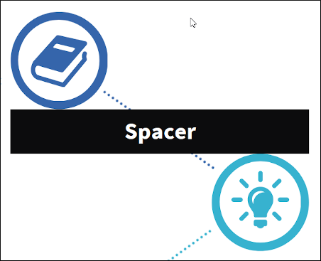
One other shortcoming I discovered is that Venngage doesn’t offer a set of tools that enable you to consistently space elements vertically or horizontally. This is essential to create a good-looking infographic. So I developed a workaround for that.
 To do this accurately, I created a new rectangle and moved it between the two existing elements that represented the perfect spacing. I resized it so it touches the bottom of the top element and the top of the bottom element (or right and left, as the case may be). This rectangle is now the perfect size to serve as a tool for spacing the rest of the elements. Once I was done using it to evenly space the elements of my infographic, I deleted my home-made spacer tool.
Page size: If you need more room to spread out the content of your infographic – or to make it less tall – Venngage gives you complete freedom over page size. Simply go into the application’s settings and adjust the width and height of your page. This feature is especially useful for eliminating extra space at the bottom of your page!
CTA: When someone is done reading your infographic, what do you want them to DO? Consider creating a simple call to action, or CTA.
In the case of my Personal Innovation Roadmap, I want inspired readers to sign up for my new CATALYST e-newsletter. So I created a rectangular area in the lower right corner of my infographic to convey that message, and added a link to the button shape that points to the landing page where readers can sign up.
Note: To create links, you must be signed up for the business edition of Venngage.
Conclusion
This isn’t the first infographic I’ve created in this way using Venngage. I need to emphasize here that this isn’t a commercial for this application. I’ve just discovered that it works for me. Over the years, I think I’ve developed a pretty good design sense. But I’m a writer, not a graphic designer. So I appreciate that I don’t need to create infographics from scratch any more.
The bottom line is that Venngage’s thoughtfully and elegantly crafted templates give me a strong set of starting points that enable me to create better-looking infographics, faster.
Below is my finished infographic. Click on it to open a PDF version of it.
And don’t forget to join my CATALYST community for the latest insights and ideas that will help you to reignite your career in today’s post-COVID workplace!


Leave a Reply