Diagramming software developer Lucidchart recently announced that its web-based toolset is now integrated with Microsoft Teams. So I reached out to their development team to learn more about what this connectivity makes possible. Here’s what I learned:
How are teams and the nature of work evolving, that created a need for this type of hyper-efficient visual collaboration?
Organizations and teams are putting a higher priority on being collaborative and enabling an evolving workforce (e.g., increase in remote workers). The ability to work collaboratively and visually where your team is already working increases clarity and makes it easier to share ideas.
What led you to offer integration between Lucidchart and Microsoft Teams?
Microsoft refers to Teams as the “hub for teamwork in Office 365,” which aligns perfectly with the way Lucidchart helps organizations work and innovate more effectively. Lucidchart is integrated with Office 365, which enables the many organizations using these programs to include visuals in Word, Excel, and PowerPoint, so this integration was a natural next step.
How, specifically, does Lucidchart for Microsoft Teams enable team members to collaborate on flowcharts, network diagrams, org charts, and other visuals?
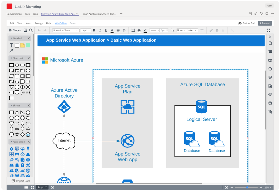
Teams users can add a Lucidchart document as a tab in any Team channel. Once you select an existing Lucidchart document or create a new one, anyone in the channel will be able to edit or comment on the document, as long as those team members are signed into their Lucidchart accounts.

What tools does this integration include that help team members share comments and feedback? I understand that users can leave their feedback on specific parts of the diagram? Is that correct?
Through the embedded editor, team members can start diagramming just as they would in our standard browser editor. Without ever leaving Microsoft Teams, they’ll be able to make comments on a document or a specific shape in the document. Also, since the document is in a Team channel, they can chat about the diagram in Conversations.
How does it enable you to link data to your diagrams? What types of data are supported?
With this integration, you can link data from Google Sheets, CSVs, and Excel spreadsheets to your diagrams directly in Microsoft Teams. Thanks to this functionality, users can put their data in context and more easily gain insights from their data.
How does conditional formatting work, and in what applications could that be useful?
Just as in our standard browser editor, users can set rules on their diagrams to change shape and line color, style, and width or to attach icons like checkmarks and warning signs.
Conditional formatting can help users easily interpret their data and monitor the health of their company or systems. For example, within an org chart, HR teams can set different colors to show who reports to each manager, or DevOps teams can set up their network diagrams so that line widths change to show higher traffic.
When team members are working together on a diagram, how does it indicate that others have made edits to it?
Lucidchart offers revision history, so you can see what changes were made and who made them since the document was created. Users also have the chance to roll back edits or start a new document from a previous version.
How far back does it track revision history?
Revision history shows all changes since the document was created.
What’s next for Lucidchart for Microsoft Teams?
Though we don’t have any new projects to comment on right now, we look forward to continuing our work with the Microsoft team to provide more opportunities for customers to work visually and communicate clearly in the services they use daily.

Leave a Reply