The last time we looked at the business functionality of Lucidchart in 2013, it was a very competent, web-based diagramming application with excellent usability. In 2019, it has evolved into a flexible data visualization tool that’s quite impressive.
In this review, we’ll take a closer look at the most notable features of today’s Lucidchart and how these new tools can benefit you.
Lucidchart enables data integration
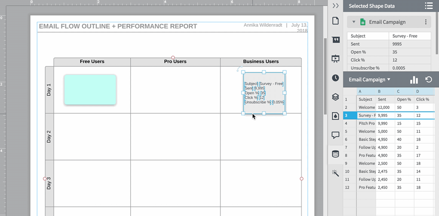
Lucidchart enables you to add data to your diagram elements. You simply select an Excel spreadsheet or a Google Sheets file and select the cell range you want to work with in Lucidchart. It displays this data in tabular form in a panel on the right side of the workspace. You can then drag and drop rows or cells of data into blank areas of the workspace to create new shapes. Or you can add this data to existing shapes in a similar way.
This functionality isn’t limited to numerical data, either. You can have a spreadsheet that contains task assignment information for a project. One column could contain a list of your team members who are assigned to each task. You can then incorporate this data into a project org chart, quickly and easily.
Lucid calls this integration between diagrams and data as “data layering.“ Instead of displaying data next to a chart, it actually integrates the two, providing much more meaning, context and intelligence.
Helping real people get work done
According to the developer, it initially focused on developing a diagramming application that would be of great utility to most business people. It is now taking more of a persona-based approach and has staffed up to build out templates that meet the needs of specific types of business users – people who aren’t typical diagrammers.
Overall, Lucidchart has moved its templates upscale, focusing on specific jobs to be done and giving them more polished, presentable designs.
How Lucidchart is bringing intelligence to org charts
A case in point is Lucidchart’s new intelligent org chart. Rearranging people within a corporate hierarchy is a matter of dragging and dropping them to their proper locations within a diagram. Connectors neatly follow suit, eliminating the need to manually re-create them every time you need to update your chart.
Additional data about employees can be integrated into the org chart using Lucidchart’s data import feature. Data can come from Excel spreadsheets, Google Sheets or can be exported as a CSV file from HR software. The result is an intelligent org chart that provides much more context about each employee.
Imported data can also relate to each employee’s performance. Using the application’s conditional formatting, you can visualize which employees are underperforming, for example. This type of visual exception management is very important in today’s business environment. I’m glad to see that Lucid is moving its diagramming application in this direction.
Intelligent sales diagrams
Another business use where Lucid’s development team has placed a lot of emphasis is making sales data more understandable and actionable through intelligent, interactive diagramming. Its goal is to help salespeople close deals faster by giving them an enhanced view of all of their contacts with prospect organizations – decision makers, influencers and so forth.
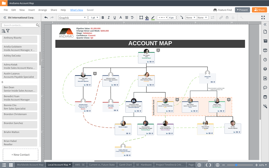
One way the developer is doing this is via account maps, which extract data from the Salesforce.com CRM and display it in a visual format. This makes it easy for a salesperson to see the account structure.
Users can drag and drop people onto the account map canvas and can add pictures, connect to LinkedIn profiles, allocate roles and opportunities and other data. All of this data is synced bi-directionally with Salesforce.
In addition to helping salespeople visualize opportunities and close deals faster, sales maps help company leaders understand key accounts faster.
Sales maps also help with the transition of accounts from one salesperson to another. Often, when these transitions take place, much knowledge about key accounts is lost or is shared on an ad hoc basis. The sales map improves this transfer of knowledge.
In effect, the sales map becomes the single source of knowledge about each sales opportunity, which can be easily be shared among members of the sales team and sales management.
 Real-time collaboration on diagrams
Another area in which Lucidchart has evolved significantly during the last several years is collaboration. Teams can work on a diagram simultaneously, complete with comments and notes. Team members can effectively use it like a shared whiteboard to capture and refine ideas and concepts together.
Conditional formatting
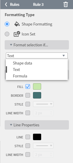
Conditional formatting adds business intelligence by automatically changing diagram element properties when certain conditions are true. This functionality works hand-in-hand with Lucidchart’s data integration. Shape formatting lets you set rules to change shape and line color, style, and width. An Icon sets option lets you set rules to attach icons like checkmarks and warning signs to your shapes.
Conclusion
If it’s been a few years since you’ve looked at Lucidchart, it’s time to see for yourself just how much it has evolved. I predict you’ll be impressed. As it builds out a growing family of business solutions, I think it’s only going to get better!
A basic Lucidchart account costs US$4.95 a month. If you want the data integration, you’ll need to upgrade to a Pro account at $9.95 a month – still a bargain in exchange for the functionality you get, in my opinion.


Leave a Reply