

You’ve just spent three weeks building a mind map of your company’s strategic plan. It holds everything: interview notes, market research, half-formed ideas, open questions, a few pet theories. To you, it’s a masterpiece. Every branch makes sense.
Then you share it with your leadership team, and you get blank stares. Someone asks what “Vendor issue?” means. Someone else wants to know why the risks branch is bigger than the goals branch. Your CEO scrolls around for thirty seconds, closes the file and asks you to “just send a summary.”
What happened? Your map didn’t fail. You shared the wrong version of it. The map you build for yourself and the map you share with others are two different things, and the skill that gets you from one to the other has a name: compression.
What compression means
Compression is the process of reshaping your working mind map so it delivers the most meaning to a specific audience in the least space. You cut what that audience doesn’t need, add back what they do need, and arrange what’s left so it matches how they think.
Notice that this isn’t just shrinking. Your working map is already compressed, but it’s compressed for an audience of one: you. Every label is a memory cue. “Vendor issue?” means something precise to you because you were in the meeting when it came up. To anyone else, it’s two words and a question mark.
I’ve been making this point on this blog for years: when you create a mind map, you own its context. You know why each branch exists, what order to read things in, and what you ruled out along the way. None of that context travels with the file. So compression is really translation. You’re moving the map out of your private shorthand and into your reader’s language.
That’s why your mind map shouldn’t always be your final output. The working map is where you think. The shared map is where you communicate. They have different jobs.
Why compression is hard. And why it’s worth it.
If compression were easy, everyone would do it. Here’s what gets in the way:
- You can’t unsee your own context. Once you know something, it’s very hard to imagine not knowing it. Your labels look perfectly clear to you, so you never notice they’re cryptic.
- Every cut feels like a loss. You worked hard for that research. Leaving it out feels like throwing it away, so you keep it all and bury the point.
- Nobody taught you how. Most mind mapping instruction stops once the map is built. Sharing it is treated as a matter of clicking Export.
- One version can’t serve everyone. Your CEO and your project team need different things from the same plan. A single map tries to please both and satisfies neither.
Now the upside. When you compress well, three good things happen:
- Your ideas actually get used. A map people understand at a glance gets discussed, approved and acted on. A confusing one gets closed.
- You find out what you really think. If you can’t reduce your map to its core, you don’t yet understand your own plan. Compression is a test of your thinking, not just a way to present it.
- You gain influence. People who can make complex material simple for each audience become the ones others rely on.
There’s one more reason this matters right now. AI tools can shorten anything in seconds. But they compress by guessing what looks important. They don’t know that your CFO is skeptical of a particular vendor, or that the board already heard the bad news last quarter. Deciding what to leave out for a specific reader takes judgment, and that judgment is yours.
One plan, three maps
Let’s make this concrete. Imagine you’re leading strategic planning for a mid-sized company. Over several weeks, you’ve captured everything in one map: survey results, competitor notes, ideas from an offsite, budget guesses and a pile of open questions.
(click any map in this article to view a larger version)
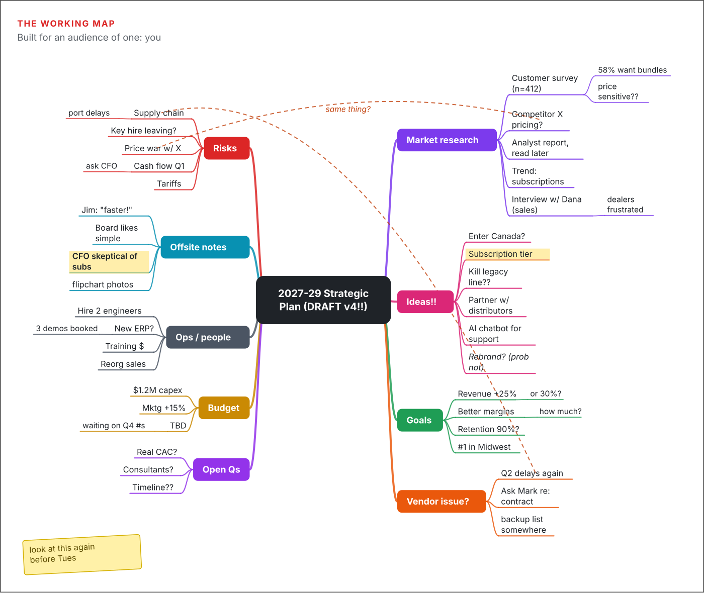
This is a perfectly good working map. It’s supposed to look like this. It holds raw research, half-baked ideas (“Kill legacy line??”), cryptic reminders (“backup list somewhere”) and a sticky note to yourself. Two dashed lines mark connections you noticed but haven’t resolved. Some of the most important insights, like the fact that the CFO is skeptical of subscriptions, are tucked away in a branch called “Offsite notes.”
The problem isn’t that this map is messy. The problem comes when you send it to someone else as is. They see nine branches, roughly 60 topics and no starting point. They can’t tell a firm goal from a passing thought.
Now watch what happens when you compress the same plan for two different audiences.
Version 1: the leadership team
Your executives want to know three things: where are we going, what could go wrong, and what do you need from us? They don’t need the research. They need to trust that you did it.

Here’s what changed:
- Depth: Two levels instead of four. Every supporting detail stays in your working map, ready if someone asks.
- Labels: Cryptic fragments became complete thoughts. “Vendor issue?” became “Supplier delays: second vendor signed by Q2,” which names the problem and your answer in one line.
- Order: The branches are numbered and read clockwise from the top right. The central topic states the strategy itself (“Grow Profitably”), not just the name of the document, so the plan makes sense before anyone reads a branch.
- Omission: The brainstorm ideas, open questions and offsite notes are gone. Canada, the chatbot and the rebrand didn’t make the cut, and that’s a decision, not an oversight.
- Emphasis: The last branch asks for decisions. A leadership map that doesn’t ask for anything is just a status report.
Notice the judgment call hidden in branch 4. Your working map says “Subscription tier,” and your offsite notes say the CFO is skeptical. So the shared map asks for a six-month pilot rather than a full launch. No software would make that choice for you. You made it because you know your audience.
Version 2: the project team
The people who will carry out the plan need something different. They don’t have to approve it. They have to act on it. Their questions are: what are we doing, who owns what, and when is it due?
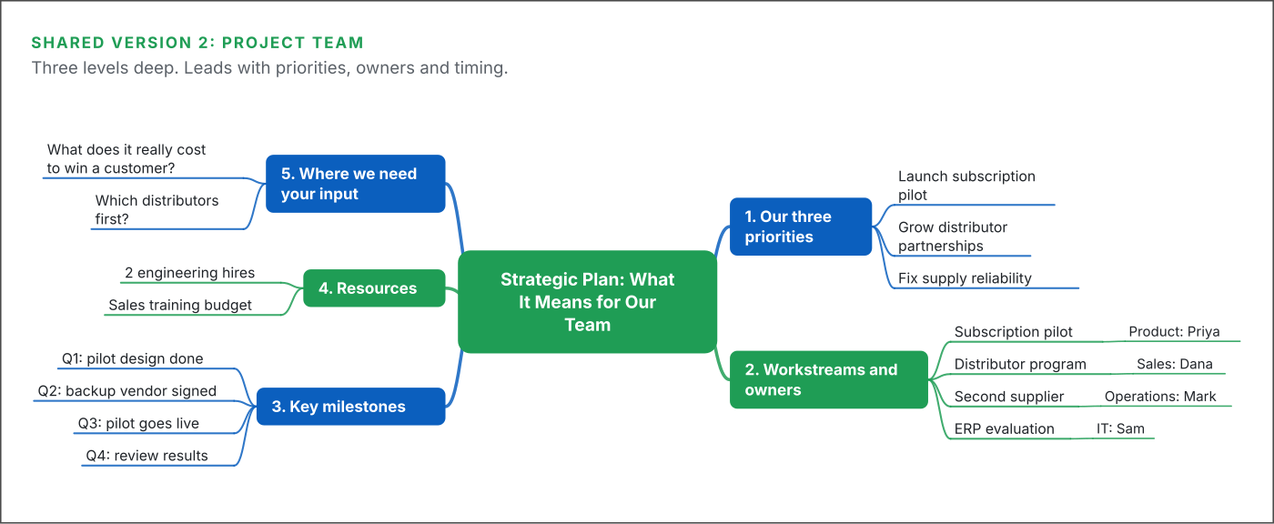
Same plan, very different map:
- Depth: Three levels, because this audience needs owners and dates, not just headlines.
- Order: It leads with priorities, then moves to workstreams, milestones and resources. That’s the order in which a team member thinks about their own work.
- Labels: The central topic speaks directly to the reader: “What It Means for Our Team.” The milestones carry quarter labels so nobody has to guess the sequence.
- Omission: The budget figure and the board decisions are gone. So are the CFO’s doubts. That’s not about hiding anything. It’s simply not information this group can act on.
- Added back: Some open questions survive here, rewritten as invitations. “Real CAC?” became “What does it really cost to win a customer?” The team has insight into that question, so you ask for their help.
Put the two shared maps side by side and you’ll see that neither one is a smaller copy of the working map. Each is a new map, built from the same raw material for a specific reader.
A six-step method for compressing any map
You don’t need talent for this. You need a routine. Here’s the one I use, and it works whether you’re compressing a strategic plan, a project kickoff or a research summary.
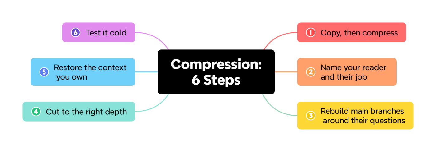
- Copy first, then compress. Never trim your working map. Save a duplicate and work on that. Your working map is your archive, and you’ll want every scrap of it when someone asks a follow-up question.
- Name your reader and their job. Write one sentence: “This map is for [who], so they can [decide, act or understand] [what].” If you can’t finish that sentence, you’re not ready to share. Then rewrite your central topic so it answers that sentence.
- Rebuild the main branches around their questions. Your working map is organized around how you gathered information: research, ideas, notes. Your reader doesn’t care how you gathered it. List the three to five questions they’ll bring to the map, and make each one a main branch.
- Cut to the right depth. Decide how many levels this reader needs. Two is plenty for executives. Three or four suits people doing the work. For each remaining topic, ask: would they miss it if it were gone? If not, cut it. It’s still safe in your working map.
- Restore the context you own. Go through every label and ask whether a stranger would understand it. Turn fragments into complete thoughts. Number your main branches so the reading order is obvious. Add a short note to the central topic if the map needs a “start here.”
- Test it cold. Show the compressed map to someone who wasn’t involved. Give them 30 seconds, then ask what the plan is about. If they can’t tell you, find the branch that confused them and fix it. If the stakes are high, walk your audience through the map live. When you narrate it, you deliver the context along with the structure.
After you’ve done this a few times, it becomes a habit. You’ll start building working maps with the eventual audience in the back of your mind, and compression will take minutes instead of hours.
Your map is where you think, not where you finish
The working map does its job when it helps you understand a problem. The shared map does its job when it helps someone else understand it. Compression is the bridge between them, and it’s a skill almost nobody teaches.
So the next time you’re about to click Export and attach your map to an email, stop. Make a copy. Ask who’s on the other end and what they need to do. Then build them a map that answers their questions instead of showing them yours.
Try it on the next map you share. Then let me know in the comments: which part was hardest for you to cut?
Leave a Reply