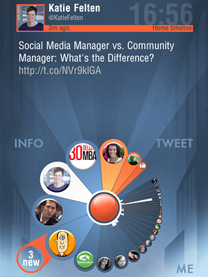
Twheel is a new Twitter app for the iPhone and iPad that helps users manage information overload by arranging tweets in a map-like visual format that is a fascinating study in data visualization.
With conventional Twitter clients, you must read – or at least skim – every tweet in order to determine if it is relevant to your needs. Much of your time is spent just trying to separate the wheat from the chaff. In other words, valuable tweets tend to be buried in the midst of many irrelevant, useless ones. The developers of Twheel, Fluid Interaction, decided to solve that challenge by taking a visual approach.
Our brains are wired to spot and interpret visual cues very quickly, such as shapes, patterns, forms and colors, and doing so even with peripheral vision. Faced with the limited screen real estate of mobile devices, The Twheel development team created an interface that uses shape, color and motion to help users to quickly zero in on the most important and relevant information. It’s a beauty to behold and is also very efficient in its functionality (click here to read more about the thinking behind Twheel’s design in the developer’s blog).
 Tweets within the Twheel app are arranged in a coxcomb format – sort of like a pie chart, except the size and configuration of each slice embeds data that helps us to understand it better. The app displays 30 tweets at a time; unread tweets appear in orange, while those you have already viewed are grayed out.
Moving a finger towards any piece of content dynamically magnifies it, making it easy to select and display a tweet, even on the iPhone’s small screen. When you slide your thumb over any of the slices, the corresponding tweet appears at the top of the screen. Dragging a slice outward from the center of the wheel designates that tweet as a favorite.
The currently-displayed segment flashes in silver and gray, helping you to understand which part of the map it’s displaying. White bars embedded within each slice give you a quick visual indication of what’s hot; the longer the bar, the more retweets it has received.
Tapping on a slice opens an action menu for that tweet, which displays in a simplified “wheel” the actions you can perform on it, such as retweeting, replying, making it a favorite and other common Twitter tasks.Tapping and dragging over the top of each slice in the action menu displays a tooltip, which helps you to understand what you can do there. Among those slices are hashtags contained within the currently-selected tweet. Tapping on one of those slices recreates the wheel with that hashtag as the subject – a great way to explore related ideas and concepts!
The big orange button that is at the center of Twheel’s distinctive user interface takes you to your home wheel. Tapping and holding it displays your other timelines, such as your retweets and favorites, displayed around the circumference of the app’s central button. As you explore tweets collected via different hashtags, you can easily add those searches to your home wheel.
As new tweets arrive, Twheel doesn’t display them immediately; that would make the app so dynamic that it would be confusing to use. Instead, a separate “slice” appears on a layer “behind” the wheel and extending outward from it, displaying the number of new tweets that have arrived since the last time you refreshed it. Tapping on it adds those new tweets to the view.
Twheel enables you to quickly scan your tweets by dragging your finger around the circumference of the wheel; as you reach the end of the tweets (either older or newer than those currently displayed), new slices slide into view, just ahead of your finger. This was a little hard to see on the iPhone app, but more apparent on the iPad’s larger screen.
The interface also contains several floating buttons, displayed in muted grays so they don’t attract too much attention. “Info” gives you context on what you’re looking at, useful for knowing where you are within the app’s interface. It also lets you do things. For example, if you’re looking at a view of the Twitterverse that is filtered by a hashtag, Twheel gives you the option of adding that search to your home wheel. “Tweet” lets you compose new tweets, as you would expect. And “Me” gives you access to app settings, Twitter search, help and more.
Because Twheel is so visually focused, the best way to understand how it works may be to view a video of it in action:
[youtube BIGImsvULK0 nolink]
I downloaded Twheel and played around with it on both my iPhone and my iPad 1. I found it easier to get used to Twheel’s terminology and navigation conventions on the iPad’s larger screen. I was then able to return to the iPhone version and use it more efficiently.
One thing that’s conspicuously absent in Twheel is support for any lists you have created on Twitter. For example, I have a list I call “rock stars” that contains the most awesome, thought-provoking people I follow. Unfortunately, that’s not supported in this app – but I must remember that this is only version 1.0 of Twheel. Perhaps lists will be supported in a future version.
Overall, Twheel is a fascinating app that breaks the typical linear, tabular model for displaying Twitter data and richly reimagines it – adding meaning and context to it in the process. I can’t wait to see where Fluid Interaction takes this innovative Twitter app from here!
Twheel is a free download in the Apple AppStore. It is designed to run on both the iPhone and iPad.

Leave a Reply