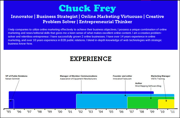
A new web-based application automatically converts your Linkedin profile into a colorful infographic. The mission of Visualize.me, a Toronto-based startup, is quite ambitious – to transform resumes.
According to its website:
“We believe that the traditional text resume is boring, lengthy and long overdue for a makeover. We are creating an online resume format that is beautiful, relevant and fun. We want to enable people to express their professional accomplishments in a simple yet compelling personal visualization. Our vision is to become the future of resumes.”
I recently set up an account on Visualize.me, imported my resume from Linkedin.com, and spent some time figuring out what this intriguing new web-based application can do.
First, because Visualize.me is still in beta testing, I needed to request an invite. Fortunately, this was very easy to do. Next, I needed to input my e-mail address, and had to give it permission to communicate with my Linkedin account. Visualize.me parses this information, and displays it in a colorful infographic on the right side of the screen, plus a control panel on the left side where you can tweak its appearance (click on the image to view my full infographic in a new window).
You can select from 3 basic templates to change the overall appearance of your visual profile (more will be offered when the service officially launches). If you don’t have an eye for colors and design, this will help you to quickly create an attractive-looking infographic. If you are more adventurous, you can customize the look and feel of your infographic, including:
- The colors, fonts and background it uses
- Your profile summary
- Work experience
- Education
- My links
- Skills
- Interests
- Languages you speak
- Recommendations
You can also replace the name of your infographic (the alphanumeric name that appears in the URL) with something more recognizable. In other words, instead of http://visualize.me/xyz123, my personalized URL now contains my name – http://vizualize.me/chuckfrey. This is very useful for sharing a clean, intuitive URL with others, rather than an “ugly” one that’s hard to write down or remember.
In short, you can tweak your infographic’s contents to a surprising degree. I’d love to be able to customize the shapes use to depict each data set – perhaps this will be possible in a future release. Once you’re done tweaking your infographic, you can share it via nearly any social network you can think of, plus e-mail, using an AddThis widget. One minor complaint: It took me a while to find the “share” button – perhaps it should be in a more prominent location, such as within the panel where you edit your infographic’s settings.
If you want to see where this intriguing service is headed, I urge you to check out the Visualize.me blog. There, I learned that it just entered public beta a few days ago. I also got a sneak peek at some of the themes that we can expect to see when Visualize.me officially launches. To my surprise, I learned that Ashton Kutcher’s top 5 job skills, in order of importance, are:
- Getting hot women
- Trend setting
- Punking
- Being hot
- Investing
Curiously, acting was his 6th most important skill. Hmm… Actually, this infographic was the developers at Visualize.me having a little fun!
If you love infographics, I strongly urge you to visit the Visualize.me website, request an invitation and create your own visual resume. I can’t wait to see where this application goes from here – this passionate start-up company has a great concept and is definitely off to an impressive start!


Leave a Reply