Many people don’t feel comfortable creating visuals to support their content, presentations, proposals and other work. They may not have a sense for design or the tools needed to create these visuals are just too complex.
Sathya, author of the popular Yellow Visuals Twitter image series and his partner Lee, a SaaS application developer, decided to team up to do something about that.
They built a simple, intuitive tool called YVisuals that enables even graphically challenged people to quickly and easily create common types of business diagrams – which they call “microvisuals.”
So I decided to take a closer look at the thinking behind it and how it works.
What is YVisuals?
A web-based toolset that enables you to select, customize and download simple diagrams that you can add to your presentations, share on social media and use in dozens of other ways.
How does it work?
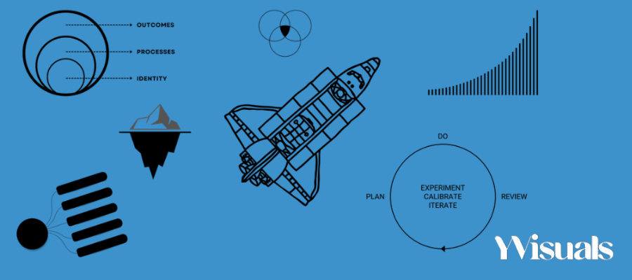
The first step is to select the diagram you want to make. You can choose from a growing library of over 30 options, including:
- 2×2 grid
- Concentric circles
- Funnel designs
- Pyramids
- Venn diagrams and more
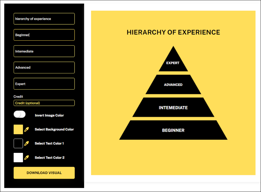
When you select a diagram in YVisuals, the app displays a screen with simple form fields (to populate your diagram with labels) and controls that enable you to customize its appearance. As you adjust its properties, the app immediately shows the results of your changes, side-by-side with the diagram settings.
You can’t change the structure of any diagram, but you can adjust its color scheme, the background color, the labels that describe each part of it and the title of your diagram.
When you’re satisfied with your diagram, you can export it as a PNG file.
Who is it for?
“Many aspiring creators, marketers, and visual thinkers want to to build their online niche authority and make a livable income,” Sathya explains. “YVisuals can be the tool to help them with their greatest challenge: growth.”
YVisuals does this by allowing a user to pick any visual and customize with your own ideas in just a few seconds. They can customize the colors to their personal brand. The user can then download the image and share in content marketing, pitch decks, blog posts or any other . medium that allows for the sharing of visuals.
My experiment with YVisuals
I created a 4-level pyramid and found YVisuals to be intuitive and easy to use. One minor complaint: The four form fields for inputting the names of the four pyramid levels appear in the opposite order that they do in the diagram. In other words, when I filled in the name of the first form field after the diagram title, it changed the name of the bottom layer of the pyramid.
Because any changes I made in the form were instantly represented in the diagram, I was able to figure this out quickly and adjust my placement of layer names.
What’s next for YVisuals?
According to Sathya and Lee, YVisuals will be expanded with additional diagram types. Users will have the option of choosing from a small family of fonts and will be s le to save their creations in an online library.
I suggested another enhancement that the developers say they may add to their product roadmap. In addition to enabling users to customize diagram colors, I recommended that they also provide a small number of themes that include selections of attractive combinations of complementary colors. This is needed because most non-designers don’t know how to pick families of colors that work well together.
Sathya and Lee are excited about the prospect of nurturing YVisuals into a must-have tool for creative entrepreneurs:
“In this digital age, you are your own PR agency. Visuals are a great way to strengthen relationships with your audience. If you want to incorporate visuals into your communication plan, yet don’t have the time to learn a new design or diagram tool, YVisuals could be the answer,” Lee emphasizes.
Want to experiment with YVisuals? You can sign up for a free account on the developers’ website.


Leave a Reply