LucidChart, a new web-based diagramming and visual thinking application, has raised the bar for this genre of software with superlative usability and a wealth of advanced features that will delight power users. Yet it’s intelligently designed so it won’t overwhelm first-time users.
I review a lot of software and apps; that means it’s hard to impress me. But LucidChart has succeeded in doing so, with its emphasis on helping users to produce professional-looking diagrams quickly and easily, with intuitive functionality that lets users get common tasks done with a minimum number of clicks. More than once, while I was working with it, I found myself smiling and saying, “Wow – that’s cool!”
In this review, we’ll take a look at what’s notable about LucidChart for business applications. I apologize in advance for the length of this review – there’s a lot to cover. But I promise it will be worth your while!
The LucidChart interface
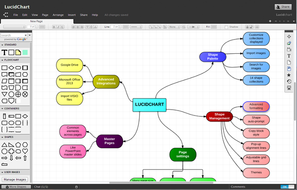
When you first open LucidChart, the user interface is just a little bit daunting. To the left of the workspace are shape palettes, where you can select from an impressive variety of diagram shapes. Clicking on a button at the bottom of this pane displays a dialog box where you can use checkboxes to customize which of the shape collections you want to display – everything from standard flow chart and data flow shapes and mind maps to UML, Venn, AWS architecture and entity relationship collections. LucidChart also provides a complete collection of shapes for web developers to use in creating website UI (user interface) mockups. In addition, you can import Visio stencil files into LucidChart shape libraries – very cool!
Below the shape palettes is also a button where you can upload and create collections of external images you want to use within LucidChart. The image selector lets you create folders to group your images into collections, and also lets you search the LucidChart library, IconFinder and Google Images for even more images to use in your diagrams. Like the shape palettes, the app lets you decide which image collections you want to display. This level of control makes it easy to customize LucidChart around the kinds of diagrams you most frequently create.
 Across the top of the workspace, a narrow horizontal toolbar lets you adjust properties for shapes and text – some of the most common tasks you’ll perform within LucidChart. On the right side of the workspace is a smaller, vertical toolbar with nine icons. How is this different than the properties toolbar? At first, I wasn’t sure. But once I viewed the LucidChart tutorials, the thinking behind this arrangement became quite clear: These are inspector panels that give you access to a deeper level of customization of your diagram and its elements. Novice users can use the basic settings that the horizontal toolbar provides, while intermediate and advanced users will love the level of control these inspectors provide.
They control things like page settings, shape options, text formatting and task history. When you click upon them, dialog boxes appear, which can be dragged around the workspace and docked at different locations. This is ideal for keeping your most commonly-used properties windows close at hand, especially on a larger screen. Think of these properties buttons as functioning something like the nested properties palettes in the typical Adobe application. Only these stay out of the way until you need them. Meanwhile, they’re not taking up precious screen real estate, unless you want them to.
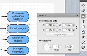
A “metrics” inspector lets you manually input the horizontal and vertical dimensions you want shapes to have. Document history enables you to revert to an earlier edit of your drawing – pretty impressive for a web-based app!
Advanced shape management tools
As you would expect, you can use the main properties bar above the workspace to change the color and text properties of diagram shapes. If you want to do more, then use the properties inspector, which gives you access to additional properties, such as opacity, gradients and embedding an image within a shape. The controls are quite intuitive.
As you move objects around the workspace, alignment lines pop up to help you position objects in relation to each other. This is a feature I use in Adobe Fireworks when I’m creating infographics, and I love it! In comparison, SmartDraw, the diagramming software I usually use, requires me to go to its design menu and use a set of “arrange” commands to line up objects with each other, which can be very time-consuming and requires more clicks. This makes me really appreciate this aspect of LucidChart’s functionality.
LucidChart also supports snap-to-grid functionality, which also helps to keep your diagrams neat and well organized. Where most drawing apps let you simply toggle a grid on and off, the developers of this app give you four choices – from a very small grid (with lines every 5 pixels) to a large one (40 pixels).
Adding lines to your diagrams
Adding lines to connect shapes in your diagrams couldn’t be any simpler in LucidChart: Simply hover your cursor over the edge of a shape and it turns into a plus sign. Drag and drop a line to the shape to which you want to connect it. This is much simpler and faster than having to return to the toolbar each time to select a line object and add it to your drawing, as I must do in SmartDraw.
If you want to create a new shape and have it look like an existing one, simply drag a new shape into the workspace. With it still selected, choose the “copy block style” command. The app will prompt you to select the shape from which you want to copy the properties. Click it, and your new shape takes on the same fill, line and text properties of the existing one. The only thing it doesn’t duplicate was the size of the existing shape. Perhaps in a future upgrade?
LucidChart doesn’t limit you to a pre-set number of connection points; you can connect any two shapes together via any spots on their perimeters. Straight, curved and elbow line shapes are supported; you can also create custom line shapes. They display adjustment handles, which enable you to reshape their curvature and end points to meet your needs. This is high-end functionality in a web-based diagramming application, folks!
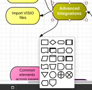
 Even cooler – if you’re creating a flow chart and you drag a line into a blank area of the application’s canvas, a “shape autoprompt” box pops up that displays the shapes from the current library you’re using. Click on one of the shapes, and it’s added to your diagram. How simple and fast is that!
Once a shape is connected, simply drag the end of the connector to a new position, where it reattaches. If you drag and drop to the center of an object and then move the object, the connector line will dynamically reposition itself – very intuitive.
As I created the diagram above, I had several connector lines that ran over the top of shapes and other. I was able to easily select them, change them to a custom line type and reshape them so they didn’t interfere with other elements in my diagram.
Intuitive page settings
The developers of LucidChart assume you’re going to want to print out your diagrams, so they have wisely included the ability to select from a range of page sizes, margins and orientations. You can also manually specify dimensions for pages.
LucidChart also supports auto-pagination. In other words, if you drag content off of the existing canvas, it automatically creates a new page, identical in size to the existing one, to hold it. This makes it easier to print multi-page diagrams. When I encountered situations like this with a program like SmartDraw, the page simply grew to tell me that my drawing had exceeded the size of the page. This looks like a more intelligent approach.
One of the things I’ve sometimes struggled with when using SmartDraw, my diagramming tool of choice, is when the document I’ve created is a little too big to fit on a single page. That means I have to spend quite a bit of time adjusting shape sizes and the distances between shapes to make everything fit within a single page. LucidChart includes a “content size” command, which proportionally resizes all of the elements in your diagram to fit on a page. Very cool!
Document themes speed diagram creation
This enables you to restyle your entire diagram without applying settings to each individual object within it. To do this, you simply add a shape to the workspace and style it the way you want. You then select “theme” from the graphic inspector, and tell the app you want to set defaults for that document. A helpful message pops up at the top of the workspace, telling you to select the shape you want to use as the default. You can then repeat this process for the connector lines. Each time you select an object as the default, the thumbnail image in the inspector is also updated to reflect your selection. LucidChart will then use those settings for the creation of any new shapes and lines, a real time-saver!
Master pages help you enforce consistent diagram styles
Remember the master slide view of PowerPoint? It’s where you create the overall theme for your slides, including the background design, placement of logos, page numbers and other design elements that you want to appear on every slide. When you return to the slide view, these elements are stored in a background layer, so they can’t be inadvertently moved or deleted. This enables you to enforce a common branding for all of your slides and presentations.
Now imagine this functionality in a diagramming application, and you’ve got a sense of what LucidChart’s master pages do. You can create multiple pages within a single LucidChart document; as you do so, you can easily apply any master page designs you have created to them. This is a real time-saver!
For web developers, this could be a real boon, because you could use it to show clients different variations of page layouts, while keeping page masthead, logo and footer designs the same from page to page. It could also be used to create a master diagram with a colorful border and a logo in one corner. Your team could then use it to produce diagrams with a consistent look and feel.
Advanced integration: Google Drive
Until recently, web-based applications could be very powerful, but they were effectively on an island: you had to go to the developer’s website, login and create and store all of your files within their private website. There was no portability outside of that environment. LucidChart is the first web-based application that allows you to store your diagrams and create new ones within Google Drive. This requires you to install a LucidChart app from the Google Chrome Store. But it makes the diagramming app behave just like a native Google app like Docs or Spreadsheet. You can also utilize all of the normal document sharing and collaboration tools within Drive to collaborate with others on your diagrams. With more people using Google apps for online collaboration, this is a big plus!
 LucidChart also makes it easy to use Google Drive as a cloud-based backup service for all of your diagrams. When you first make the connection between LucidChart and Drive, simply tell it whether you want to automatically back up all of your LucidChart diagrams to Drive, or only those created from within Drive.
I was easily able to download the plug-in, get it registered with my Google Drive account and then create a new diagram from there. When I closed the diagram about an hour later, I noticed that a LucidChart folder was added to my file directory, and my new diagram was stored there. It all worked flawlessly.
Advanced integration: Microsoft Office 2013
Another example of the advanced functionality of LucidChart is that you can integrate your diagrams with Microsoft Office 2013 documents. As part of Office 2013, Microsoft is now allowing web applications to integrate with programs in Office; LucidChart is one of the first to take advantage of this capability. To use it, you must install a LucidChart app from the Microsoft Store. Once you do that, you can create new diagrams from within Word, or easily insert existing ones from your LucidChart document library. Once you have done so, it behaves just like any other inserted image. I don’t have Office 2013, so I wasn’t able to try this. But it sounds very promising.
What about the other Office 2013 applications like PowerPoint and Excel? I asked the developers, and they said they’ll add integration with PowerPoint and potentially other Office applications as soon as Microsoft releases the APIs (application programming interfaces) for them.
Support for Visio
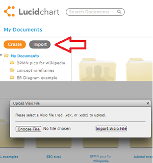
 If you use Visio, Microsoft’s diagramming software, you can now view and edit Visio documents in Drive with LucidChart, if you have a Professional or Team level account. To do this, first upload your Visio document to your Drive account. Then open it within Drive; LucidChart will launch and convert it to its proprietary format. Once you’re done working with it, you can save it back to Drive as a PDF, PNG, JPG or native VDX file.You can also import your Visio documents directly (see the screen shot at right).
According to the developers, LucidChart maintains all of the basic functionality of Visio files during the import process, but a few advanced features such as smart shapes aren’t preserved.
Other advanced functionality
In addition to the impressive functionality I’ve already described, LucidChart enables you to:
- Embed page and URL links into your diagrams
- Embed hotspots in your diagrams for demonstrating web applications (Professional and Team level accounts only)
- Real-time collaboration with other LucidChart users
- Publish your LucidChart diagrams to Twitter, a web page or a PDF
- The diagram editor plays well on tablet devices; a native application to run on popular tablets is now under development
Conclusion
LucidChart is the most impressive diagramming application I’ve seen in some time. I love the way it speeds the development of new diagrams, through features like the pop-up that appears at the end of a line so you can quickly add another shape when creating flowcharts, as well as the ability to set the app’s default formatting for shapes and lines. With other diagramming programs, I can’t even begin to tell you how many hours I have spent selecting and adjusting the formatting of multiple objects. LucidChart does away with all of that, and lets you get down to business.
Its integrations with Google Drive and Microsoft Office 2013 are also very impressive. Considering that these two productivity suites are used by a critical mass of the world’s businesses, LucidChart has positioned itself to enable teams and individuals to do much more than was ever possible before, especially with the growing emphasis on visual thinking today.
When it comes to reviewing software, nothing irks me more than unintuitive user interfaces – functionality that leaves me scratching my head and wondering, “What the hell were they thinking?” I’m pleased to report that LucidChart did NOT give me any of those moments. In fact, it was quite the opposite experience. The application was well-behaved, intuitive and a pleasure to use. This was supported by some excellent tutorials, which helped me to get up to speed with it quickly. Kudos to the development team on job well done.
LucidChart’s pricing is as follows: A basic account, which gives you limited storage and basic functionality, is US$3.33 per user per month. The pro account adds web user interface wire framing and iOS interface design as well as Visio import/export and revision history and more storage for US$8.33 per month. Finally, the team version enables Confluence, JIRA and Google Apps support (single sign-on and faster on-boarding for large numbers of users) and still more storage for US$21 per month. Enterprise pricing is also available. Click here for more details on pricing.
The developers of LucidChart view this application as still in its “infancy.” I can’t wait to see what it looks like when it “grows up” because it’s already very full featured and mature for a new web-based application!


Leave a Reply